 Originally posted by mattb123
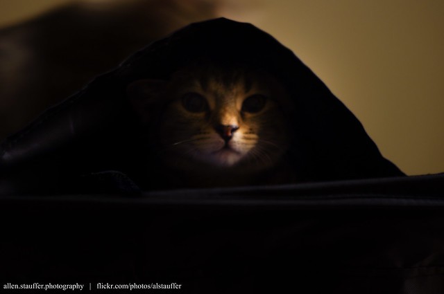
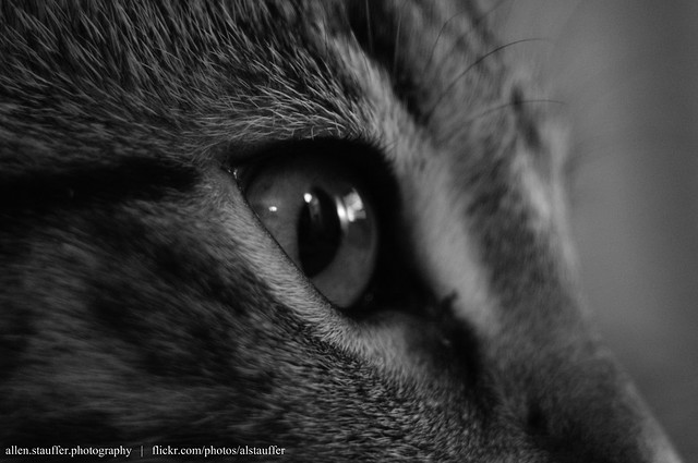
The last one is definitely a little dark but they are generally very nice. I love the composition of the last one! Did you add the vignette? It might be a little too much IMO.
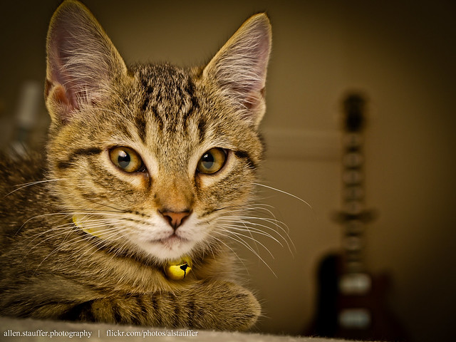
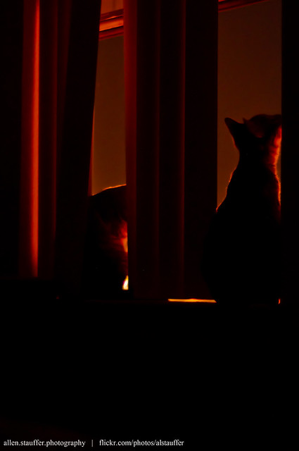
The background of the first one is just a bit distracting and I would have left a little more room around the cat's ear that touches the edge of the frame.
Overall I think you are on the right track and the photos are good. I can see you think about your compositions which is a good thing!
Thank you for the constructive comments! I did add the vignette, and I admit I've gone quite overboard with it lately.. I just bought Lightroom and liked it on the first image I tried it on, and have been using it far too often since

I will try to keep track of the ear cut-off in the future, I didn't notice it until you pointed it out, thanks.
Originally posted by fg-one First, you seem to have got the focus right in all three, which is not so easy to do. The first one would be great without the ear cut (
")
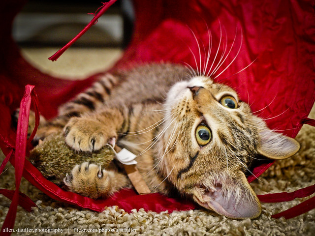
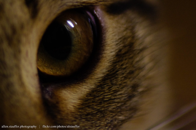
). The white balance might be off a bit but I don't know the actual colour of the walls or of the cat. I like the guitar in the background. Lighting is excellent in the second one and the third one is definitely under exposed and the WB seems off. Here it is, with some corrections. It have taken the WB on the ceiling but it might not be correct. Only you can tell whether or not the cat fur looks good. Vignetting suits the third photo very well by darkening the empty upper left hand corner. I would not have added any to the other ones. Removing the vignette from the first one would make a nicer view of the guitar. Anyway, I like all three compositions. I am sure you will make plenty more nice photos of those two. Cats are pleasant models, more easy going than dogs that always run towards the photographer.
Getting the focus right is pretty challenging because of how active these little guys are - these three photos I managed to grab during some of their 'down time,' so it was a bit easier. Now that I'm over the honeymoon period with Lightroom, I'll have to revisit these photo's without the vignette - I definitely have been using it too liberally. As far as the cats vs. dogs comment, my cats are very 'dog-like', as in they'll run over to investigate as soon as they hear the camera click or focus or notice you pointing it at them
it makes shooting them difficult at times.
For white balance, my third image is definitely off. I think that the real life color is just a bit warmer (is that the right term?) than the version you edited (not quite pure white ceiling, and beige-ish walls), but what you posted helped point out some of what I did wrong in that image.
Originally posted by Schraubstock You are in the Pentax forum here and these are taken with an Olympus.
Nevertheless, now that you are here, your colour reproduction is sadly lacking. If you enjoy taking photos and want to be more serious about it the final product, namely the photos that you take, is in the end what matters. In my opinion your photos will only be as good as the weakest link in the chain will allow you. In your case the weak link is the laptop. Laptops are notoriously not up to the task because their graphics card, generally speaking, is not designed for serious photo editing. Some are better than others of course.
On the other hand you should be able to load some good photo manipulation software on your laptop and with a bit of learning and practice you should be able to come up with better quality corrections as far as colour is concerned.
These were taken with my Olympus that I just sold. My K-x came in the mail yesterday, and I've been working on my thesis all day today and haven't had a chance to play/shoot with it yet, sadly. The rest of the shots I post here will probably be from the K-x.
Thanks for the response and showing the more accurate WB renderings. The original images were much closer to the ones that you posted than the ones from my first post. On the third, I think I just sort of 'lost my way' while editing, but on the first the yellow-ish cast was somewhat intentional. The lighting in that room of my apartment as a very yellow tint to it, so when I think of the cat in that place/pose, the colors of my first image are how I 'remember' him. Is it bad practice to intentionally push colors away from 'true'? I thought the warm tint added to the photo, but like I said, I am very new to this! The third photo was just poor processing on my part.
My laptop is certainly not ideal for image editing; it doesn't even have a dedicated graphics processor, but it's probably all I will have for a while. I do have Lightroom (hooray student pricing!) and Corel Paintshop Pro for editing though, so I could be worse off.
Thanks very much for the advice; hopefully by the end of the week I'll have time to look at these again with fresh eyes and of course shoot the kittens with my new camera!


 Similar Threads


