Forgot Password
Pentax Camera Forums Home
 

Reply
Show Printable Version Search this Thread
01-18-2012, 10:18 AM   #1
Veteran Member
HockeyDad's Avatar

Join Date: Mar 2011
Location: Michigan
Posts: 482
Hard Working Chuck
Lens: Pentax-M 50mm f/1.7 Camera: Pentax Kr Photo Location: Garage ISO: 100 Shutter Speed: 1/180s Aperture: F8 

I had an idea for this photo rattling around in my head and I just acquired my M 50mm f/1.7 so I decided to try it out with this. This whole Converse photo habit of mine started long long ago with a "portrait" a friend took of my shoes hanging from a truck mirror with a sunset reflecting in the paint on the truck. Since then... it's kinda become a thing our friends get a kick out of. But anyway, on to the image at hand... I would love some critique on ways I can improve on it. Hit me with everything, composition, lighting, exposure, etc... Also, PP treatment. I am posting two versions, 1st the sepia(ish) image that I originally conceived but also the color version because I like what the rust brings to the table. So, I'm also looking for opinions on which you prefer.

Thanks for looking.


01-18-2012, 10:29 AM   #2
Junior Member


Join Date: May 2011
Location: Eastern PA
Posts: 42
what about bringing out the rust on the sockets and the chisel (?, i think its a chisel bottom left) and leave the rest in the sepia-ish? .. I am just saying that because you like what the rust brings to the table and you like the sepia-ish. For me to pick one I like better, umm, I think I would pick the sepia-ish because the converse shoe is very retro and the first image brings a vintage feel to it. But, to modernize it a little bit, adding that rust into it may do that.
01-18-2012, 10:38 AM   #3
Veteran Member
JohnBee's Avatar

Join Date: Sep 2008
Location: Newrfoundland
Photos: Albums
Posts: 4,667
Very interesting.

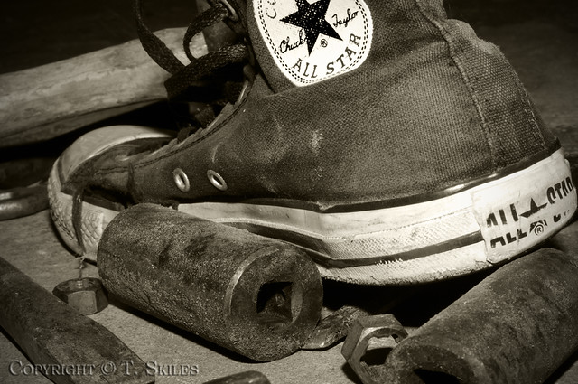
One thing that I've learned with images such as these is that sometimes, its best to hone-in or identify something that strikes you about the image and then post process to bring that particular characteristic.

ie. in this image I find the stressed metal could work and so I'd push for a distressed look.

And so just for fun, I tried a high structure(detail) look combined with a rather strong vignette effect to add a feeling of obscurity feeling to the scene. TO sort of make someone work to figure out what their looking at. - of course this is all just from my own perspective, and so take it with a grain of salt.


PS. please don't take offense to the edit, I assure you that my intentions are based entirely on sharing ideas with others.

Hope this helps.
JohnB

Last edited by JohnBee; 01-18-2012 at 11:19 AM.
01-18-2012, 10:57 AM   #4
Veteran Member
HockeyDad's Avatar

Join Date: Mar 2011
Location: Michigan
Posts: 482
Original Poster
Thank you both for taking the time to comment!

QuoteOriginally posted by onesikej8 Quote
But, to modernize it a little bit, adding that rust into it may do that.
I hadn't thought of that. I just now tried working that up and it seemed like it would almost work but I felt the upper right wound up lacking... like if I had an upended sledge hammer or something to add a little rusty balance up there...

QuoteOriginally posted by JohnBee Quote
PS. please don't take offense to my edit, I assure you that my itentions are based entirely on sharing my own ideas with others.
No offense taken! I'm very new to this hobby and the more I learn, the more I realize how little I know! I got into it to shoot my kids playing hockey but I'm loving the hobby of photography as a whole so the more information/input/ideas people post, the better. I like what you suggest about a less obvious image... I may try throwing some kind of brush stroke filter at it and see where that takes me.

Thanks again for the input!

01-18-2012, 02:06 PM   #5
Veteran Member


Join Date: Nov 2008
Location: Minneapolis
Photos: Albums
Posts: 587
Is the subject the socket, or the shoe? I'm more drawn to the socket, and I'm not sure why the shoe is there. The socket is also the only thing that is completely in the frame, everything else is partially cut out.

The most interesting elements of the shoes, for me, are the texture of the canvas and the grommets for the laces and vents. I'd maybe shoot it from 90 degrees to the left, to get more of that and less of the logo/emblem. The front quarter view, rather than the rear quarter.The brightest part of the scene draws the eye to it, so I'm seeing a lot of the sole and logo and not as much of the socket and canvas texture.
01-18-2012, 07:57 PM   #6
Veteran Member
HockeyDad's Avatar

Join Date: Mar 2011
Location: Michigan
Posts: 482
Original Poster
Thanks for commenting grainbelt. I had the same thought about the angle of the shoe. In fact the torn canvas toward the front caught my eye and I did shoot several from a forward looking angle but in the end, didn't like them as well. Not because the idea was flawed, but I think because that socked didn't play as well from that angle. I think ultimately I'm going to re-stage this and try again so I can explore everyone's input so please keep the feedback coming!
01-19-2012, 05:33 AM   #7
Junior Member


Join Date: May 2011
Location: Eastern PA
Posts: 42
Yeah you're right, something rusty up in the right is needed

01-25-2012, 10:05 AM   #8
Veteran Member
HockeyDad's Avatar

Join Date: Mar 2011
Location: Michigan
Posts: 482
Original Poster
Ok, so I had a chance to give it another try... Better? worse? All critique welcome.

1st the new composition with reduced saturation and some vignetting:


And here's a monochromatic/sepia(ish) version:

Last edited by HockeyDad; 01-25-2012 at 10:22 AM.
01-28-2012, 10:47 PM   #9
Junior Member


Join Date: May 2011
Location: Eastern PA
Posts: 42
I like the sepia-ish one more again, for the same reasons haha
01-30-2012, 01:39 PM   #10
Senior Member
ekim89's Avatar

Join Date: Sep 2010
Location: Illinois
Photos: Gallery | Albums
Posts: 239
QuoteOriginally posted by HockeyDad Quote
Ok, so I had a chance to give it another try... Better? worse? All critique welcome.
This angle works much better in my opinion and the sepia(ish) rendering is done well. Great job! PS, I really enjoy the Lego Star Troopers holding up the red shoe on your Flickr!
01-30-2012, 07:19 PM   #11
Veteran Member
HockeyDad's Avatar

Join Date: Mar 2011
Location: Michigan
Posts: 482
Original Poster
Thanks for the compliments. I think it's definitely getting better. This whole exercise is really giving me a respect for composition. Each time I try, I notice something more in the image that I should have paid more attention to while shooting. In the end, it will make me a better photographer by having a greater attention to extraneous details. It's also a fun experiment in lighting using my old Minolta flash and some utility lights to try get the background dark enough that it hides my garage clutter.

It's also funny that people have walked through the garage and not one has asked, "Why is there a shoe in a pile of old tools on the floor?".

P.S. Thanks for the fav on flickr. That shoot was the result of me and my 7 year old goofing around one evening... there's actually one more, "Tragedy Strikes", that I'll have to upload.
Reply

Bookmarks
  • Submit Thread to Facebook Facebook
  • Submit Thread to Twitter Twitter
  • Submit Thread to Digg Digg
Tags - Make this thread easier to find by adding keywords to it!
critique, image, photo, photography, truck

Similar Threads
Thread Thread Starter Forum Replies Last Post
Nature Working hard ggeorge11 Post Your Photos! 0 05-11-2011 04:48 PM
Any Hard Body Holsters out there (Think Tank? Lowe? anything hard?) cadmus Pentax Camera and Field Accessories 16 03-05-2011 08:25 PM
Nature Bees working hard fekish Photo Critique 5 02-28-2011 09:43 AM
Sports Hard Working Horse Eastern Shore Charlie Post Your Photos! 10 03-27-2010 10:59 AM


All times are GMT -7. The time now is 08:04 AM. | See also: NikonForums.com, CanonForums.com part of our network of photo forums!
  • Red (Default)
  • Green
  • Gray
  • Dark
  • Dark Yellow
  • Dark Blue
  • Old Red
  • Old Green
  • Old Gray
  • Dial-Up Style
Hello! It's great to see you back on the forum! Have you considered joining the community?
register
Creating a FREE ACCOUNT takes under a minute, removes ads, and lets you post! [Dismiss]
Top