Forgot Password
Pentax Camera Forums Home
 

Reply
Show Printable Version Search this Thread
01-26-2012, 01:54 PM   #1
New Member


Join Date: Sep 2009
Location: Lincoln, NE
Posts: 7
Mr. President
Lens: Pentax A 50mm 1.7 Camera: K-7 Photo Location: Lincoln, Ne ISO: 400 Shutter Speed: 1/125s Aperture: F2.8 


Not new to the forum but I don't post much. I thought some input could help me improve my photography and PP.
This afternoon I took a quick portrait of the President of my Kiwanis club to have on the home page of our website. I just used the backdrop of a projector screen and the light available in the room as it was just done quickly after our meeting.
In Lightroom I made some standard adjustments of sharpness, vibrancy and bumped up the exposure just a bit. Then I changed the split-toning of the highlights to add some warmth to the background and a little post crop vignetting. Last I used Corel PSPx2 to add a quick inter frame to add a little weight to the image on the website. I didn't like the line bisecting the lower body so I took it out of just that area.

This is the website just for some context.
http://www.cornhuskerkiwanis.com/public/index.aspx

Any impressions or feedback would be greatly appreciated.

Thanks in advance,
Zach

01-26-2012, 02:18 PM   #2
Senior Member


Join Date: Oct 2011
Photos: Gallery
Posts: 293
Don't you think Mr. President looks nicer like this? (WB set on a white stripe of his shirt). I think he would also handle B&W very well.
Attached Images
 
01-26-2012, 04:46 PM   #3
New Member


Join Date: Sep 2009
Location: Lincoln, NE
Posts: 7
Original Poster
Thanks fg-one,
I think I do like having the wb set correctly and not messing with split-toning. I was trying to warm up the background but lost track of my subject.


I also did a B&W version and I like it little better but I don't think it works for the image of our club.
I'm the youngest member at 36 and we are always trying to appeal to younger demographic.


Thanks again and any other input would be appreciated.
01-26-2012, 05:30 PM   #4
Veteran Member


Join Date: Nov 2008
Location: Minneapolis
Photos: Albums
Posts: 587
The lighting is perhaps a bit harsh, A bit of fill flash from the bottom right to open up the shadows would go a long way. Not sure what you have available to you for equipment.

If you don't have an off-camera flash, I'd turn him toward the available light and use the on-camera flash for fill, and use a diffuser or bounce it off the ceiling to minimize shadows behind him.

Also, with a white shirt, grey hair, and white background, he doesn't really 'pop' out of the frame. Not sure what other options you have available, but a darker background would be useful.

01-26-2012, 05:42 PM   #5
Veteran Member
Bruce's Avatar

Join Date: Oct 2009
Location: Sydney
Photos: Gallery | Albums
Posts: 448
Can I suggest you 'crop', him! Way too much dead space (IMO) if he is the subject and there is nothing else around then make him the centre and rule of third his eyes, and when you crop, can I suggest you change the aspect from landscape to portrait. Also agree with FG re the WB.
01-26-2012, 08:56 PM   #6
Site Supporter
Site Supporter


Join Date: Oct 2010
Location: Melbourne
Photos: Gallery
Posts: 3,386
Hi

I agree with Bruce, usually portraits work better in, well, portrait format for this sort of publication. (Check out annual company reports for this) But looking at the web site you seem to have format restrictions to observe. Still, what I see, Mr. President does look a bit dark to me. I have just done a white balance correction with the eye dropper tool in OLONEO increased brightness a bit and finished off with a light sharpening in FocalBlade. I included a sample because one has to have a side by side comparison to spot the difference.

Greetings

Last edited by Schraubstock; 09-16-2012 at 05:28 PM.
01-27-2012, 12:09 PM   #7
Veteran Member
Deiberson's Avatar

Join Date: Dec 2009
Photos: Albums
Posts: 734
Looks to me like the right side of the frame is out of focus and soft. I'd stop that lens down to f/11 to give you greater depth of field. Not knowing what the limitation of the K7 is....bump the ISO up to to 1200ish and drag the shutter a little longer to compensate the exposure.

Also looks like he is facing away from a window or light source. Wondering what would happen if he was turned the other way?

01-27-2012, 02:26 PM   #8
Pentaxian


Join Date: Apr 2011
Photos: Albums
Posts: 8,743
QuoteOriginally posted by Deiberson Quote

Also looks like he is facing away from a window or light source. Wondering what would happen if he was turned the other way?
This raises an issue in our left to right reading culture. This way he looks like he is going forwards, but facing the light he would look like he was going backwards. Would that fit the club image?

The choice to have his eyes facign the camera is conventional, and engaging, and for this purpose is right. I recently did a big set of conference pictures, and got some subjects looking directly at me, and others in very strong face and looking out of the frame poses. Those have a feeling of visionariness, and are approrpiate for conveying the personality of people such as company portfolio leaders and military officers of reasonable rank.
01-27-2012, 02:29 PM   #9
Veteran Member


Join Date: Nov 2008
Location: Minneapolis
Photos: Albums
Posts: 587
QuoteOriginally posted by tim60 Quote
This raises an issue in our left to right reading culture. This way he looks like he is going forwards, but facing the light he would look like he was going backwards. Would that fit the club image?
Great point, one which would never have occurred to me.

I guess the other option is to flip the image horizontally after shooting.
01-27-2012, 02:45 PM   #10
New Member


Join Date: Sep 2009
Location: Lincoln, NE
Posts: 7
Original Poster
Wow, thanks for the input and discussion.

I had just got the 50mm lens the day before and I'm still learning how to shoot with it. Growing up with AF and now learning MF will be a fun and hopefully rewarding challenge. I don't have any off camera flash and to be truthful I need to learn how to use the on camera flash better to be able to get a natural look.
I think that will be the next thing I start working on in my photography after getting better at using MF.

Thanks again,
Zach
01-27-2012, 03:53 PM   #11
Pentaxian


Join Date: Apr 2011
Photos: Albums
Posts: 8,743
QuoteOriginally posted by grainbelt Quote
Great point, one which would never have occurred to me.

I guess the other option is to flip the image horizontally after shooting.
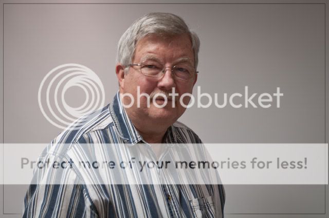
The difficulty of horizontal flipping is that people's faces are actually asymmetrical, and look wrong if flipped. The President has a hair part on what appears as the right side of his face, when facing, which would be inverted.

The left-right reading issue was mentioned in an article in Australian Photography about 1980, which suggested that the cultural difference may make the communication of images different in right-left reading format countries. This kind of thing is important in images used in instruction manuals, too. For all my contact with Chinese, I have not perceived any particular, different, imaging convention with them, although there do seem to be two responses to pictures:
1. Documentation style - must show the tourist in front of the object of interest to prove they were there.
2. Traditional western portraiture to capture mood or personality.
Note: Chinese use multiple text printing formats - columns and rows.
01-27-2012, 07:04 PM   #12
Site Supporter
Site Supporter


Join Date: Oct 2010
Location: Melbourne
Photos: Gallery
Posts: 3,386
Hi

The dark side of El Presidente's face seems to be undesirable.

I just remembered only recently I acquired a plugin called "LightMachine". Have not used it a lot and at first thought it was a bit of a gimmick. But now I see it can actually be useful for images such as this one where you wish to lighten (or darken) only a small part of the picture. So I applied a very localised small amount of light to Mr. President's left side of his face.

What do you thing guys ?

Greetings

Last edited by Schraubstock; 02-16-2013 at 01:49 AM.
01-27-2012, 08:11 PM   #13
Pentaxian


Join Date: Apr 2011
Photos: Albums
Posts: 8,743
I think that the left side of his right cheek, near the moustache should also be lightened a little, otherwise the image looks doctored because of inconsistent shadows.

IEEE Spectrum had an interesting article a few years ago about picking processed images in surveillance and security applications, and things like inconsistent shadows were taken as indicators of image cut and paste.
01-27-2012, 08:42 PM   #14
Site Supporter
Site Supporter


Join Date: Oct 2010
Location: Melbourne
Photos: Gallery
Posts: 3,386
QuoteOriginally posted by tim60 Quote
I think that the left side of his right cheek, near the moustache should also be lightened a little, otherwise the image looks doctored because of inconsistent shadows.
Quite right. I am fully aware of shadow placements in doctored images. In a serious job with the full size image to work with one would spend more time to get it right. In this small image I think it does not look too bad, but you are quite right.

How is that then ?

Greeings

Last edited by Schraubstock; 02-16-2013 at 01:49 AM.
01-27-2012, 09:03 PM   #15
Pentaxian


Join Date: Apr 2011
Photos: Albums
Posts: 8,743
That is better.
My comments were intended as educative for Wisco. You are more patient than me to do demonstration PP for someone else. And I agree, it is only worth doing proper PP on an 'original' image, except for special reasons.
I actually do very little PP myself. It is a habit of my Kodachrome days - I try to get it right in camera. Only recently have I done a little experimentation with anything at all sophisticated, such as beyond colour cast correction for whitebalance and light sources.
The cricket ended here today, I liked the result. And the commentary was more dignified than in the Ashes series a few years ago. Clouds are building like there might be a minor thunderstorm tonight.
Reply

Bookmarks
  • Submit Thread to Facebook Facebook
  • Submit Thread to Twitter Twitter
  • Submit Thread to Digg Digg
Tags - Make this thread easier to find by adding keywords to it!
critique, photography, post, president, website

Similar Threads
Thread Thread Starter Forum Replies Last Post
Palin for President TV ad !!!! jogiba General Talk 10 06-04-2011 06:52 AM
I wish this guy were still President deadwolfbones General Talk 30 02-16-2011 11:22 AM
President Obama is a Christian? stevewig General Talk 29 02-04-2011 05:11 PM
President Nafta Backs President Shafta jeffkrol General Talk 1 12-11-2010 09:13 AM
A President of vision gokenin General Talk 37 06-22-2010 11:44 AM


All times are GMT -7. The time now is 02:24 AM. | See also: NikonForums.com, CanonForums.com part of our network of photo forums!
  • Red (Default)
  • Green
  • Gray
  • Dark
  • Dark Yellow
  • Dark Blue
  • Old Red
  • Old Green
  • Old Gray
  • Dial-Up Style
Hello! It's great to see you back on the forum! Have you considered joining the community?
register
Creating a FREE ACCOUNT takes under a minute, removes ads, and lets you post! [Dismiss]
Top