Forgot Password
Pentax Camera Forums Home
 

Reply
Show Printable Version 1 Like Search this Thread
04-17-2012, 08:21 AM   #1
Veteran Member


Join Date: Nov 2011
Location: NoVa The "burg"
Photos: Gallery
Posts: 899
Portrait
Lens: DAL 55 - 300 Camera: K7 ISO: 1000 Shutter Speed: 1/45s Aperture: F4 

Please let me know what I can improve on, what I did correctly, what I did wrong so I can improve some more, Thanks (:

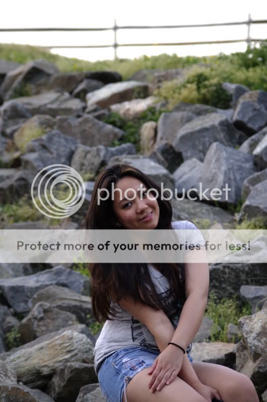
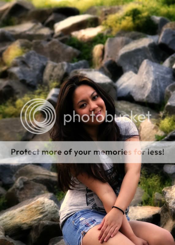
Just a random spontaneous portrait of my friend.

From this


to this


04-17-2012, 05:46 PM   #2
Veteran Member
vievetrick's Avatar

Join Date: Sep 2006
Location: Easthampton - Massachusetts - USA
Photos: Gallery
Posts: 5,183
I would still crop more off the top but do like what you have done with the second one
04-17-2012, 07:26 PM   #3
Brooke Meyer
Guest


If it is a portrait, make it all about her, If it is about the place, make it all about the place. Half of each is leaving the viewer halfway. If it was me, I'd crop a lot tighter to her. She's engaged, open, interesting, someone you'd like to know. The rocks, not so much.
04-17-2012, 11:31 PM   #4
Ash
Loyal Site Supporter
Ash's Avatar

Join Date: Mar 2007
Location: Toowoomba, Queensland
Photos: Gallery | Albums
Posts: 23,920
Certainly your worked edit is better however the framing in this shot s not effective. She should be the prominent subject in the frame, so fill the frame with her and avoid placing her head in the centre of the frame.

04-18-2012, 01:07 AM   #5
Site Supporter
Site Supporter


Join Date: Oct 2010
Location: Melbourne
Photos: Gallery
Posts: 3,386
Hi

The picture has background with surplus to requirement. The fence at the top must go. The picture looks to me as if your girlfriend is about to slide toward the bottom out of the frame. I have suggested many times, cropping is often the cheapest way to improve an image. Don't hesitate to experiment.

You say: "Just a random spontaneous portrait of my friend" and because of this you are forgiven for taking this photograph in front of such an unsuitable busy background with its hard edged rocks. Next time try place her in front of something a bit more evenly textured, so it does not compete so much with the portrait subject.

Also, both colour renderings to my eye (and monitor) is off.
The first one is a tad dull and could benefit from less blackpoint. It lacks vibrancy.
The second image is too red, too green, too yellow, too black, to contrasty too everything. I have reduced a bit of all of these in OLONEO which allows you to work directly with individual colour channels and observe the result in real time. But please don't forget that JPGs have their PP limitations.

This is my evaluation of of the two pictures and relies on a proper colour system. It is only meant as a pointer. Don't know how it comes across your monitor.

Greetings

Last edited by Schraubstock; 09-16-2012 at 05:33 PM.
04-18-2012, 03:50 AM   #6
Veteran Member
Velja's Avatar

Join Date: Nov 2011
Location: Velenje
Photos: Gallery | Albums
Posts: 554
Hi,
I see that your "portraits" filled with too many items around the model, that too many distracting the viewer! Without a grudge, that's just my humble opinion!
greeting
04-18-2012, 06:34 AM   #7
Veteran Member


Join Date: Sep 2009
Posts: 1,196
Hi...

As others have suggested - I would crop close. Really close. Like, right by her hair for the edge of the frames. Closer than what schraub suggested.

Schraub's image comes across too cool on my monitor.

04-18-2012, 09:24 AM   #8
Senior Member


Join Date: Sep 2011
Location: Wisconsin
Photos: Albums
Posts: 151
Showing her left knee is awkward, (compared to her right), Maybe blurring the background a little.
04-18-2012, 05:36 PM   #9
Veteran Member


Join Date: Nov 2011
Location: NoVa The "burg"
Photos: Gallery
Posts: 899
Original Poster
Thanks for the tips guys! btw she's not my girlfriend. . . Anyway if I'm going to take portraits = more of the face less of the background. In my defense I really like the background that's why I tried to show more of it because it makes the photo much more interesting to me. So I guess this photo is not a portrait but more of a?

Note to self*

*Fill the frame with the subject
*Make it all about the subject
*Avoid placing the subject's head in the centre of the frame.
*Background doesn't have to compete with the subject

Anyway how about this one?

04-19-2012, 04:11 AM   #10
Ash
Loyal Site Supporter
Ash's Avatar

Join Date: Mar 2007
Location: Toowoomba, Queensland
Photos: Gallery | Albums
Posts: 23,920
The same issues apply to that portrait.
His face is in the centre of the frame - no need for all that space above his head - frame it such that the head is in the top third of the frame (generally).
There is a distracting orange band across the frame, but only a little distracting.
The background is a little busy but would be better applied if the subject did fill the frame better.
04-19-2012, 06:31 AM   #11
Veteran Member


Join Date: Nov 2011
Location: NoVa The "burg"
Photos: Gallery
Posts: 899
Original Poster
Thanks ash. That was shot with my super program and I and I made a newbie mistake opening the film door before rewinding the whole film thus the orange band was formed.

Notes*

Frame head on the top third of the frame.

Also I have a question here. They say we focus on the eyes for portraits, but the thing is I use MF all the time (M lenses) I'm worried that w/o focus confirm, or my program plus' focus screen, I won't be able to hit the focus right if I want my subject not in the center of the frame. Should I not be worried in focusing the subject in the center and then re-composing?
04-19-2012, 08:24 AM - 1 Like   #12
Veteran Member


Join Date: Oct 2011
Location: Texas
Photos: Gallery
Posts: 381
Not at all. I generally focus with the subject dead center in the frame, then recompose. If using manual focus, you can move the camera around all you want to recompose as long as you don't move position or touch the focus ring. If using auto focus, I focus on the eyes, press the shutter halfway to focus, then while still holding the shutter halfway, recompose, snap the picture.

My 2 cents on the second portrait you showed:

Like the others have said, crop it a bit closer. It'd be interesting to see this shot from even a bit further beneath the subject looking up at him. I get the feel from this picture that you were trying to capture a slightly intimidating look? Having the subject look down to the camera would capture that feel a bit more, with the hard look in his eyes staring directly into the lens.
04-19-2012, 07:31 PM   #13
Veteran Member


Join Date: Nov 2011
Location: NoVa The "burg"
Photos: Gallery
Posts: 899
Original Poster
Thanks. I really appreciate the input. I've been reading a lot on how to shoot portraits and I've been also taking a look on my idol photographers on how they do portraits, I'm hoping that I get my own style in the near future
04-20-2012, 02:59 PM   #14
New Member


Join Date: Jun 2011
Location: Lansing, MI
Photos: Albums
Posts: 5
You may want to lighten the dark areas. Notice the skin tones and background are well lit, but you loose detail in her dark hair. I'd recommend playing with the tonal curve to lighten the darkest areas a bit.
04-20-2012, 05:39 PM   #15
Veteran Member


Join Date: Nov 2011
Location: NoVa The "burg"
Photos: Gallery
Posts: 899
Original Poster
QuoteOriginally posted by millesr Quote
You may want to lighten the dark areas. Notice the skin tones and background are well lit, but you loose detail in her dark hair. I'd recommend playing with the tonal curve to lighten the darkest areas a bit.
Agreed.

Note to self I really need to start shooting raw
Reply

Bookmarks
  • Submit Thread to Facebook Facebook
  • Submit Thread to Twitter Twitter
  • Submit Thread to Digg Digg
Tags - Make this thread easier to find by adding keywords to it!
critique, photography, portrait

Similar Threads
Thread Thread Starter Forum Replies Last Post
People Portrait Willem Wernsen Post Your Photos! 1 04-13-2011 05:58 AM
When you take a picture in a portrait shot do you rotate it back to portrait and save rustynail925 Troubleshooting and Beginner Help 24 08-22-2010 08:29 AM
People B+W Portrait yusuf Post Your Photos! 13 04-26-2010 10:51 PM
People A Self-Portrait kevinschoenmakers Post Your Photos! 3 04-25-2010 03:48 AM
Portrait, Self-Portrait and a Bonus, all in one shot! Buddha Jones Post Your Photos! 7 05-07-2007 05:52 AM


All times are GMT -7. The time now is 05:58 AM. | See also: NikonForums.com, CanonForums.com part of our network of photo forums!
  • Red (Default)
  • Green
  • Gray
  • Dark
  • Dark Yellow
  • Dark Blue
  • Old Red
  • Old Green
  • Old Gray
  • Dial-Up Style
Hello! It's great to see you back on the forum! Have you considered joining the community?
register
Creating a FREE ACCOUNT takes under a minute, removes ads, and lets you post! [Dismiss]
Top