Hi Rupert
It's a "quick grab shot" and to say anything for or against its quality is neither here nor their and perhaps even meaningless. If you like it then keep it the way it is.
However, since you ask and had you not provided the "quick grab shot" comment I would venture into dangerous territory and tell you a lot is wrong with the image or at least not a lot is right. (Hope you are not feeling suicidal over this, but for a
small fee I can provide grieve counseling)

Of course all the following suggestions can't be considered in a "quick grab shot" and if you could it wouldn't be one.
First and foremost the background is way,way too busy and the colour of it is not doing anything for the picture. The overall couloring of the image to me does not look right either. Can't say really why, just does look a bit too pinkish as it where.
The colour of the subject would require different lighting to make the hair less prominent. As it is it looks to me like the hairdo is the focus of the attention and gives it a kind of "product shot" feel with the end bits missing if it was.
The framing or crop ,as it may be, is all wrong. The picture is too "squat" making her shoulders too big looking. It also makes the white rose too prominent and of course it is "burned out". Perhaps a true portrait orientation would have been better and then the cut off top of her head would not matter so much. But again it is a quick grab shot and you may not be able to change this.
Rupert, sorry for the bad news and I can hear you say - "bloody hell,why did I ask" But please bear in mind it is only the way I see it.
Greetings
P.S. I am not a big fan for a B&W conversion.


 ....still, I like it! Any suggestions in the processing?
 [IMG]
[IMG]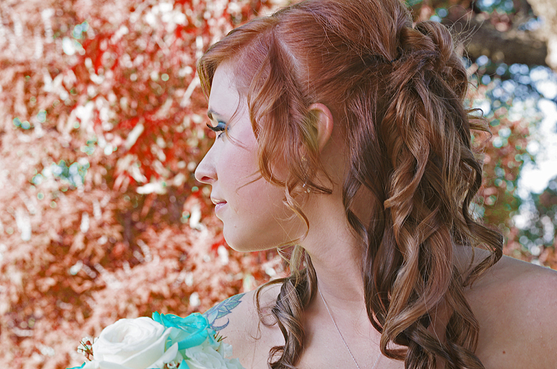


 Similar Threads


