Forgot Password
Pentax Camera Forums Home
 

Reply
Show Printable Version 1 Like Search this Thread
11-17-2012, 12:46 AM   #1
Veteran Member
Sagitta's Avatar

Join Date: Feb 2011
Location: Maine
Photos: Gallery
Posts: 3,081
Six Gulls
Lens: Sears 135mm f/2.8 (non-macro) Camera: Pentax K-x Photo Location: Waterville, Maine ISO: 800 Shutter Speed: 1/1000s Aperture: F8 

Going back through some of my old stuff, I came across this one.

Personally, this shot never really 'clicked' with me (for whatever reason), but I uploaded it to my flickr for the hell of it just to get opinions since The Other Half said she thought it was really neat.

To my surprise, the few places I shared it seemed to generally net the shot positive comments, both on flickr and elsewhere.

Then I realized I don't think I ever shared it here on PF.

Since I don't like the shot (but others do) I figured I'd stick it in the critique section to see if someone else mentions something that will make me realize why *I* don't like it either.

This was shot with an old Sears 135mm f/2.8 manual lens - the non-glowy one - probably around f/8-ish.


11-17-2012, 03:28 AM   #2
Forum Member


Join Date: Apr 2012
Photos: Albums
Posts: 73
I like it - it's so simple, minimalistic.
I would even the line, however.
11-17-2012, 04:35 AM   #3
Veteran Member
bdparker's Avatar

Join Date: Sep 2011
Location: Melbourne
Photos: Gallery | Albums
Posts: 307
I love it, images that simple have gone for millions
The only thing I'd do would be to straighten it a little, up on the right.
11-18-2012, 10:50 AM   #4
Pentaxian


Join Date: Feb 2011
Location: Hoek van Holland
Photos: Gallery | Albums
Posts: 1,393
composition wise I like it. But the background color fails to let the gulls stand out, it looks like they are cut out of another shot and put on this background

11-18-2012, 01:35 PM   #5
Moderator
bigted's Avatar

Join Date: Oct 2011
Location: Jessica Lake, Whiteshell Provincial Park, or Winnipeg Manitoba, Canada
Photos: Gallery | Albums
Posts: 1,594
I like the simplicity of the shot too.
11-18-2012, 03:23 PM   #6
Pentaxian
Kozlok's Avatar

Join Date: Jun 2012
Location: Albuquerque
Photos: Gallery
Posts: 3,148
It's classically simple, very modern looking. Put that in a black frame and sell it for big bucks!
11-18-2012, 03:31 PM   #7
Veteran Member
Sagitta's Avatar

Join Date: Feb 2011
Location: Maine
Photos: Gallery
Posts: 3,081
Original Poster
As far as the horizon line goes, its actually straight (or very, very close). Maybe I could nudge it a degree northwards and see if it improves things.

If I'm really lucky maybe I still have the RAW for it, but I don't think I do.

11-20-2012, 08:43 AM   #8
Veteran Member


Join Date: Jul 2010
Location: Lyngby, Copenhagen
Photos: Albums
Posts: 742
I think the shot would be stronger if one of the birds stood out in some way - different size, orientation, species, colour, something. That's not something you can fix in post though, unless you're willing to downright manipulate.

Number 3 from the left looks to the side while the others look straight ahead. I see that now. Nevertheless, I think I uphold my critique.

Regards,
--Anders.
11-22-2012, 05:31 AM - 1 Like   #9
Senior Member
VTerlakyPhoto's Avatar

Join Date: Sep 2012
Photos: Gallery
Posts: 107
I like the simplicity here, the composition is great. My only nit would be that there isn't enough contrast between the gulls' head and the background, otherwise it's definitely a keeper
11-22-2012, 07:34 AM   #10
Veteran Member


Join Date: Jun 2011
Location: London, Canada
Photos: Gallery
Posts: 343
Hello
I like the simplicity too. I suppose it would be nice if say the second one from the right was doing something something different (stupid seagulls just can't follow directions 
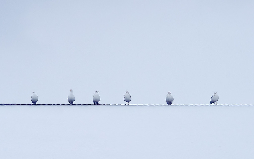
). I agree that it's lacking contrast and they don't stand out. I personally don't like the strong blue cast which to me looks like the wb being off rather than a choice. A levels adjustment layer click auto and click the white eyedropper makes them stand out much better. I personally think since it's nearly a monochrome anyway that it's nicer that way did a quick edit as a toned monochrome posted it here. 2012-11-22_090634 | Flickr - Photo Sharing!
Cheers
Greg
11-24-2012, 11:57 PM   #11
Veteran Member
Alliecat's Avatar

Join Date: Dec 2010
Location: East of Everywhere, Canada
Posts: 740
Yeah, I like it too. Simple. Maybe you didn't like it because you thought there wasn't enough in it.
I was once told that odd numbers of things work better in photos than even... would it strike you better if there were only 5 gulls...?
I like that it has some colour, although the gulls too are kinda blue. Maybe a colour cast somewhere between this blue & straight b&w? Unless you want to adjust the colour on the gulls individually...
Reply

Bookmarks
  • Submit Thread to Facebook Facebook
  • Submit Thread to Twitter Twitter
  • Submit Thread to Digg Digg
Tags - Make this thread easier to find by adding keywords to it!
critique, flickr, gulls, photography, shot, six

Similar Threads
Thread Thread Starter Forum Replies Last Post
Nature For the Gulls tim.anderson Post Your Photos! 2 11-28-2011 08:28 AM
Nature Herring gulls- the same like sea gulls, only different normhead Post Your Photos! 3 11-08-2011 05:35 PM
Nature Gulls tootall Photo Critique 4 09-10-2011 07:39 PM
Nature Gulls off the bridge cgilbert Photo Critique 2 04-15-2011 06:42 AM
Nature Gulls OrenMc Post Your Photos! 11 02-18-2011 09:18 PM


All times are GMT -7. The time now is 06:21 AM. | See also: NikonForums.com, CanonForums.com part of our network of photo forums!
  • Red (Default)
  • Green
  • Gray
  • Dark
  • Dark Yellow
  • Dark Blue
  • Old Red
  • Old Green
  • Old Gray
  • Dial-Up Style
Hello! It's great to see you back on the forum! Have you considered joining the community?
register
Creating a FREE ACCOUNT takes under a minute, removes ads, and lets you post! [Dismiss]
Top