Forgot Password
Pentax Camera Forums Home
 

Reply
Show Printable Version Search this Thread
12-01-2012, 08:34 PM   #1
Veteran Member
Julie's Avatar

Join Date: Aug 2010
Location: Illinois
Photos: Gallery | Albums
Posts: 1,069
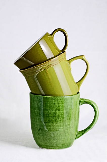
Green Cups
Lens: Pentax A 50 2.8 Macro Camera: K-30 

So, this was the original processed photo that I had.... I thought it looked good- until I printed it on 8x10 and viewed it on a better monitor... ick!


Here is my second touched-up version, I think that it looks better to me, but still have yet to print it out.


What do you guys think?
Does it look fine or too touched-up?
I deliberately left the shadow on the left and didn't go full-blown white on the background, thinking that it would make it appear faked.

12-01-2012, 11:37 PM   #2
Veteran Member


Join Date: Jun 2011
Location: London, Canada
Photos: Gallery
Posts: 343
Hello Julie
I don't think it looks too touched up but I'm one who pushes my images around a lot sometimes. I can see your point of leaving the shadow to ground the cups so they don't seem to be floating. I might suggest a white woven fabric background that stands out more. ( I added some texture in my edit to show what I mean.) It looks like you might have used a white table cloth but it's hard to tell. I would suggest cropping a smidge, say 5% off the top. Seems a little too empty up there. The other aspect that could be modified are the highlights from the light source. It's OK on the middle cup but the top one has a burnt out hot spot. Perhaps changing the angle or distance or further diffusion would solve it or toning it down in pp. The color seems to me to be a touch blue and corrected it to what looks neutral on my monitor. I did a quick edit to show what I mean( a picture is worth a thousand words and all that) and posted it here. Suggested crop, color adjust, texture, toned down highlights and dodge and burn. Just my take on it. It might not be what you were working towards at all. http://www.flickr.com/photos/69407470@N06/8236299093/in/photostream/

Cheers
Greg
12-02-2012, 01:14 AM   #3
Veteran Member
vladimiroltean's Avatar

Join Date: Dec 2010
Location: Bucharest, Romania
Photos: Gallery
Posts: 1,465
Technically, the photo is perfectly OK. But I have another question: as a concept photo, it should have a clear message, right? I mean, sorry for asking you to explain it, but I really don't understand if it's more than 3 empty cups stacked one on top of the other.
12-04-2012, 09:34 PM   #4
Veteran Member
Julie's Avatar

Join Date: Aug 2010
Location: Illinois
Photos: Gallery | Albums
Posts: 1,069
Original Poster
QuoteOriginally posted by Gregory_51 Quote
Hello Julie
I don't think it looks too touched up but I'm one who pushes my images around a lot sometimes. I can see your point of leaving the shadow to ground the cups so they don't seem to be floating. I might suggest a white woven fabric background that stands out more. ( I added some texture in my edit to show what I mean.) It looks like you might have used a white table cloth but it's hard to tell. I would suggest cropping a smidge, say 5% off the top. Seems a little too empty up there. The other aspect that could be modified are the highlights from the light source. It's OK on the middle cup but the top one has a burnt out hot spot. Perhaps changing the angle or distance or further diffusion would solve it or toning it down in pp. The color seems to me to be a touch blue and corrected it to what looks neutral on my monitor. I did a quick edit to show what I mean( a picture is worth a thousand words and all that) and posted it here. Suggested crop, color adjust, texture, toned down highlights and dodge and burn. Just my take on it. It might not be what you were working towards at all. Suggested edit of Julie's green cups | Flickr - Photo Sharing!

Cheers
Greg
Hi Greg, thanks for all your suggestions, I will consider them.
I really like your idea for the texture.

Thanks!

12-04-2012, 09:36 PM   #5
Veteran Member
Julie's Avatar

Join Date: Aug 2010
Location: Illinois
Photos: Gallery | Albums
Posts: 1,069
Original Poster
QuoteOriginally posted by kcobain1992 Quote
Technically, the photo is perfectly OK. But I have another question: as a concept photo, it should have a clear message, right? I mean, sorry for asking you to explain it, but I really don't understand if it's more than 3 empty cups stacked one on top of the other.
I wasn't really going for any meaning behind the photo.
It is for the 12 elements/principles of art; this photo happens to be for "form/shape".
Reply

Bookmarks
  • Submit Thread to Facebook Facebook
  • Submit Thread to Twitter Twitter
  • Submit Thread to Digg Digg
Tags - Make this thread easier to find by adding keywords to it!
critique, flickr, photography

Similar Threads
Thread Thread Starter Forum Replies Last Post
Landscape Green and more green Jimbo Post Your Photos! 15 07-03-2011 04:23 PM
Misc Vancouver 2010 Olympic Cups dugrant153 Post Your Photos! 2 11-15-2009 03:10 PM
Any green line and green banding on the K-x? raider Pentax DSLR Discussion 3 10-21-2009 02:46 PM
Coffee cups Miranda1710 Photo Critique 4 03-13-2008 01:48 PM
Eye cups roy Pentax Camera and Field Accessories 4 05-13-2007 06:52 AM


All times are GMT -7. The time now is 09:28 PM. | See also: NikonForums.com, CanonForums.com part of our network of photo forums!
  • Red (Default)
  • Green
  • Gray
  • Dark
  • Dark Yellow
  • Dark Blue
  • Old Red
  • Old Green
  • Old Gray
  • Dial-Up Style
Hello! It's great to see you back on the forum! Have you considered joining the community?
register
Creating a FREE ACCOUNT takes under a minute, removes ads, and lets you post! [Dismiss]
Top