 Originally posted by kcobain1992
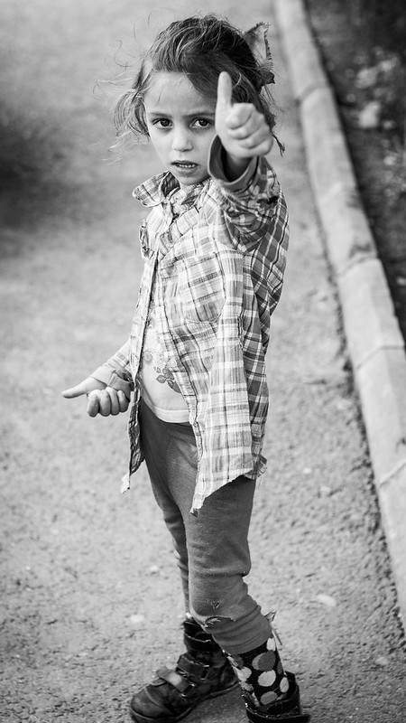
I was trying to suggest that one could still be cheerful, even if impoverished (notice the sloppy clothes and the torn pants). It is however clear that the message failed somehow.
I think this picture has impact. The cheerfulness while impoverished is gives a special flavour to it and for me also bit of sadness. This girl has something in eyes and face which make her too adult for age.
I like photo a lot. For me its pity, that shoes are bit cut of and backround...feels like there is not enough space around her.


 Similar Threads


