Forgot Password
Pentax Camera Forums Home
 

Reply
Show Printable Version Search this Thread
03-09-2013, 08:41 PM   #1
Veteran Member
Otis FanOtis FanOtis FanOtis FanOtis FanOtis Fan
Rupert's Avatar

Join Date: Sep 2006
Location: Texas
Photos: Gallery | Albums
Posts: 25,123
I Did My Best......
Lens: 43 Ltd Camera: K5 Photo Location: Texas ISO: 80 Shutter Speed: 1/90s Aperture: F6.7 

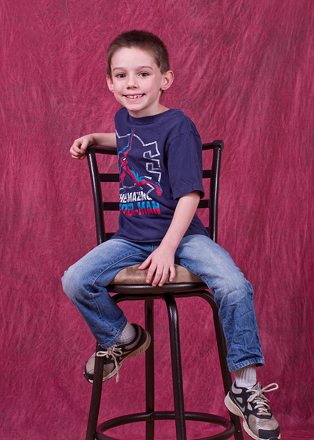
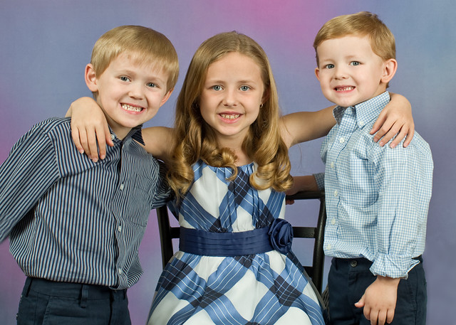
I shot this brother/sister, two of my most favorite kids in the world, a short time ago in my little downtown studio, and did the best I was capable of in getting some decent shots and good poses.
I get another chance soon for their Easter shots and would like any suggestions that might help me improve. I'm not dissatisfied with this shot in particular, but feel that it is lacking somewhere...maybe the background, maybe the processing.....you tell me? If I can do better for their next shoot, I want to do so!
Thanks!

Tristan/Allee
[IMG] [/IMG]

03-09-2013, 08:48 PM   #2
Pentaxian


Join Date: Apr 2011
Photos: Albums
Posts: 8,758
The eyes: they are each looking at something different.
03-09-2013, 09:22 PM   #3
Loyal Site Supporter
ivanvernon's Avatar

Join Date: Oct 2012
Location: Medina, OH
Photos: Albums
Posts: 7,224
Lovely children, but yet the different gazes is a little disquieting. Looks like some kind of "photographic backdrop cloth" behind the models. I am not fond of these things in general, though I suppose they are a solution to a proglem,but his one, the color is not a good match for the models.
03-10-2013, 09:20 AM   #4
Veteran Member
Otis FanOtis FanOtis FanOtis FanOtis FanOtis Fan
Rupert's Avatar

Join Date: Sep 2006
Location: Texas
Photos: Gallery | Albums
Posts: 25,123
Original Poster
Both of those comments are helpful, sort of what I thought. Eyes not right in their direction, and the background just doesn't work well with the young kids.
This worked better on the eyes, but I still think the background hurt the shot. I will correct that on my Easter shots of them.
[IMG] [/IMG]

Regards & Thanks!

03-10-2013, 09:27 AM   #5
Site Supporter
Site Supporter
Miguel's Avatar

Join Date: Sep 2007
Location: Near Seattle
Photos: Gallery
Posts: 2,743
The second one of the boy is very well done. Looks like the white balance needs a little warming though. He is too blue.

M
03-10-2013, 03:58 PM   #6
Veteran Member
Otis FanOtis FanOtis FanOtis FanOtis FanOtis Fan
Rupert's Avatar

Join Date: Sep 2006
Location: Texas
Photos: Gallery | Albums
Posts: 25,123
Original Poster
QuoteOriginally posted by Miguel Quote
The second one of the boy is very well done. Looks like the white balance needs a little warming though. He is too blue.

M
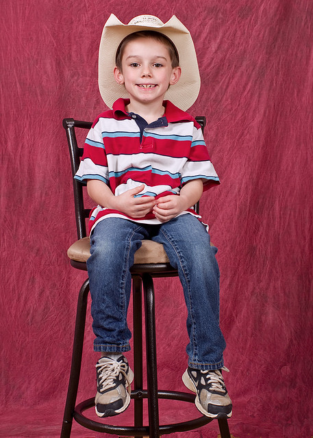
I think you may be right...I'm always fighting WB difficulties. I think I got it just right here, you think?
[IMG] [/IMG]

I try to use the tools available to me, but admit, most of what I do depends on a good amount of luck!

Regards!
03-11-2013, 01:26 PM   #7
Inactive Account


Join Date: Jun 2012
Posts: 132
Yeah...the WB is better in the little Cowboy there...but that background just kills it. For that shot with the Cowboy hat, I think it would look better with a few bales of hay and a barn wood background. Putting Cowboy boots on the little kid might work too...I dunno I'd have to try both to see.

Cute Kid btw

03-11-2013, 01:46 PM   #8
Loyal Site Supporter


Join Date: Dec 2009
Location: Dallas / Yucatan
Posts: 1,842
If possible, try to get the background out of focus. If you have different color backgrounds, I'd try a blue or a darker green to see if that helps. Being able to see the pattern in the background makes it seem "too included" to me. It should be a simple "colors/forms" out of the consciousness thing behind the kids, rather than seeming close to them and clearly discernible.

If you only have the red one, try keeping the light off it and more on the kids. Also, moving the backdrop farther back or kids up closer may help with the depth of field keeping it in focus.

The second one really looks pretty good, aside from so much red. The eyes bother me in the first. In the third, he seems too "perched." Maybe trying a different chair or getting closer would minimize the chair a bit? I do think the color balance is better in the 3rd.

Just some random thoughts I had.
03-11-2013, 03:04 PM   #9
Site Supporter
Site Supporter


Join Date: Mar 2008
Location: Prince George, BC
Photos: Gallery | Albums
Posts: 3,546
Hey, Rupert. Not sure how adept you are at post processing but you could change the background to any colour you like with a capable image editor.

Jack
03-11-2013, 07:43 PM   #10
Veteran Member
Otis FanOtis FanOtis FanOtis FanOtis FanOtis Fan
Rupert's Avatar

Join Date: Sep 2006
Location: Texas
Photos: Gallery | Albums
Posts: 25,123
Original Poster
QuoteOriginally posted by yucatanPentax Quote
Being able to see the pattern in the background makes it seem "too included" to me.
I think you nailed my thoughts with the exact correct words......"too included".

Stevi...Also great observations. I didn't have the time or opportunity to get their dress right, I just shot them as they were, but next time maybe I will be able to try your versions.

Jack.....Sometimes I can make the color change and sometimes I fail. This particular shade of red is hard for me to change for some reason?

I appreciate the advice here, it is all valid and helpful for my next shoot of them. I'm always "going to do better" and sometimes I do......and sometimes I don't!

Best Regards!
03-12-2013, 06:21 AM   #11
smf
Pentaxian
smf's Avatar

Join Date: Feb 2008
Location: Midland, MI
Photos: Gallery | Albums
Posts: 4,083
I think you did a very good job capturing the children's expressions, and I agree that the differing direction of gaze is an issue in the first photo.

The background doesn't bother me in the first photo — perhaps because so little background is visible.

In the second and third photo, the background might be less of an issue if it were more distant from the people and blurry. As presented, the background calls attention to itself.

I am not a portrait photographer.

Best wishes, and I look forward to seeing more of your work.
03-12-2013, 06:37 AM   #12
MSL
Site Supporter
Site Supporter
MSL's Avatar

Join Date: Feb 2012
Location: Greater Toronto Area
Photos: Gallery | Albums
Posts: 4,756
Hi Rupert,
Always good to see the fruits of your labors. Not sure if I can describe what's bugging me, but hopefully this will point you in the right direction. In the pose with both kids, there is something odd in the way they are positioned. Allee is both higher than and in front of Tristan, and the main problem I see is that it blocks and shadows part of his face. Aside from their eyes looking at different things, Tristan's facial expression also looked a little too fixed or rigid. I think the two shots of Tristan on his own are fine, and actually like the first one more. Neither background really bothers me, although in both cases the background is close to, but not exactly matching part of his shirt. In theory you should be able to easily select the entire background and recolor it, which should give you a chance to get a sense of what a different background color would have done for the shot (even if the PP isn't good enough for making a final image).
Marc
03-14-2013, 08:28 PM   #13
Veteran Member
Otis FanOtis FanOtis FanOtis FanOtis FanOtis Fan
Rupert's Avatar

Join Date: Sep 2006
Location: Texas
Photos: Gallery | Albums
Posts: 25,123
Original Poster
MSL---Comments appreciated, you are on the money, and like I stated, I am not totally dissatisfied with these shots, but just have that feeling they could have been much better. Part of that was under my control, part wasn't.

I had a shoot yesterday and tried to do better, keeping in mind some of the things mentioned here. Although there are still some issues, I think this has more "eye appeal" than the shots of Allee and Tristan?
[IMG] [/IMG]

Regards & Thanks as always!
Reply

Bookmarks
  • Submit Thread to Facebook Facebook
  • Submit Thread to Twitter Twitter
  • Submit Thread to Digg Digg
Tags - Make this thread easier to find by adding keywords to it!
critique, photography, shot, shots

Similar Threads
Thread Thread Starter Forum Replies Last Post
I'm waiting for my K-30 to come in mail. Did I get the WR 18-55mm lens?? spectamaniac Pentax K-30 & K-50 4 02-15-2013 03:42 AM
well i did it. i upgraded from my k-x josh_smith77073 Pentax DSLR Discussion 5 02-03-2013 01:49 AM
did I waste my time and money? JimJohnson Flashes, Lighting, and Studio 11 09-25-2012 07:02 AM
Did I just kill my *ist DL? E-man Troubleshooting and Beginner Help 15 09-07-2012 11:48 AM
Did I just scratch my VF screen? slr_neophyte Troubleshooting and Beginner Help 7 06-08-2011 08:02 PM


All times are GMT -7. The time now is 07:29 AM. | See also: NikonForums.com, CanonForums.com part of our network of photo forums!
  • Red (Default)
  • Green
  • Gray
  • Dark
  • Dark Yellow
  • Dark Blue
  • Old Red
  • Old Green
  • Old Gray
  • Dial-Up Style
Hello! It's great to see you back on the forum! Have you considered joining the community?
register
Creating a FREE ACCOUNT takes under a minute, removes ads, and lets you post! [Dismiss]
Top