Forgot Password
Pentax Camera Forums Home
 

Reply
Show Printable Version Search this Thread
09-30-2013, 07:29 PM   #1
Site Supporter
Site Supporter
Clarkey's Avatar

Join Date: Jan 2008
Location: Brampton, ON, Canada
Photos: Gallery
Posts: 2,456
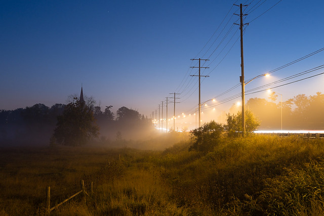
Colour Theory - Orange and Blue
Lens: Fuji 27mm Camera: X-E1 Photo Location: Credit River ISO: 200 Shutter Speed: Above 6s Aperture: F9.5 

I've been doing a bit of reading on colour theory and will be doing quite a bit of exploring on the subject.
I'd like to ask for some critique on this image - technical stuff is all good. How would you go about treating the colour of the image?
(larger on the click through)


09-30-2013, 09:12 PM   #2
Veteran Member


Join Date: Jul 2011
Location: Adelaide
Posts: 4,546
I'm starting to realize I overstep the mark on a lot of my colour processing and that leaving the colour alone in most cases is the wise way to go. My advice is If you tweak the colour and it looks great then back it off a bit and leave that aspect alone after that.

I like playing with the DR of an image too (like unblocking shadows) but then again there may be an emotional aspect to an image that often is more powerful when also leaving that be as well.

Understanding the emotional affects of tone and colour as applied to making images and knowing what to leave alone and what to tweak is the hardest part of the process IMO.

Equal parts orange and blue are generally considered to be a balance but other aspects of a particular image may demand you do something completely 'wrong' in that regard for the sake of communicating an idea.

It's all up to you because there are no rules, only conventions to use as a guide.

PS> I think the image is fine as it is apart from the sky on the upper left being a hole in space that draws the viewers eye away from the interesting stuff at ground level.
10-01-2013, 03:45 AM   #3
Loyal Site Supporter
Bruce Clark's Avatar

Join Date: Mar 2010
Location: Ocean Grove, Victoria
Photos: Gallery | Albums
Posts: 4,458
Dealing with a mixed light source (daylight and street lighting) is always going to be a compromise as there is no "right" colour balance. I like the idea from Bossa to tweak until it looks good then back it off a touch. I quite like the colour balance you have achieved, it looks quite natural and not overcooked.
10-02-2013, 12:08 AM   #4
Veteran Member


Join Date: Jul 2011
Location: Adelaide
Posts: 4,546
Mixed lighting is definitely a challenge:
Hand held 1/8 sec f/8 ISO 640
D800E & Nikkor 14-24 F2.8


10-02-2013, 07:39 AM   #5
Veteran Member


Join Date: Jun 2011
Location: London, Canada
Photos: Gallery
Posts: 343
Hi
A lot of color preference is personal. Certain things or scenes look wrong to most people like greenish skin tones etc. but a lot of times it will come down to what the viewer likes. I tend to like punchy colors myself most of the time, others might like muted color. Having a calibrated monitor is important. I think there are a lot of people who judge the color with un-calibrated monitors. As for this image in particular it can be presented in a lot of ways. Because of the scene I think it is open to interpretation. In the days of film different films would see the color differently and there would be a range of results. Today sensors react slightly differently to color. If you look at review sites they test the color accuracy and they all record differently. Having said all that I find the light from the streetlights to be rather greenish yellow rather than orange. Sodium vapor lights have a definite orange cast. Again with this type of lighting it can be presented pretty much how you like it. I took a run at it and altered the color of the lights. There is a slight rosy glow just above the trees as the sun is rising and I think it might be brought out. I tweaked the tone and contrast a bit and posted it here.
alternative edit of photo by Clarkey | Flickr - Photo Sharing!
Just my 2 cents.
Regards
Greg
10-02-2013, 03:46 PM   #6
Site Supporter
Site Supporter
Clarkey's Avatar

Join Date: Jan 2008
Location: Brampton, ON, Canada
Photos: Gallery
Posts: 2,456
Original Poster
Thanks for that guys.
Bossa, I've been mulling your response (which is a good one) over for a bit. Colour balance for the sake of balance doesn't address what the picture was about. TI agree, the sky does need a little cropping.

Greg, thanks for the input. I think you are on the money in terms of the yellow - I am using a calibrated (TX LCD) screen, but backing off the yellow in HSL has resulted in the oranges being more predominant - including the horizon line, which is a nice touch and balances things a bit more.

I'm in a bit of a rut at the moment as regards "making" pictures, hence trying to think a little differently.
That being said, it was nice to get out by myself early in the morning.
10-02-2013, 06:33 PM   #7
Veteran Member


Join Date: Jul 2011
Location: Adelaide
Posts: 4,546
I'm a painter so my understanding of colour is probably different than that of a specialist photographer.

There are quite a number of theories of colour but in the end you're "art" will be the governing factor in determining what is required of it.

Most people here learn to shoot by 'wrote' or recipe methods and whilst they turn out decent looking photographs it is only when you start consciously trying to communicate visually (where you may have a particular message about anything at all or something as basic as a mood) that you start to change things according to the requirements of your decisions rather than the conditioning.

When I used to teach painting in tertiary institutions I found the hardest thing to overcome was people's programming.

Reply

Bookmarks
  • Submit Thread to Facebook Facebook
  • Submit Thread to Twitter Twitter
  • Submit Thread to Digg Digg

Similar Threads
Thread Thread Starter Forum Replies Last Post
Inaccurate colour vision and colour photography? Raffwal Photographic Industry and Professionals 6 01-02-2013 04:33 PM
would sir like his camera in blue and orange... bluefoam Pentax Q 7 10-08-2012 01:29 PM
WINNERS: P52-3-19 Colour: Blue VaughnA Weekly Photo Challenges 10 12-18-2010 04:48 PM
P52-3-19 Colour: Blue Rense Weekly Photo Challenges 27 12-14-2010 10:30 AM
People Yellow, orange, green, blue, brown, and two blue girls Rense Post Your Photos! 10 06-14-2010 08:02 AM


All times are GMT -7. The time now is 02:26 PM. | See also: NikonForums.com, CanonForums.com part of our network of photo forums!
  • Red (Default)
  • Green
  • Gray
  • Dark
  • Dark Yellow
  • Dark Blue
  • Old Red
  • Old Green
  • Old Gray
  • Dial-Up Style
Hello! It's great to see you back on the forum! Have you considered joining the community?
register
Creating a FREE ACCOUNT takes under a minute, removes ads, and lets you post! [Dismiss]
Top