 Originally posted by Macario
The first two do not work for me.
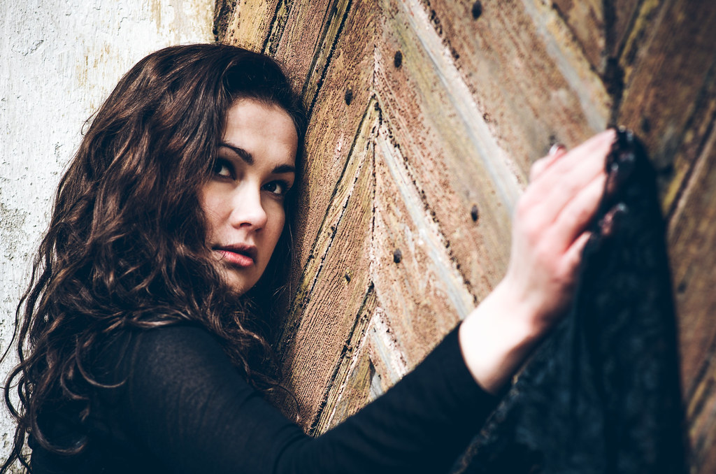
First one looks like she has no left arm at first glance. with the second one it looks like she has extremely big hips.
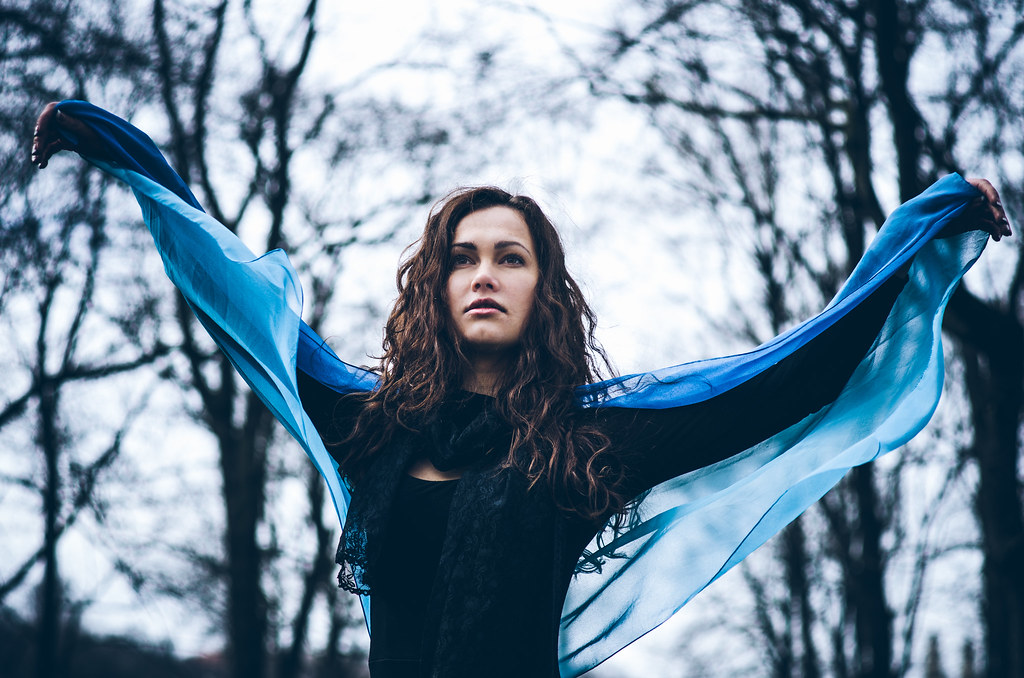
3: is nice, but I think red would have gone better than blue.
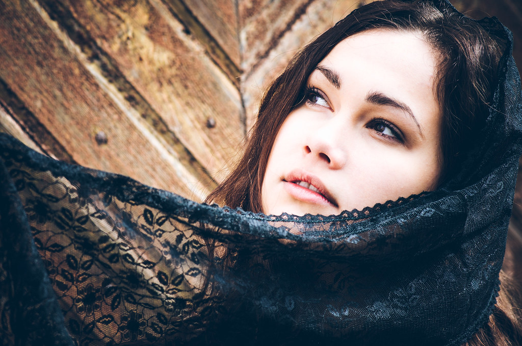
4: I think is really lovely
5: I do not like the pose
6: see 4 (though I like nr 4 more)
7: don't like her expression in this one
8: not really fond of this one, it is missing somethinfg for me
9 through 11: all just very good, really good
very nice model btw,
Thanks, Macario,
Critique like this really helps me to see my mistakes and produce a better result in the future!

I am looking through these photos now and I have to admit that you spotted a few mistakes I did that I failed to see.
Thank you!
Originally posted by theraven871 I'm curious what PP you do to your photos. I'm learning portrait photography and this is the exact type of look I'm going for.
Do you use Photoshop? Lightroom? or something else? How much PP do you do?
I use lightroom only.
Hard to define what is
a lot or
a little PP. I look at PP as a way to enhance the photo not to alter reality. So, for me, if it looks unnatural, it is too much

When I export photos to Lightroom, the first thing I do is to
create a filter (like a chemist creates a mixture of some sort). That consists of some color adjustments (I like a slight film look) and basic stuff like highlights, shadows, etc. Then I apply this filter to all the photos and do some necessary, usually minimal final adjustments.


 Post #8 by Macario
 Similar Threads


