Forgot Password
Pentax Camera Forums Home
 

Reply
Show Printable Version 1 Like Search this Thread
10-21-2014, 07:07 PM   #1
Veteran Member
CarlJF's Avatar

Join Date: Sep 2014
Location: Quebec City
Posts: 1,185
Need opinions: which PP looks best ?
Lens: Tamron 17-55 F2.8 XR Di II LD Camera: K-500 Photo Location: Cap-Tourmente ISO: 100 Shutter Speed: 1/350s Aperture: F8 

Hi guys,

I've done some PP on a shot I made last weekend but really have a hard time figuring out which one looks best. I just can't make my mind... So, I turn to you: if you had to choose only one of the following four, which one will be ?

Thanks!

PP 1:


PP 2:


PP 3:


PP 4:


10-21-2014, 07:23 PM   #2
Pentaxian
micromacro's Avatar

Join Date: Jan 2014
Location: Florida
Photos: Gallery
Posts: 3,722
I like the first picture.
10-21-2014, 07:35 PM   #3
Site Supporter
Site Supporter
nicoprod's Avatar

Join Date: Nov 2010
Location: New Berlin, WI
Photos: Gallery | Albums
Posts: 528
First
10-21-2014, 08:10 PM   #4
Site Supporter
Site Supporter
todd's Avatar

Join Date: Jul 2008
Location: Arizona
Photos: Gallery
Posts: 6,791
first

10-21-2014, 08:57 PM   #5
Pentaxian


Join Date: Jan 2011
Location: New York
Posts: 4,834
It depends on the mood you're aiming at. #1 looks like a cold stormy day because of the darker clouds. That's my choice.
10-21-2014, 09:02 PM   #6
Site Supporter
Site Supporter


Join Date: Sep 2011
Location: Richland, Washington, USA
Posts: 935
First
10-21-2014, 09:14 PM   #7
Veteran Member


Join Date: Feb 2009
Posts: 876
Tough one. I hate to say it, but I like elements from each of the first two. In the first one, I feel the sky is a little too dark and HDRish but I like the look of the field. The second... I think I prefer the look of the tree but the sky might be too light around it (above it). I'm not sure which way I prefer the yellow bush.

Each of the first two pics could used warmed up slightly, IMO.

To answer your question, I would say the first.

10-21-2014, 09:46 PM   #8
NKK
Inactive Account


Join Date: Mar 2009
Location: Malmö, Sweden
Photos: Gallery
Posts: 583
Second or fourth depending on color or b&w.
10-21-2014, 09:49 PM - 1 Like   #9
Site Supporter
Site Supporter
luftfluss's Avatar

Join Date: Jun 2011
Location: NJ
Photos: Gallery | Albums
Posts: 11,619
PP 2

PP 1 is more dramatic, but I see blotchy artifacting in the sky from too much clarity/structure pushing. I also appreciate the 1st's smooth, softer sky as a counterbalance to the the sharpness of the detail in the land and flora.
10-21-2014, 10:52 PM   #10
dms
Site Supporter
Site Supporter


Join Date: Aug 2011
Location: New York, NY
Photos: Gallery
Posts: 2,192
It is not what I/we think is best but what feeling you want.

Nevertheless for me the second one is the most natural and pleasing.

Also I find the beginning of (what I assume is) a mountain/hill on the left side to be a fault--it should have more of it--as it stands now it is somewhat weak--and cropping it away does not seem to work.
10-22-2014, 12:33 AM   #11
Site Supporter
Site Supporter


Join Date: Oct 2010
Location: Melbourne
Photos: Gallery
Posts: 3,386
Hi

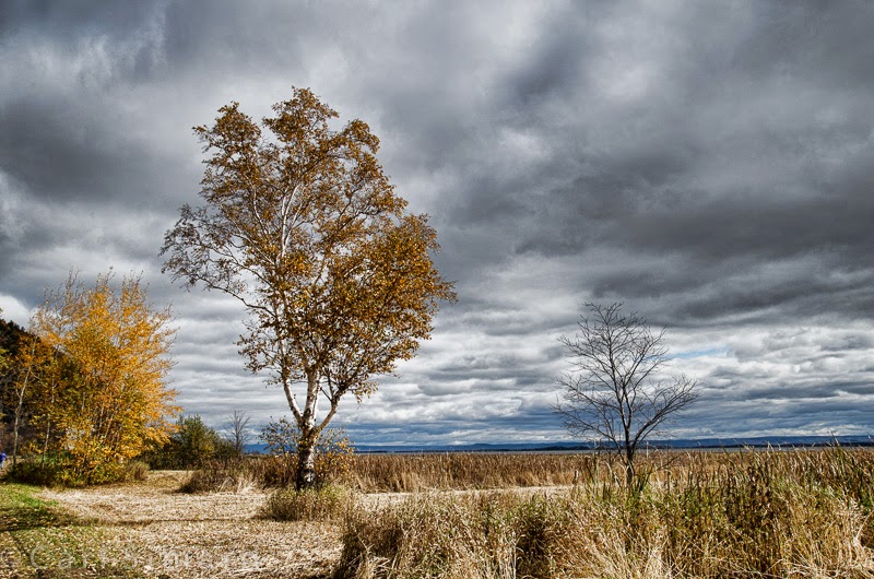
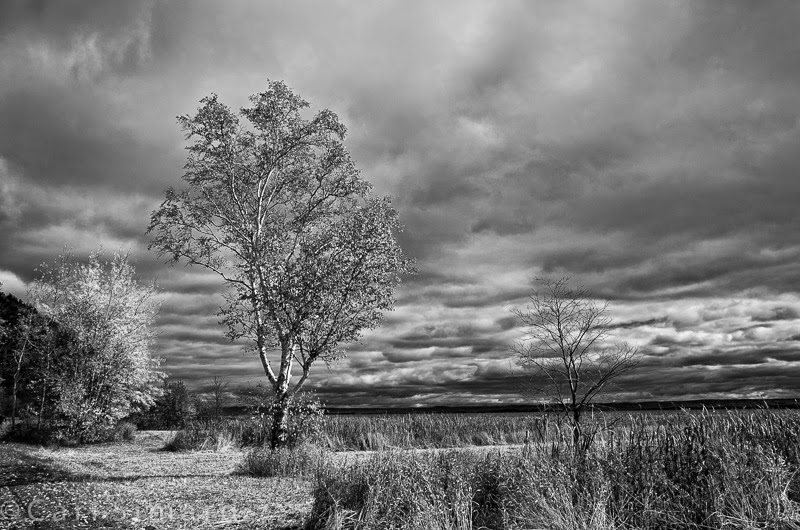
It is interesting to see how many people like No.1
To me it confirms that a lot of people adore this sort of picture treatment. In the first image the sky/clouds start to look blocky.

I personally would go for No.2, it gives me a better feeling all round. In another thought, I would also pay attention to the horizon and level this so it does not fight my in-build spirit level I have in my head. And I think a very light crop to lover the ceiling of the sky a little bit would give the picture a better aspect ratio, taking it more into a panorama look. And you won't miss this little bit of extra sky. The crop will be very small, but small crops sometimes make a big difference. Experiment with it and see for yourself.

Nice image by the way.

Greetings
10-22-2014, 01:45 AM   #12
Veteran Member
noelpolar's Avatar

Join Date: Oct 2013
Location: Goolwa, SA
Photos: Gallery
Posts: 4,310
2/4 for me....
10-22-2014, 07:27 AM   #13
Pentaxian
micromacro's Avatar

Join Date: Jan 2014
Location: Florida
Photos: Gallery
Posts: 3,722
#2 looks more artificial to me because of oversoft clouds. Something in between 1 and 2 would be just right, imo.
10-22-2014, 08:19 AM   #14
Veteran Member


Join Date: Jun 2011
Location: London, Canada
Photos: Gallery
Posts: 343
I like the second one best of the four if you are just looking for preferences and not a critique.
10-22-2014, 08:28 AM   #15
Site Supporter
Site Supporter
traxino's Avatar

Join Date: Jul 2013
Location: Nashville, TN
Posts: 209
I like PP2, first is too sharp to my eyes and the BW just doesn't fit to this landscape.
Reply

Bookmarks
  • Submit Thread to Facebook Facebook
  • Submit Thread to Twitter Twitter
  • Submit Thread to Digg Digg
Tags - Make this thread easier to find by adding keywords to it!
cap-tourmente, critique, k-500, photography, pp, tamron 17-50/2.8

Similar Threads
Thread Thread Starter Forum Replies Last Post
HELP, Need opinions on 2 lenses for portraits! laughlady99 Pentax SLR Lens Discussion 41 10-02-2013 01:18 PM
People Need opinions csmoore Photo Critique 12 11-29-2012 06:31 PM
Which looks better? Clicker Pentax Q 8 02-03-2012 09:52 PM
Which Pentax logo looks better? hiktaka General Talk 6 08-04-2011 08:36 AM
Misc Buddha image - opinions on PP please thoughton Post Your Photos! 4 12-06-2009 05:12 PM


All times are GMT -7. The time now is 04:54 PM. | See also: NikonForums.com, CanonForums.com part of our network of photo forums!
  • Red (Default)
  • Green
  • Gray
  • Dark
  • Dark Yellow
  • Dark Blue
  • Old Red
  • Old Green
  • Old Gray
  • Dial-Up Style
Hello! It's great to see you back on the forum! Have you considered joining the community?
register
Creating a FREE ACCOUNT takes under a minute, removes ads, and lets you post! [Dismiss]
Top