Forgot Password
Pentax Camera Forums Home
 

Reply
Show Printable Version Search this Thread
11-12-2014, 08:32 PM   #16
Veteran Member


Join Date: Sep 2010
Posts: 2,799
@micromacro: On my monitor... er, TV, she looks a bit like a zombie in your version.


@Jonathan: I think it's an improvement, though not quite there yet. There is something just a bit off with that photo, and I can't figure out what.

11-12-2014, 08:40 PM   #17
Pentaxian
micromacro's Avatar

Join Date: Jan 2014
Location: Florida
Photos: Gallery
Posts: 3,722
QuoteOriginally posted by kadajawi Quote
@micromacro: On my monitor... er, TV, she looks a bit like a zombie in your version.


Now it seems warmer.
Attached Images
 

Last edited by micromacro; 11-12-2014 at 09:12 PM.
11-21-2014, 06:16 PM   #18
Veteran Member
LensBeginner's Avatar

Join Date: Sep 2014
Photos: Albums
Posts: 4,696
QuoteOriginally posted by micromacro Quote


Now it seems warmer.
I'd respectfully suggest you buy a calibrator!

@OP I believe your crop nails it.
I also liked the first version, but I'd second the opinions of those who were saying that the subject was a little too centered.
11-25-2014, 06:33 AM   #19
Veteran Member
Canis's Avatar

Join Date: Mar 2013
Location: Columbia, Maryland
Posts: 432
I like your original. I think the skin tones and expression appear natural. The wall as a background is probably not optimal but only for the color. B&W might look nice, but you would lose the unique eye color. I am not a pro, but I think this shot is very good and I would be pleased with it.

11-25-2014, 01:58 PM   #20
Brooke Meyer
Guest


QuoteOriginally posted by JonathanJSM Quote
So I would like to know what do you think of the photo and what could have been done better. Thank you
Less brick and more girlfriend. The brick in the foreground heavily distracts with its texture and color and consequently, its visual weight. Make It about her.

Last edited by Brooke Meyer; 12-03-2014 at 09:08 PM.
11-25-2014, 02:21 PM   #21
Veteran Member
LensBeginner's Avatar

Join Date: Sep 2014
Photos: Albums
Posts: 4,696
QuoteOriginally posted by Brooke Meyer Quote
Less brick and more girlfriend. The brick in the foreground heavily distracts with its texture and color and consequently, its visual weight. Make It about her.
...and less color, less WB issues!
Nice crop & conversion!
11-25-2014, 07:35 PM   #22
Brooke Meyer
Guest


QuoteOriginally posted by LensBeginner Quote
...and less color, less WB issues!
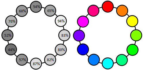
It goes a bit farther than that. Our eyes go to lightest portion of an image. The luminance value of yellow is close to white, so the brick takes our attention from the young lady. It's why warm colors appear to come forward and cool colors recede.

B&W does simplify and abstract the composition but it also allows a reduction of the yellow brick luminance or lightness via yellow filter, reducing its visual competition with the portrait. Here's an explanation Color Luminance: perceived brightness, luminance and contrast


11-25-2014, 08:45 PM   #23
Veteran Member


Join Date: Apr 2011
Location: California
Photos: Gallery
Posts: 1,356
I would have asked if she could part her hair in the other direction, so it would not cast a shadow on her eye.

nice work, for sure!
11-26-2014, 09:54 AM   #24
Veteran Member
LensBeginner's Avatar

Join Date: Sep 2014
Photos: Albums
Posts: 4,696
QuoteOriginally posted by Brooke Meyer Quote
It goes a bit farther than that. Our eyes go to lightest portion of an image. The luminance value of yellow is close to white, so the brick takes our attention from the young lady. It's why warm colors appear to come forward and cool colors recede.

B&W does simplify and abstract the composition but it also allows a reduction of the yellow brick luminance or lightness via yellow filter, reducing its visual competition with the portrait. Here's an explanation Color Luminance: perceived brightness, luminance and contrast

I do like to have some amount of control in my B/W conversions, but I normally use the HSL panel instead of colored filters (even though you obviously used a digital filter, not a physical one)... tried them once or twice... didn't get hooked.
11-26-2014, 01:35 PM - 1 Like   #25
Brooke Meyer
Guest


QuoteOriginally posted by LensBeginner Quote
I do like to have some amount of control in my B/W conversions, but I normally use the HSL panel instead of colored filters (even though you obviously used a digital filter, not a physical one)... tried them once or twice... didn't get hooked.
HSL would be the way to go if I didn't use Nik Silver efex for B&W conversions.

11-26-2014, 02:00 PM   #26
Veteran Member
LensBeginner's Avatar

Join Date: Sep 2014
Photos: Albums
Posts: 4,696
QuoteOriginally posted by Brooke Meyer Quote
HSL would be the way to go if I didn't use Nik Silver efex for B&W conversions.
That's another (nice) way to do things... and another creative picture of a musician!
11-27-2014, 07:01 AM   #27
Veteran Member
Na Horuk's Avatar

Join Date: Feb 2012
Location: Slovenia, probably
Photos: Gallery | Albums
Posts: 11,186
Great portrait! Nice in-focus sharpness and OoF blur, pretty girl, interesting expression! I find the second version slightly better than the first. And I don't mind if the WB is a little warm/pink, as this is a portrait. Portraits are supposed to be warm, nobody wants to look at a blue (freezing!) or green (sick!) person. In this case, the colours emphasize her youth, so its not over the top. On another model, it might be too much, but I think it works fairly well in this case
Reply

Bookmarks
  • Submit Thread to Facebook Facebook
  • Submit Thread to Twitter Twitter
  • Submit Thread to Digg Digg
Tags - Make this thread easier to find by adding keywords to it!
critique, light, photography, picture, portrait, wall
Thread Tools Search this Thread
Search this Thread:

Advanced Search


Similar Threads
Thread Thread Starter Forum Replies Last Post
People quick portrait S1erra Photo Critique 3 02-15-2012 09:24 PM
Quick portrait... mrmorrill Photo Critique 6 06-15-2008 01:54 AM
Quick portrait experiments with mixed studio lighting hamidlmt Post Your Photos! 12 03-20-2008 05:25 PM
a quick portrait khardur Post Your Photos! 6 10-17-2007 09:05 PM
A quick portrait... Nixarma Post Your Photos! 4 06-26-2007 11:08 PM


All times are GMT -7. The time now is 01:47 AM. | See also: NikonForums.com, CanonForums.com part of our network of photo forums!
  • Red (Default)
  • Green
  • Gray
  • Dark
  • Dark Yellow
  • Dark Blue
  • Old Red
  • Old Green
  • Old Gray
  • Dial-Up Style
Hello! It's great to see you back on the forum! Have you considered joining the community?
register
Creating a FREE ACCOUNT takes under a minute, removes ads, and lets you post! [Dismiss]
Top