Forgot Password
Pentax Camera Forums Home
 

Reply
Show Printable Version Search this Thread
11-29-2014, 07:17 AM   #1
Forum Member
Nicolas514's Avatar

Join Date: Feb 2014
Location: Stockholm
Photos: Albums
Posts: 87
What could I have done better?
Lens: DA 35mm Camera: K-5 ISO: 400 Shutter Speed: 1/180s Aperture: F4.5 

Hi guys!

I really enjoyed the comments on my night shot and I wanted to see what you thought of this portrait and what I could have done differently/better. This was for a "corporate" shoot for the student association. I used a Sigma "EF-500 DG Super" flash with a Gary Fong lightsphere. I am not used to using flashguns and I had a rough time with this shoot. Let me know what you think!


11-29-2014, 08:01 AM   #2
Veteran Member


Join Date: Feb 2014
Location: Togliatti, Russia
Photos: Gallery | Albums
Posts: 920
QuoteOriginally posted by Nicolas514 Quote
Let me know what you think!
It's a good portrait.
But in my opinion you should move the frame a little bit lower to capture the man with his arms.
11-29-2014, 01:05 PM   #3
Veteran Member


Join Date: Oct 2014
Location: Washington
Photos: Gallery
Posts: 2,176
Crop tighter and bounce the light from a wall, rather that the ceiling.
11-29-2014, 01:11 PM   #4
Veteran Member


Join Date: Jan 2012
Photos: Albums
Posts: 1,972
I might be wrong but to me the expression in man's eyes is a little bit empty.. or artificial maybe ? - apart from that what others say - some different framing would help. Nice BW processing !

11-29-2014, 02:22 PM   #5
Forum Member
Nicolas514's Avatar

Join Date: Feb 2014
Location: Stockholm
Photos: Albums
Posts: 87
Original Poster
QuoteOriginally posted by manntax Quote
I might be wrong but to me the expression in man's eyes is a little bit empty.. or artificial maybe ? - apart from that what others say - some different framing would help. Nice BW processing !
This is a shot I took while he was not posing, I thought he looked thoughtful, but I see what you mean.

Thanks for commenting!
11-29-2014, 06:17 PM   #6
Veteran Member
Na Horuk's Avatar

Join Date: Feb 2012
Location: Slovenia, probably
Photos: Gallery | Albums
Posts: 11,186
Its a good portrait. I would crop out a little more of the top and the right side, which would bring in the viewer.
Also, watch out how you frame - the hands should be in the shot. There are some parts of the human body that have to be either in or out of the shot, they cannot be cut.
But very nice processing, you got the focus just right, photo is sharp and full of detail, the model looks good
11-29-2014, 07:28 PM   #7
Pentaxian


Join Date: May 2012
Posts: 2,962
I agree that the frame could have been moved down to capture the arms.

I don't really like that window in the background and the glare on it. It's distracting.

The 'expression' of the subject doesn't 'engage' or connect with me (the viewer).

On a technical level though your processing is good.

I am not a pro by any means but 'looking at a picture'...as a viewer I want to feel emotion or see a story.

11-30-2014, 11:32 AM   #8
Forum Member
Nicolas514's Avatar

Join Date: Feb 2014
Location: Stockholm
Photos: Albums
Posts: 87
Original Poster
QuoteOriginally posted by Rimfiredude Quote
Crop tighter and bounce the light from a wall, rather that the ceiling.
How should I do that? With a remote flashgun on a tripod?

QuoteOriginally posted by olegp Quote
It's a good portrait.
But in my opinion you should move the frame a little bit lower to capture the man with his arms.
Thanks! Yes I do realize that now.

QuoteOriginally posted by Na Horuk Quote
Its a good portrait. I would crop out a little more of the top and the right side, which would bring in the viewer.
Also, watch out how you frame - the hands should be in the shot. There are some parts of the human body that have to be either in or out of the shot, they cannot be cut.
But very nice processing, you got the focus just right, photo is sharp and full of detail, the model looks good
Thanks for the comment! I will try to be more careful in the composition.

QuoteOriginally posted by alamo5000 Quote
I agree that the frame could have been moved down to capture the arms.

I don't really like that window in the background and the glare on it. It's distracting.

The 'expression' of the subject doesn't 'engage' or connect with me (the viewer).

On a technical level though your processing is good.

I am not a pro by any means but 'looking at a picture'...as a viewer I want to feel emotion or see a story.
I thought the window would be interesting to add a bit of texture to a flat picture but I see that's a rookie mistake. On the K-5 screen it looked fine and then on the computer, not so much. Thanks for sharing your comments, that's how I learn!
11-30-2014, 12:54 PM   #9
Veteran Member


Join Date: Oct 2014
Location: Washington
Photos: Gallery
Posts: 2,176
Originally posted by Rimfiredude Crop tighter and bounce the light from a wall, rather that the ceiling.

How should I do that? With a remote flashgun on a tripod?

You can do it with a flash attached to your camera that swivels. Sometimes, not all times you can obtain quite a nice effect. It fills in shadows and adds a little sparkle to the eyes.
11-30-2014, 01:14 PM   #10
Veteran Member
Flugelbinder's Avatar

Join Date: Nov 2014
Location: Toronto - missing the ocean
Posts: 466
QuoteOriginally posted by Rimfiredude Quote
Originally posted by Rimfiredude Crop tighter and bounce the light from a wall, rather that the ceiling.

How should I do that? With a remote flashgun on a tripod?

You can do it with a flash attached to your camera that swivels. Sometimes, not all times you can obtain quite a nice effect. It fills in shadows and adds a little sparkle to the eyes.
I wouldn't say fills in shadows, but rather creates shadows, therefore giving a bit of dimension, or depth to - in my opinion - a somewhat "flat" image... Bouncing the flash to camera left, would leave him (the subject) with some shadow on his left side of the face - known as short lighting - which is a very complementary lighting situation for either men or women.
As for the crop, it's a very personal decision. I, personally don't mind unusual crops...
Also, I agree with the expression being a little empty, or not engaging... But, good start.
Best of luck.

Paul

Last edited by Flugelbinder; 11-30-2014 at 01:24 PM.
11-30-2014, 01:20 PM   #11
Veteran Member


Join Date: Oct 2014
Location: Washington
Photos: Gallery
Posts: 2,176
QuoteOriginally posted by Flugelbinder Quote
I wouldn't say fills in shadows, but rather creates shadows, therefore giving a bit of dimension, or depth to - in my opinion - a somewhat "flat" image... Bouncing the flash to camera left, would leave him (the subject) with some shadow on his left side of the face - known as short lighting - which is a very complementary lighting situation for either men or women.
As for the crop, it's a very personal decision. I, personally don't mind unusual crops...
Absolutely. Sometimes I don't explain things correctly.
11-30-2014, 01:42 PM   #12
Pentaxian


Join Date: May 2012
Posts: 2,962
QuoteOriginally posted by Nicolas514 Quote
I thought the window would be interesting to add a bit of texture to a flat picture but I see that's a rookie mistake. On the K-5 screen it looked fine and then on the computer, not so much. Thanks for sharing your comments, that's how I learn!
I wouldn't call it a mistake at all to include that stuff in the background. But it needs to add something to the context and you must keep in mind balance.

Check out this link...

What is the Definition of Balance in Art? - About.com

If there was another window on the other side of the frame then it would better, but looking at it from an artistic standpoint it's not really balanced.

I talked to a friend of mine who is a very well known artist (he has stuff hanging in the Met in NYC) and his advice to me on my photography was to study books about art. They supposedly have nothing to do with 'photography' but they have everything to do with it at the same time.

And for the record I talk a big game but I am still learning how to do all this stuff myself. It's through trial and error and talking it over that we learn.

http://en.wikipedia.org/wiki/Principles_of_art

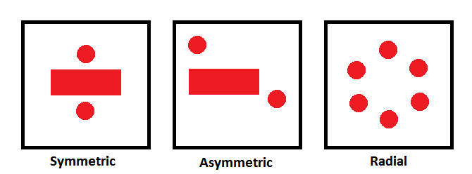
"Balance is arranging elements so that no one part of a work overpowers, or seems heavier than any other part. The three different kinds of balance are symmetrical, asymmetrical, and radial. Symmetrical (or formal) balance is the most stable, in a visual sense. When both sides of an artwork on either side of the horizontal or vertical axis of the picture plane are exactly (or nearly exactly) the same the work is said to exhibit this type of balance. It is also a principle that deals with the visual weight of an artwork."


Last edited by alamo5000; 11-30-2014 at 01:47 PM.
Reply

Bookmarks
  • Submit Thread to Facebook Facebook
  • Submit Thread to Twitter Twitter
  • Submit Thread to Digg Digg
Tags - Make this thread easier to find by adding keywords to it!
black & white, corporate, critique, photography, portrait

Similar Threads
Thread Thread Starter Forum Replies Last Post
What could I have done Better? NCGirl Troubleshooting and Beginner Help 19 11-20-2010 09:53 AM
Machinery New car - What could I have done to make this more interesting? user440 Photo Critique 9 02-20-2010 12:09 PM
What possible harm could I have done .... daacon General Talk 58 08-07-2009 12:08 PM
What could I have done? Ed in GA Photo Critique 14 03-29-2008 06:26 PM
What could I have done better? (Basketball) Buschmaster Photo Critique 9 03-12-2008 09:27 PM


All times are GMT -7. The time now is 11:22 PM. | See also: NikonForums.com, CanonForums.com part of our network of photo forums!
  • Red (Default)
  • Green
  • Gray
  • Dark
  • Dark Yellow
  • Dark Blue
  • Old Red
  • Old Green
  • Old Gray
  • Dial-Up Style
Hello! It's great to see you back on the forum! Have you considered joining the community?
register
Creating a FREE ACCOUNT takes under a minute, removes ads, and lets you post! [Dismiss]
Top