 Originally posted by pjv
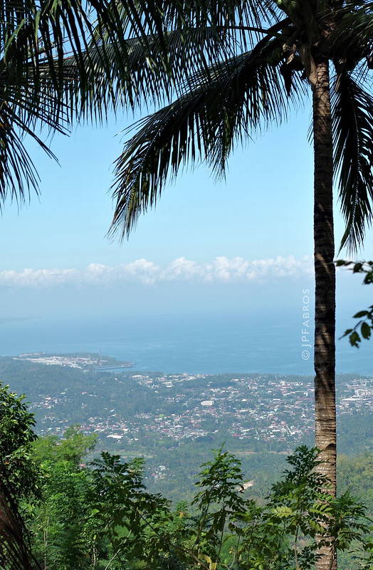
1 = D.
2 = C
3 = B
4 = F. Worst.
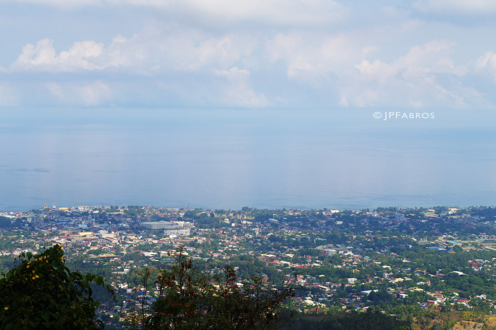
5 = A. Best.
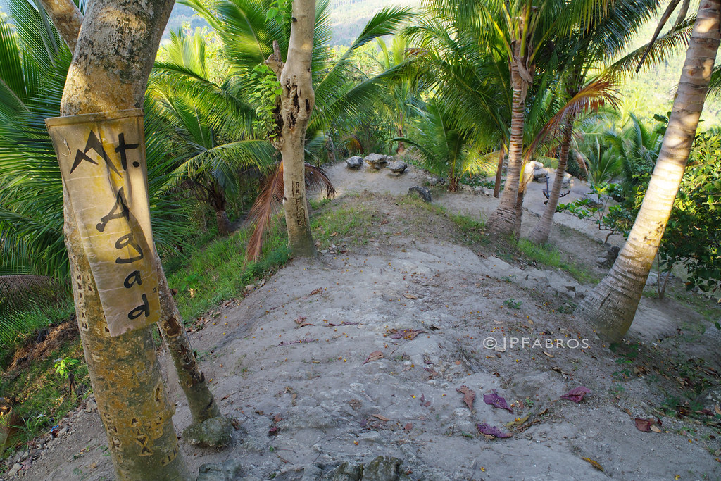
6 = E
For me, the closer the watermark is to the middle, the more distracting it is. The creative angles ( rather than just horizontal ) are fine, but they should be closer to corners IMO. Also for me, they should be more opaque so my eye is not drawn to them rather that the image itself. The sizing is also important so the watermark is not " in your face." All of the above is just 1 man's opinion and should be judged as such.

Good luck.

I'll offer another opinion for the OP. The watermarks can be distracting, but I'll try to ignore them.
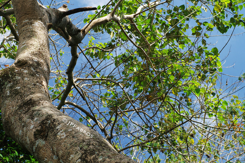
It's interesting that you like 5 the most. For me, it's just a jumbled mess of branches.
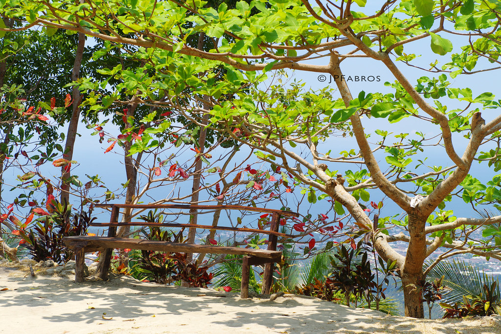
Images 1 and 6 are my favorites. 1 has an interesting framing of the tree occupying two edges of the photo. The distant haze is okay, but I would experiment with the Lightroom contrast and dehaze sliders, or maybe a B&W conversion, to see what develops. 6 does a good job conveying the altitude of the path above the lower low background terrain. The range of leaf colors and writing on the tree adds interest.


 Similar Threads


