Update 5/2 - See post 13, #3 made it through to the fair to be displayed.
I am entering a few photos in the San Diego Fair competition this year. Need help deciding which ones to submit. Deadline is Friday.
Ive posted several of these before, but I need to know which ones would be best for a competition. Its $20 each to submit so I want to limit my submissions to just the best ones.
Looking for opinions on how to improve any of them specifically for competition as well as which ones would fair the best in competition. Previous years judges notes indicate they often judge on reliance on traditional photography rules.
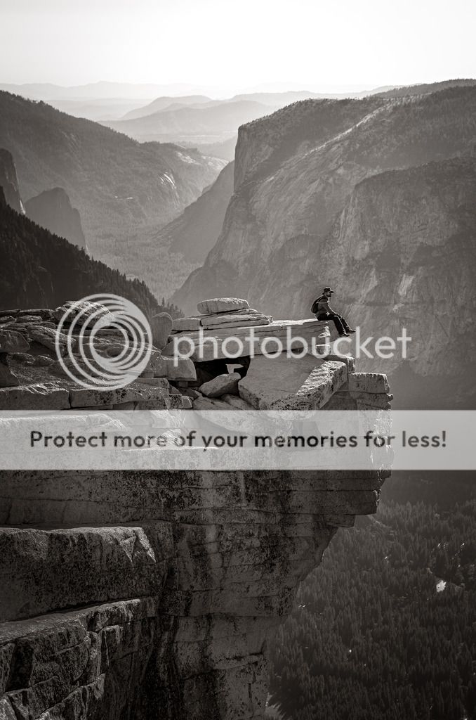
1.

2.
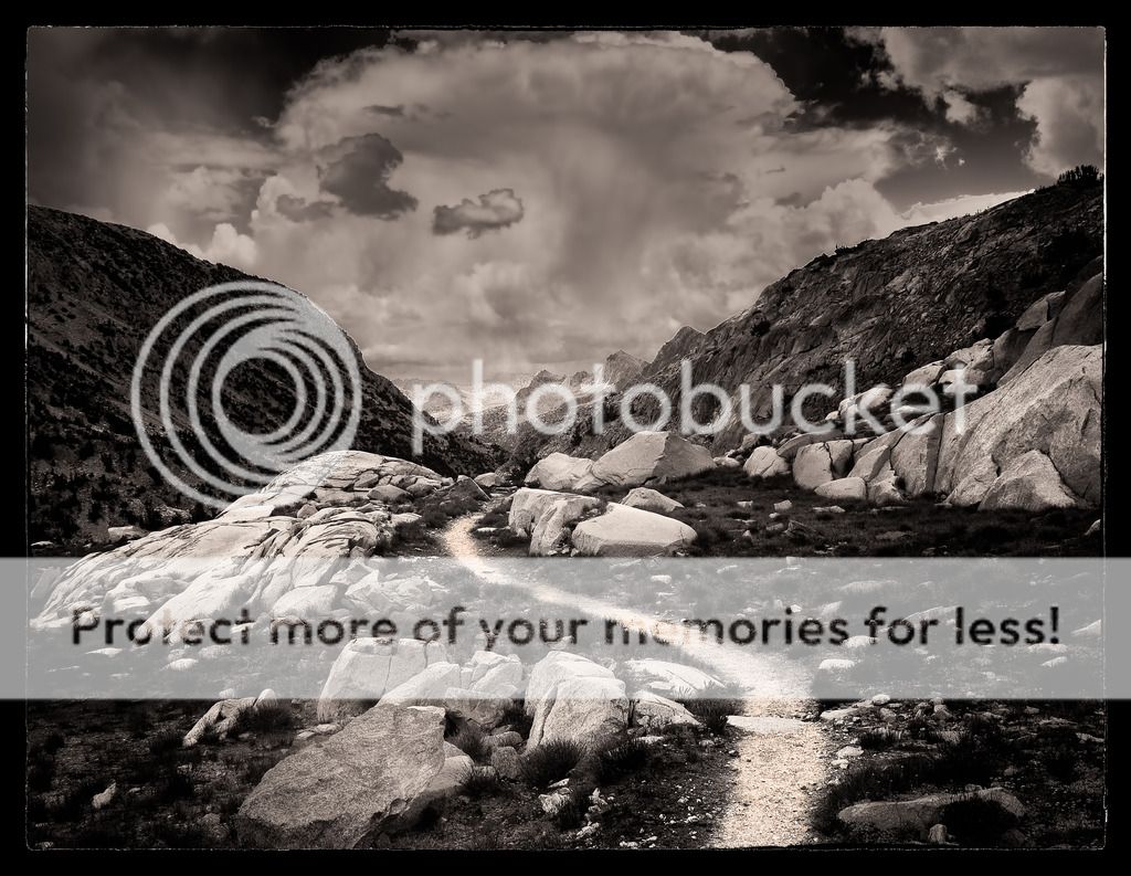
3.
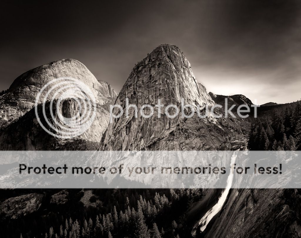
4.
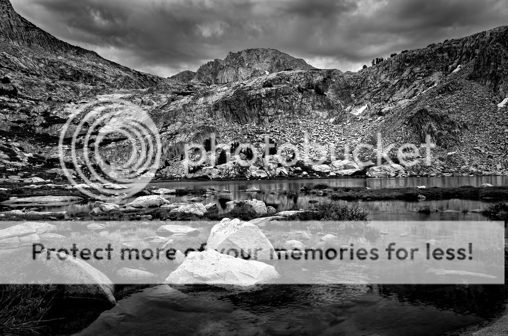
5.
6.

Last edited by bakerking31; 05-02-2016 at 04:35 PM.


 Photos 3, 4, and 5 continue to be my favorites (though I might level the waterline a bit in #5)--as for processing, I agree #3 and #4 appear to be overcooked a bit for the Web, but printed might not be over the top. I think #3, especially, would benefit from a little lighter hand--the tonal gradations you have in #5 might be what you're shooting for.


 Post #10 by clockworkrat
 Similar Threads


