Forgot Password
Pentax Camera Forums Home
 

Reply
Show Printable Version Search this Thread
07-17-2016, 09:45 AM - 1 Like   #1
Veteran Member
butangmucat's Avatar

Join Date: Jul 2016
Posts: 709
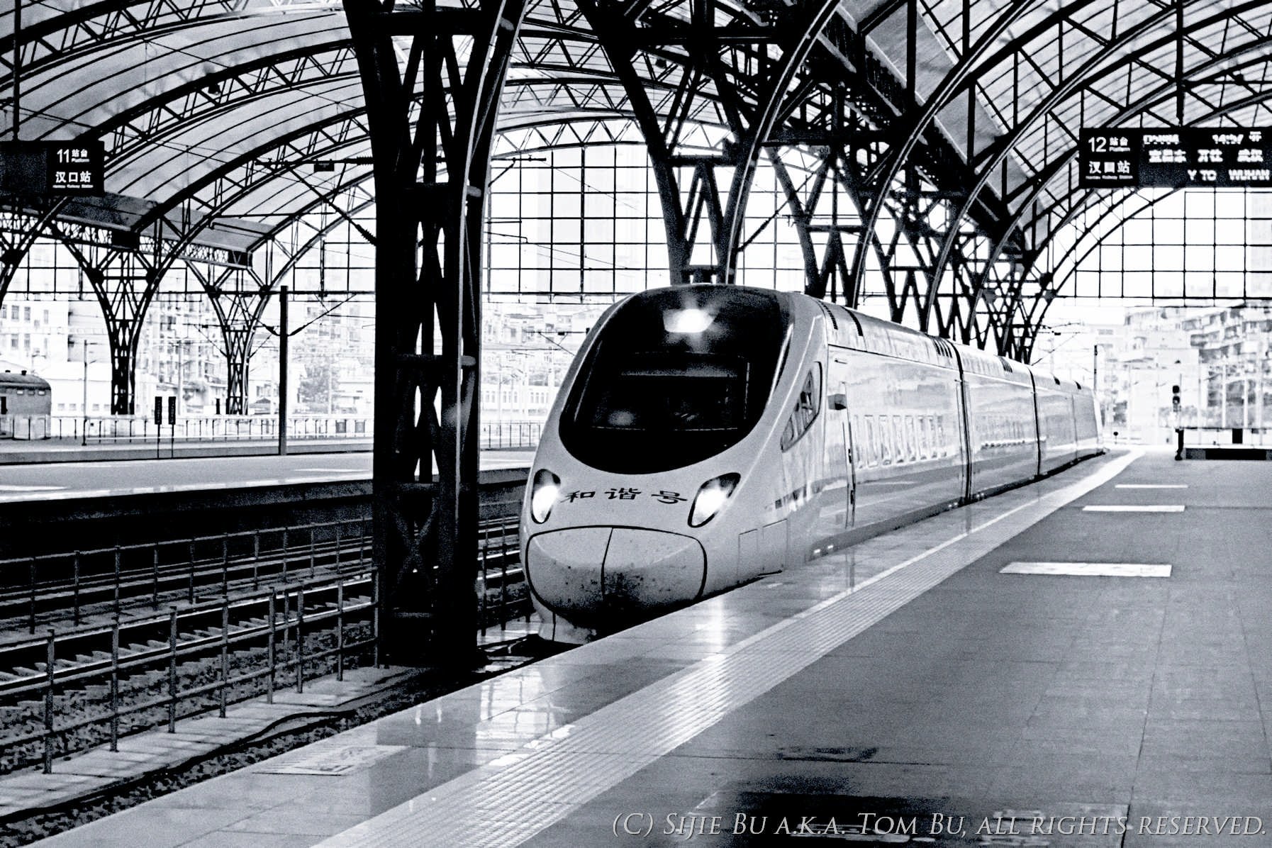
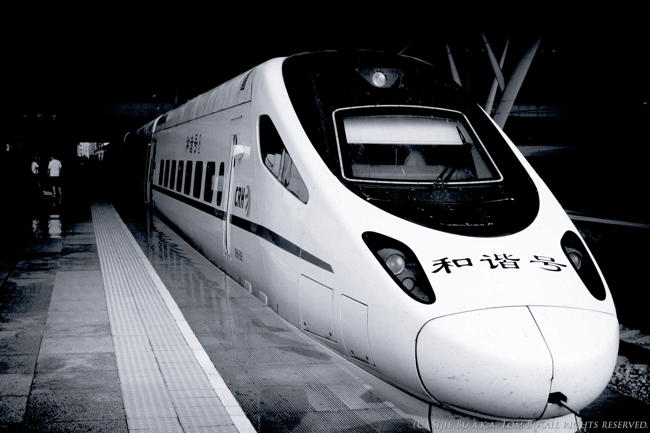
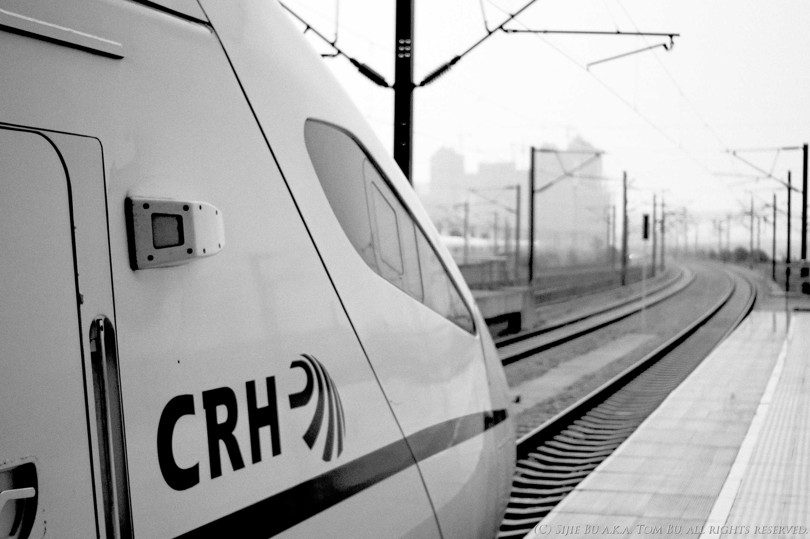
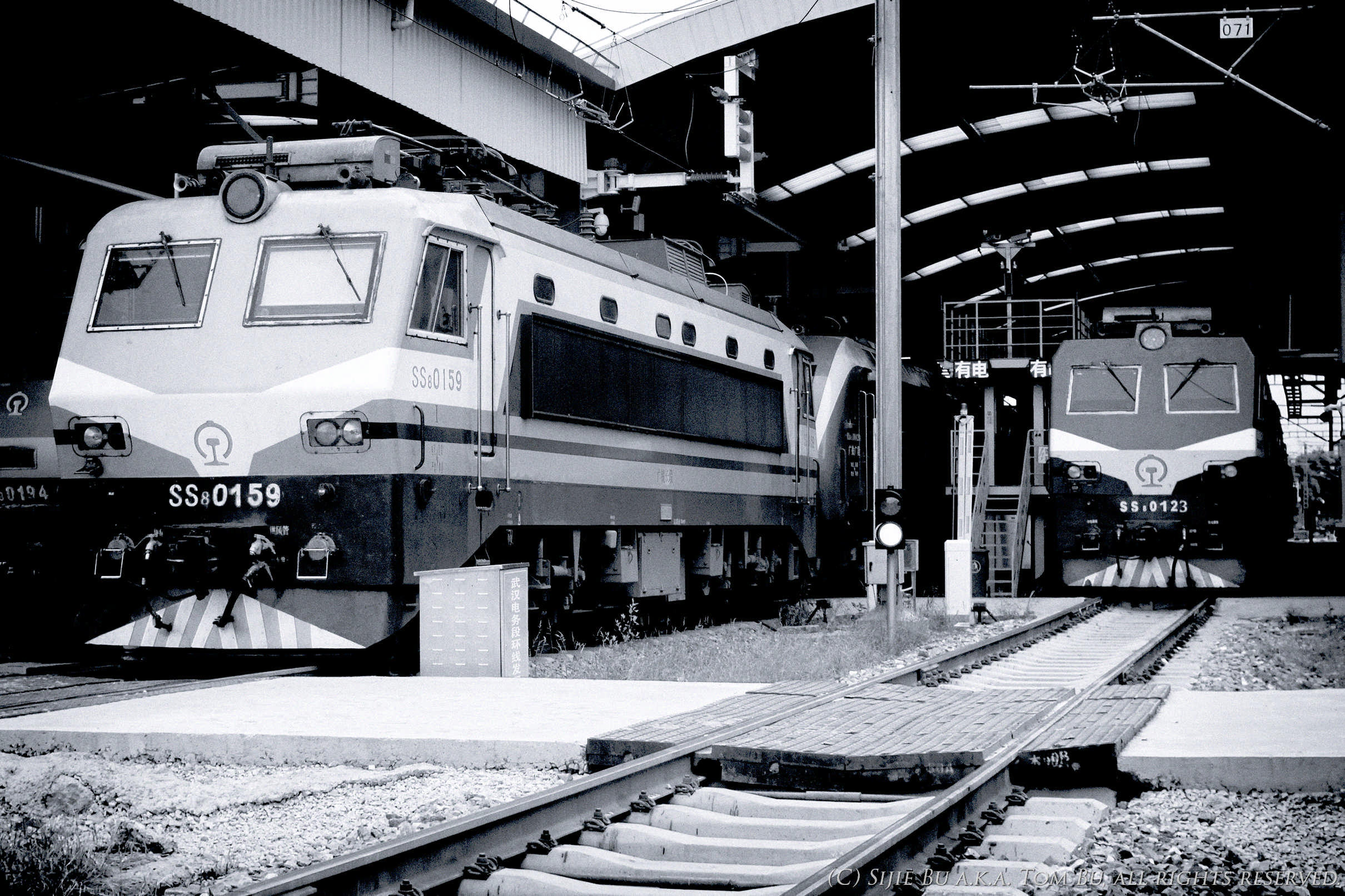
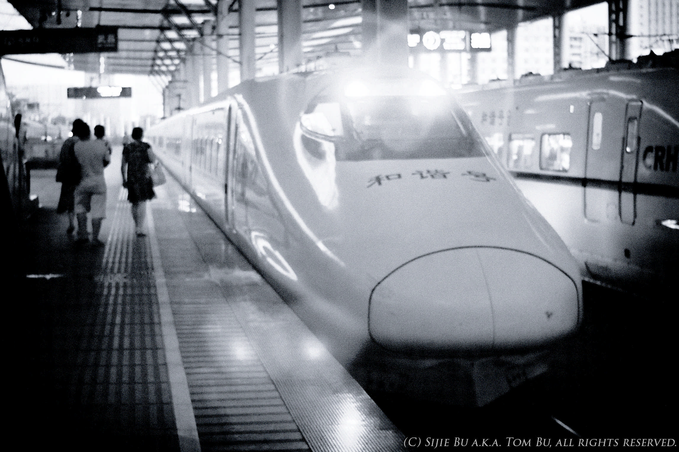
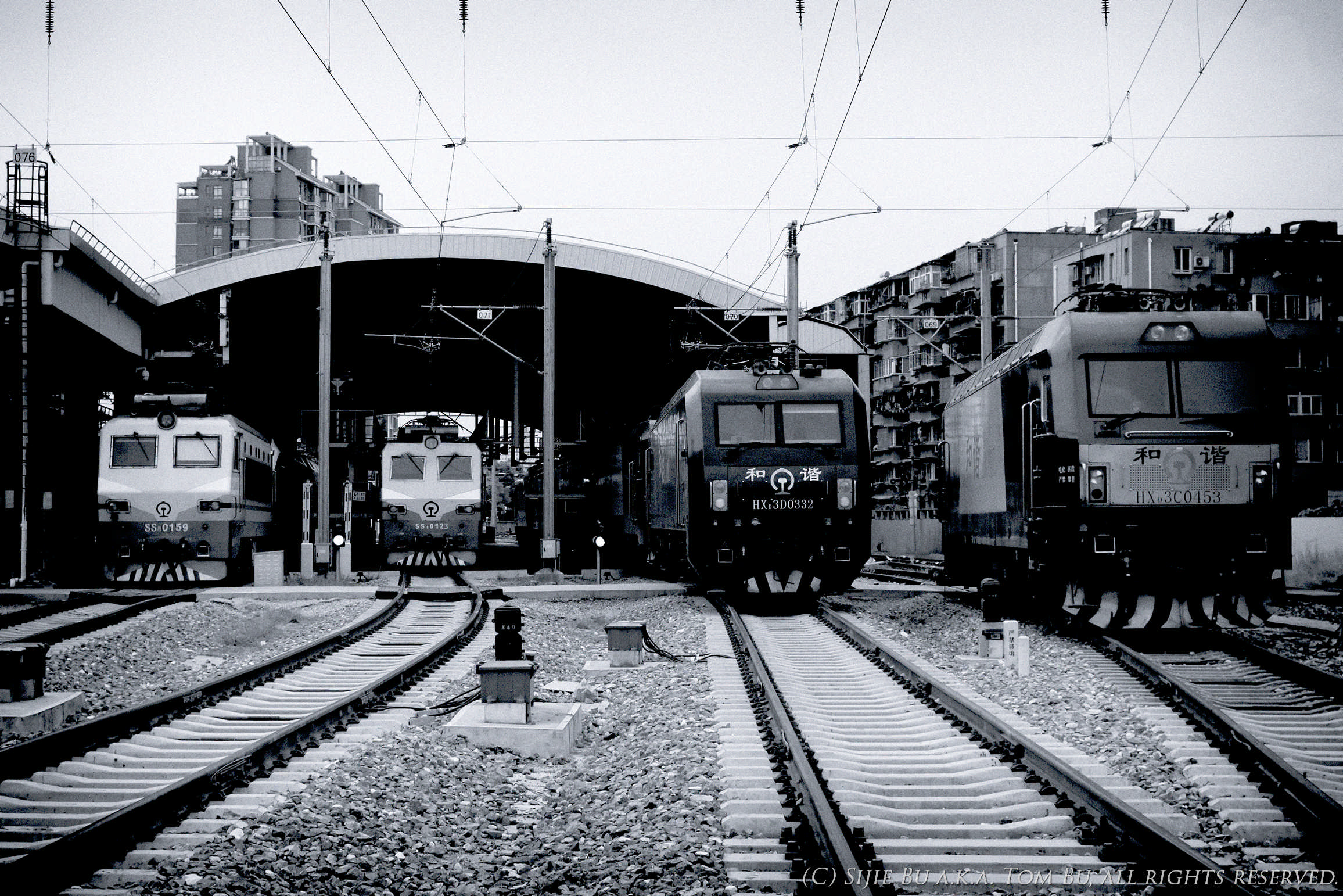
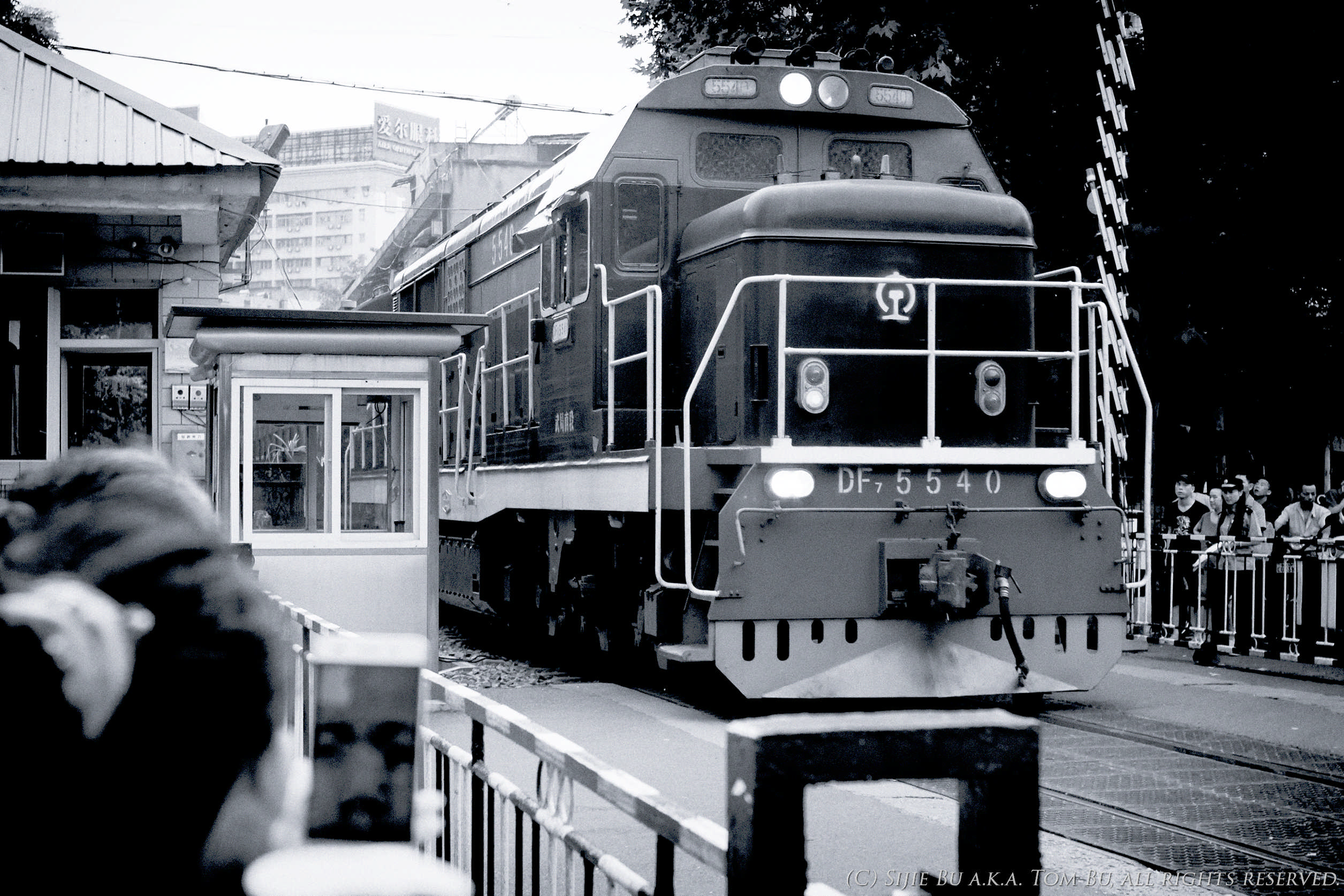
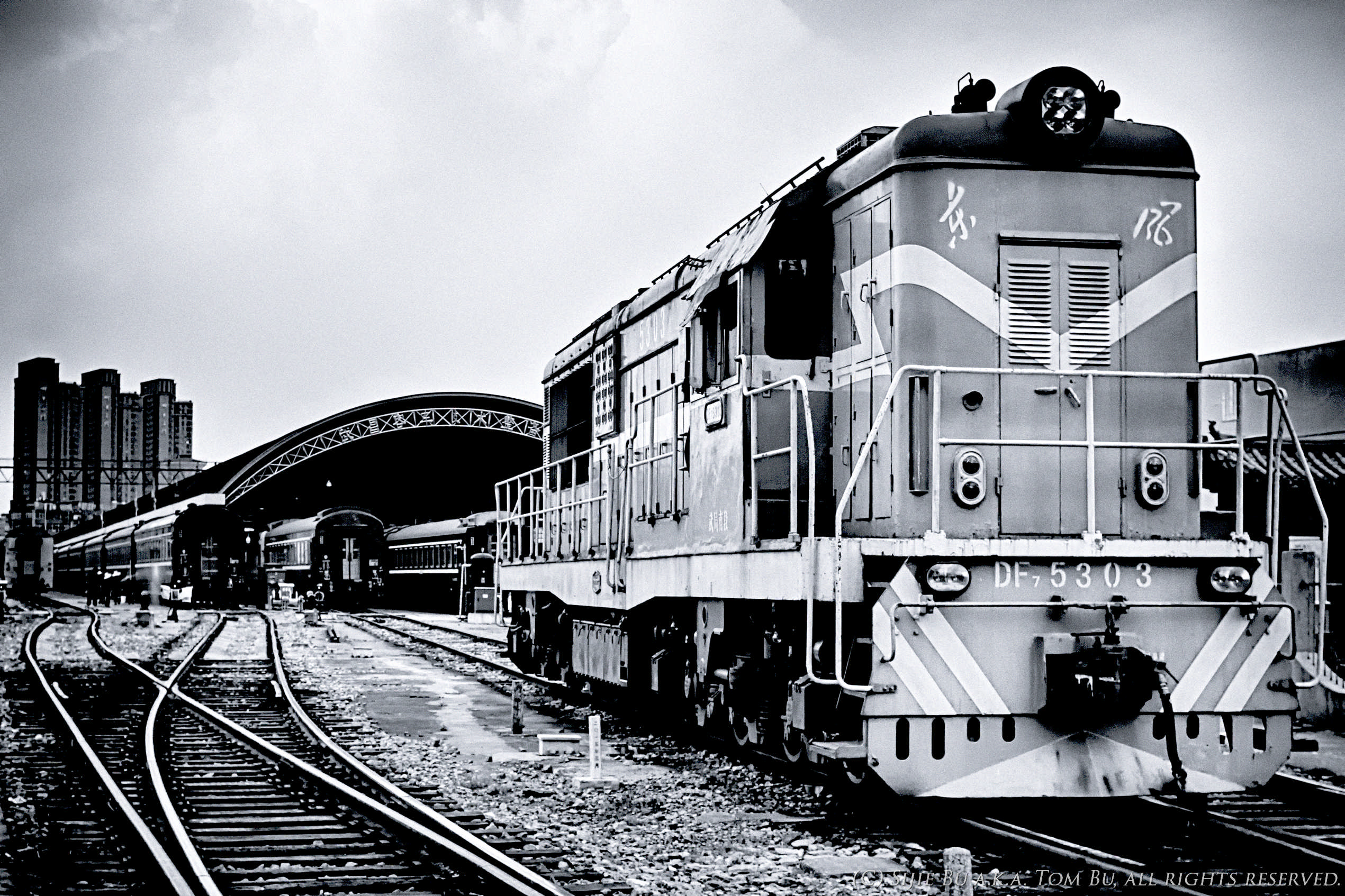
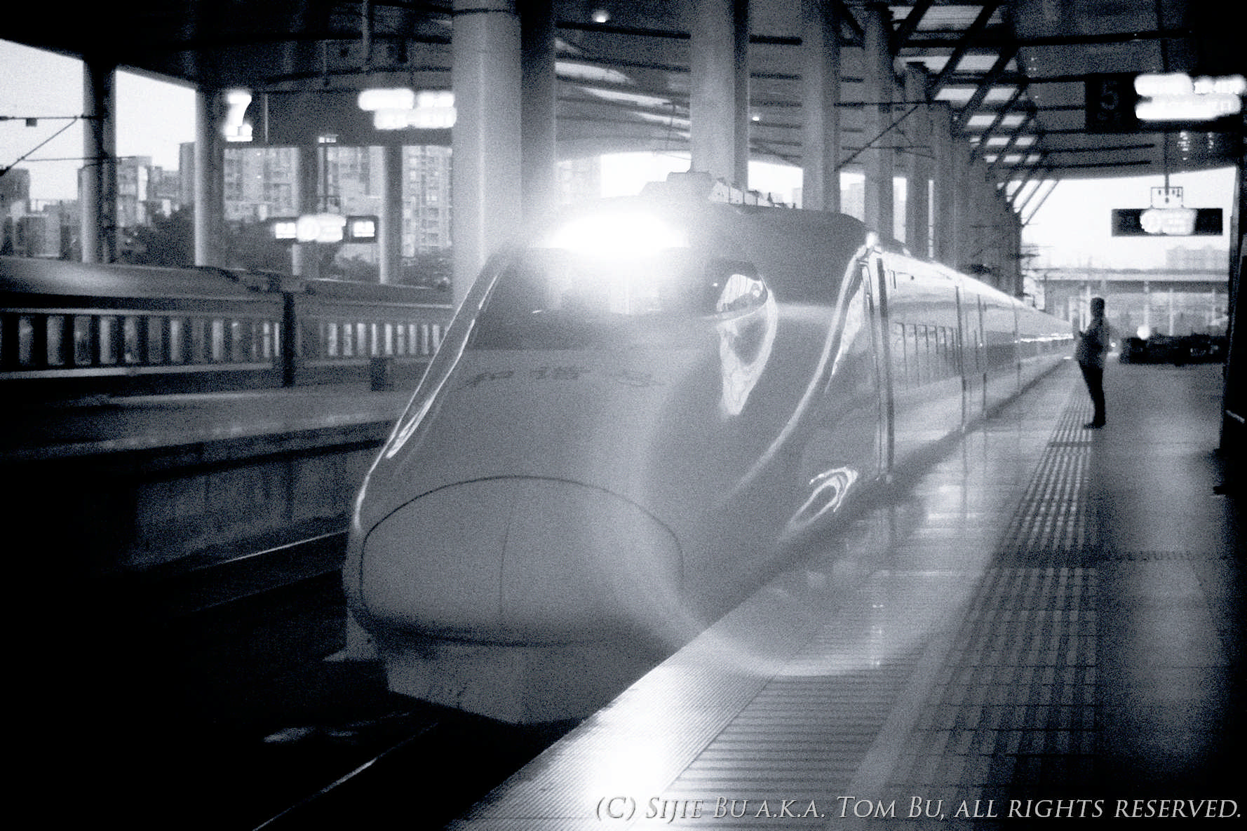
Out Trainshooting with a Friend, and went B&W
Lens: Super-Takumar 1:2/35 Camera: SONY ICLE-5000 Photo Location: Wuhan, China 

So a friend of mine was visiting my city on his way home from college and asked me to take him around the city for trainshooting. No problem, and I decided to try out with B&W for a day.

All photos were shot in RAW and converted using the Silver Efex Pro 2 from Google Nik Collection, I opted the Ilford XP2 for my "film of the day" and tried various color filters.

Comments are greatly welcome as I am usually not a B&W guy.


07-17-2016, 11:43 AM - 1 Like   #2
Administrator
Site Webmaster
Adam's Avatar

Join Date: Sep 2006
Location: Arizona
Photos: Gallery | Albums
Posts: 51,593
Great shots! It's hard to critique when there are so many, but for me, the last one is the best overall. The composition and B&W conversion works nicely.

I also like the first and second, and the last, though I think the grain effect and midtone contrast boost is a bit excessive.

Adam
PentaxForums.com Webmaster (Site Usage Guide | Site Help | My Photography)


PentaxForums.com server and development costs are user-supported. You can help cover these costs by donating or purchasing one of our Pentax eBooks. Or, buy your photo gear from our affiliates, Adorama, B&H Photo, KEH, or Topaz Labs, and get FREE Marketplace access - click here to see how! Trusted Pentax retailers:
07-17-2016, 10:05 PM   #3
Veteran Member
butangmucat's Avatar

Join Date: Jul 2016
Posts: 709
Original Poster
QuoteOriginally posted by Adam Quote
Great shots! It's hard to critique when there are so many, but for me, the last one is the best overall. The composition and B&W conversion works nicely.

I also like the first and second, and the last, though I think the grain effect and midtone contrast boost is a bit excessive.
So I should probably compress the midtone? The first image was shot backlight and I had to do some HDR tone mapping before the B&W conversion, and it also seems that the Ilford XP2 (film or filter) seems to have a different character compared to films like Kodak TAMX or Ilford's own Delta line.

Some of the original RAW images were already pretty noisy, so I am not sure about what to do, probably leave them as grain?
07-18-2016, 12:41 AM   #4
Senior Member


Join Date: Feb 2015
Photos: Gallery
Posts: 152
well, not being an expert either in lokomotives or photo, I get a sence that the hard midtone contrast in some of the pics sort of adds to a kind of nostalgic feeling, or air if you will, in them...(the not so ultra modern highspeed ones) Overall a very nice series of pics!

07-18-2016, 03:08 PM   #5
Administrator
Site Webmaster
Adam's Avatar

Join Date: Sep 2006
Location: Arizona
Photos: Gallery | Albums
Posts: 51,593
QuoteOriginally posted by butangmucat Quote
So I should probably compress the midtone? The first image was shot backlight and I had to do some HDR tone mapping before the B&W conversion, and it also seems that the Ilford XP2 (film or filter) seems to have a different character compared to films like Kodak TAMX or Ilford's own Delta line.

Some of the original RAW images were already pretty noisy, so I am not sure about what to do, probably leave them as grain?
After seeing the color versions I think you did a great job with the B&W conversion. Might be hard to squeeze more detail out of those files, but I suppose you could mess around a bit with noise reduction and contrast.

Adam
PentaxForums.com Webmaster (Site Usage Guide | Site Help | My Photography)


PentaxForums.com server and development costs are user-supported. You can help cover these costs by donating or purchasing one of our Pentax eBooks. Or, buy your photo gear from our affiliates, Adorama, B&H Photo, KEH, or Topaz Labs, and get FREE Marketplace access - click here to see how! Trusted Pentax retailers:
07-21-2016, 08:34 AM   #6
Pentaxian


Join Date: Jan 2011
Location: New York
Posts: 4,833
Good set of photos. I like trains so I'll give a quick comment on all of them. My favorites in order are 1, 8, 2, 6.

#1: I like this because of the station architecture.

#2: The contrast between white train and black background works well. My style would probably lead me to lift the shadows to show more background detail, but your choice is good too.

#3: I don't like this one. I'd like to see more of the train and less of the blurred poles.

#4: Maybe too much contrast; there's a lot of black in this one.

#5: Looks like it was taken with an old pocket instamatic film camera. The softness, grain, and flare are individually bad but they work well together.

#6: I like the composition. The right-edge has distracting vignetting; the far edge of the train fades to black and the building seems to change color.

#7: The blurred head, cell phone reflection, and guard booth neat the lower left corner are distractions.

#8: Another good shot. The station interior drops off too black but that's fine because it's s small portion of the photo.

#9: Similar to #5 with the old look to it. The single passenger waiting adds interest.
07-21-2016, 08:48 AM   #7
Veteran Member
butangmucat's Avatar

Join Date: Jul 2016
Posts: 709
Original Poster
QuoteOriginally posted by DeadJohn Quote
Good set of photos. I like trains so I'll give a quick comment on all of them. My favorites in order are 1, 8, 2, 6.

#1: I like this because of the station architecture.

#2: The contrast between white train and black background works well. My style would probably lead me to lift the shadows to show more background detail, but your choice is good too.

#3: I don't like this one. I'd like to see more of the train and less of the blurred poles.

#4: Maybe too much contrast; there's a lot of black in this one.

#5: Looks like it was taken with an old pocket instamatic film camera. The softness, grain, and flare are individually bad but they work well together.

#6: I like the composition. The right-edge has distracting vignetting; the far edge of the train fades to black and the building seems to change color.

#7: The blurred head, cell phone reflection, and guard booth neat the lower left corner are distractions.

#8: Another good shot. The station interior drops off too black but that's fine because it's s small portion of the photo.

#9: Similar to #5 with the old look to it. The single passenger waiting adds interest.
Actually I think on #5 and #9 I had simply pushed by gear beyond its envelop. I had my Super-Takumar 1:2/35 (single-coated version) shot wide open and had my Sony a5000 body set to ISO 2000. The original image was noisy, not sharp at all, and had that giant color flare.

---------- Post added 07-21-16 at 08:51 AM ----------

QuoteOriginally posted by DeadJohn Quote
Good set of photos. I like trains so I'll give a quick comment on all of them. My favorites in order are 1, 8, 2, 6.

#1: I like this because of the station architecture.

#2: The contrast between white train and black background works well. My style would probably lead me to lift the shadows to show more background detail, but your choice is good too.

#3: I don't like this one. I'd like to see more of the train and less of the blurred poles.

#4: Maybe too much contrast; there's a lot of black in this one.

#5: Looks like it was taken with an old pocket instamatic film camera. The softness, grain, and flare are individually bad but they work well together.

#6: I like the composition. The right-edge has distracting vignetting; the far edge of the train fades to black and the building seems to change color.

#7: The blurred head, cell phone reflection, and guard booth neat the lower left corner are distractions.

#8: Another good shot. The station interior drops off too black but that's fine because it's s small portion of the photo.

#9: Similar to #5 with the old look to it. The single passenger waiting adds interest.
And for #7 I wanted to capture people waiting for the train to pass and taking photos of the train, so I probably need a lens with a wider FOV?

Reply

Bookmarks
  • Submit Thread to Facebook Facebook
  • Submit Thread to Twitter Twitter
  • Submit Thread to Digg Digg
Tags - Make this thread easier to find by adding keywords to it!
background, cell, city, color, contrast, critique, flare, friend, head, photography, photos, shot, station, train
Thread Tools Search this Thread
Search this Thread:

Advanced Search


Similar Threads
Thread Thread Starter Forum Replies Last Post
Agfacolor 100 - Any good and can I cook it with B&W processing and/or Caffenol ? Jean Poitiers Film Processing, Scanning, and Darkroom 10 03-02-2015 12:25 PM
B&W prints coming out purple Another dyemention Troubleshooting and Beginner Help 9 12-04-2014 03:27 PM
Black & White Starting out with B&W conversions kenafein Post Your Photos! 4 06-11-2012 08:56 PM
Is there a difference between shooting b&w and processing as b&w? justtakingpics Digital Processing, Software, and Printing 5 04-25-2010 07:10 PM
trying out a different b&w conversion Nesster Post Your Photos! 5 08-09-2008 09:39 PM


All times are GMT -7. The time now is 10:18 AM. | See also: NikonForums.com, CanonForums.com part of our network of photo forums!
  • Red (Default)
  • Green
  • Gray
  • Dark
  • Dark Yellow
  • Dark Blue
  • Old Red
  • Old Green
  • Old Gray
  • Dial-Up Style
Hello! It's great to see you back on the forum! Have you considered joining the community?
register
Creating a FREE ACCOUNT takes under a minute, removes ads, and lets you post! [Dismiss]
Top