 Originally posted by J.R.
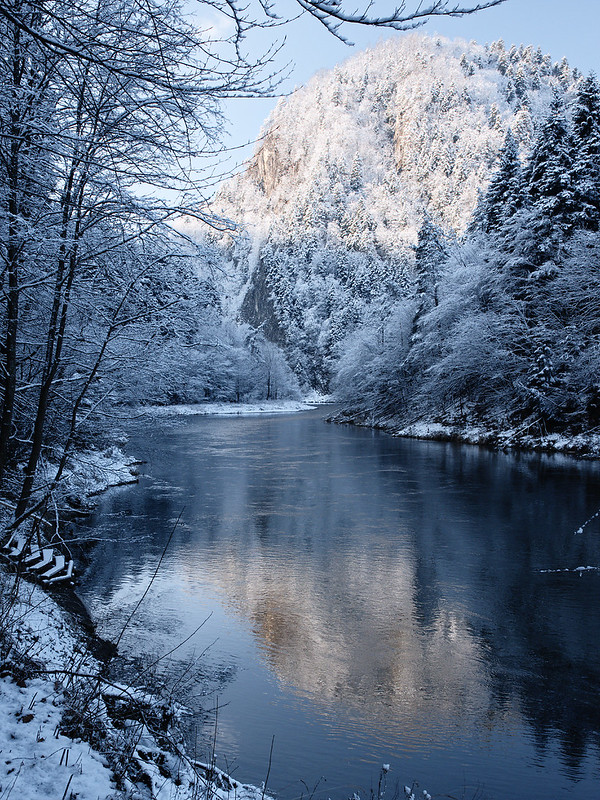
Years ago, when using film, the saying was "expose for shadows and print for highlights." High contrast scenes call for lower contrast film, or in this case, perhaps some change of the settings. I have found some information on pages 56-57 of the K3II owner's manual that seems to address this issue, at least in part.
What I usually do, is get the spot reading from the highlights, then manually set exposure around +2 stops from that reading to get some shadow detail without (hopefully) overblowing the highlights. I think this is called ETTR (expose to the right). I've been trying this only recently, as I used to shoot AV or TAV exposure modes before. It certainly gave me better results, and gave enough dynamic range to pull the shadows a bit in post without introducing much noise, but in the end, it is not as easy as I thought to combat high contrast scenes. I wonder if graduated filter would help...? (I used a polarizer here)
Originally posted by CreationBear: a high contrast scene like this one usually really benefits from bracketing and exposure blending. If you've not already, you might explore the technique of using "luminosity masks" to fine tune the bright and dark areas of the frame.
I guess that's probably the way to go, although Ansel Adams didn't use exposure bracketing and blending to get stunning, well exposed shots :P.
Originally posted by CreationBear: In terms of composition, one thing that is happening for me is that with the bright mountain in the background at the top of the frame and the bright reflection at the bottom, my eyes flicker back and forth between the bright areas instead of being "guided" through the scene. Try cropping, say, the lower third of the picture: you lose the interesting reflection of course, but to me the resulting square crop is much more harmonious, since our eyes naturally "want" to travel over the dark water and out of the frame.
I understand what you mean, although I'd prefer not to lose the reflection, as I like the effect. Maybe the "flickering' wouldn't be an issue if the reflection were more faint, and the mountain brighter, punchier.
Originally posted by J.R.: With your permission, I can demonstrate a way to preserve most of the elements without doing too much violence to the original.
Sure! Would you like the RAW file?


 In terms of composition, one thing that is happening for me is that with the bright mountain in the background at the top of the frame and the bright reflection at the bottom, my eyes flicker back and forth between the bright areas instead of being "guided" through the scene. Try cropping, say, the lower third of the picture: you lose the interesting reflection of course, but to me the resulting square crop is much more harmonious, since our eyes naturally "want" to travel over the dark water and out of the frame. The current lack of harmony might also be exacerbated by the portrait orientation--it's possible that the same scene laid out more horizontally would be easier for my eye to "read."


 Similar Threads


