 Originally posted by hks_kansei
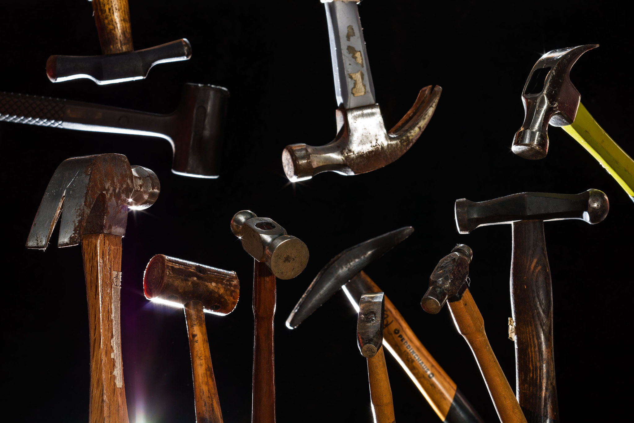
But it really depends on what you're going for here, more a descriptive image of hammers as hammers, or a more abstract use where the hammers are really incidental to it all and the focus is more about the shape/texture of them,
Thanks for the input. I believe you identified the biggest problem.
I think I need to answer this question, I think i was going for both. The variety of shape/texture in hammers was my goal. I got caught up in a fancy layout that distracts from that goal.
The rest of the I input is nice also.


 Post #1 by swanlefitte
 Similar Threads


