Forgot Password
Pentax Camera Forums Home
 

Reply
Show Printable Version Search this Thread
12-17-2008, 08:00 PM   #1
Veteran Member
Andi Lo's Avatar

Join Date: Jul 2008
Location: Halifax, Nova Scotia
Posts: 2,924
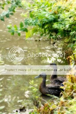
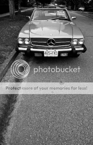
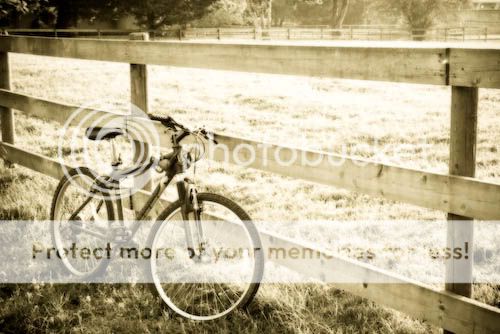
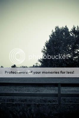
Am I being too hard on myself?

ever since I've used John's background switcher, I've been bombarded with (mostly) excellent images every 30 minutes I sit on my computer. It kinda made me set my bar a bit higher and some images that i have now just seems... lacking.

i just would like some opinions on these, am I just being too hard on myself? The one that I still kinda like is the bike one.


12-17-2008, 08:48 PM   #2
Veteran Member
sawtooth235's Avatar

Join Date: Apr 2008
Location: Orange Park, Florida
Photos: Gallery | Albums
Posts: 886
They seem a little flat. Have you tried bumping up the contrast or applying a high pass filter in photoshop?

Ray
12-17-2008, 09:03 PM   #3
Veteran Member
Buddha Jones's Avatar

Join Date: Sep 2006
Location: Charlotte, NC
Photos: Gallery
Posts: 2,587
Well, I am no professional, but here are my impressions...

#1 - The image is way to busy, the leaves on top and the reflection of the leaves in the water are just to distracting.

#2 - I reallyu like. The use of negative space is very creative and making it B&W kind of sets a somber tone as if you were emulating the emotion of the car that knows its being sold and is sad about it.

#3 - I also like because of the high conrast post processing, I dont think it would of worked in color, but the Sephia is right on because it adds just the right amount of softness to it where as making it a B&W may of been too harsh still.

#4 - I dont know if the vignetting was intentional but that is really the only artistic quality i can find in that photo. I am assuming that the focus of the image is the boat, but the framing doesnt do it for me.

That is my $.02
12-17-2008, 09:25 PM   #4
Veteran Member
Andi Lo's Avatar

Join Date: Jul 2008
Location: Halifax, Nova Scotia
Posts: 2,924
Original Poster
I forgot to add that I was considering to delete all three of them other than the bike picture at one point. Thanks for the comments so far =)

@sawtooth: the first and third one is intentionally "flat", I was experimenting with orton. I bumped up the contrast for the rest already. I think the fourth one seems flat also becaue of the size.
@buddha: yes, the vignetting was intentional. I guess there really isnt a point (story) to that picture, is there?

Reply

Bookmarks
  • Submit Thread to Facebook Facebook
  • Submit Thread to Twitter Twitter
  • Submit Thread to Digg Digg
Tags - Make this thread easier to find by adding keywords to it!
critique, images, photography

Similar Threads
Thread Thread Starter Forum Replies Last Post
Macro It's Been a Hard Night! Take 2 eaglem Post Your Photos! 11 04-19-2010 10:43 PM
It all gets too hard sometimes..... Mallee Boy Post Your Photos! 5 04-06-2009 06:46 PM
Question how hard would it be....... Lowell Goudge Site Suggestions and Help 4 11-10-2008 08:48 AM
hard rock craftsmansky Photo Critique 3 12-12-2007 12:47 PM


All times are GMT -7. The time now is 04:16 PM. | See also: NikonForums.com, CanonForums.com part of our network of photo forums!
  • Red (Default)
  • Green
  • Gray
  • Dark
  • Dark Yellow
  • Dark Blue
  • Old Red
  • Old Green
  • Old Gray
  • Dial-Up Style
Hello! It's great to see you back on the forum! Have you considered joining the community?
register
Creating a FREE ACCOUNT takes under a minute, removes ads, and lets you post! [Dismiss]
Top