Forgot Password
Pentax Camera Forums Home
 

Reply
Show Printable Version Search this Thread
01-02-2010, 05:11 PM   #1
Veteran Member


Join Date: Oct 2006
Location: Albuquerque, NM
Photos: Gallery | Albums
Posts: 308
protector of the wastelands
Lens: 35mm Camera: *istDs ISO: 400 Shutter Speed: 1/200s Aperture: F6.7 

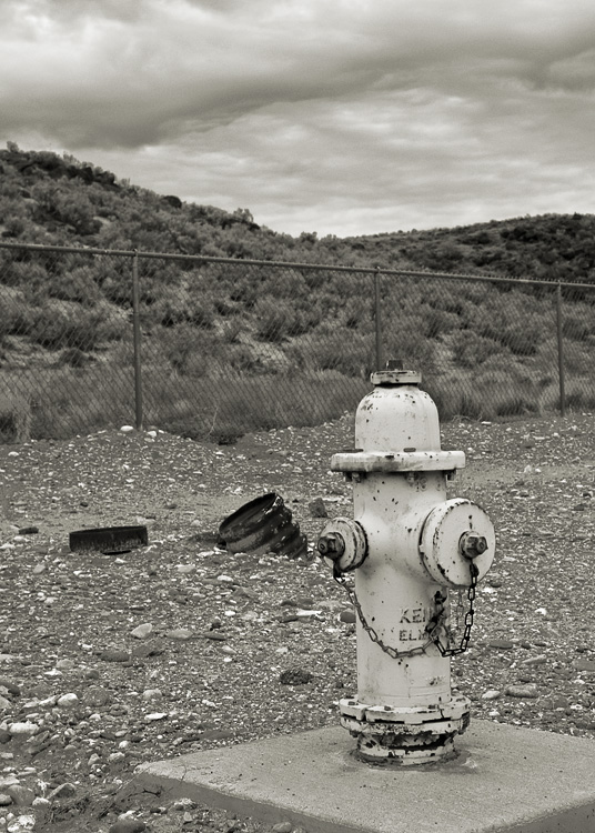
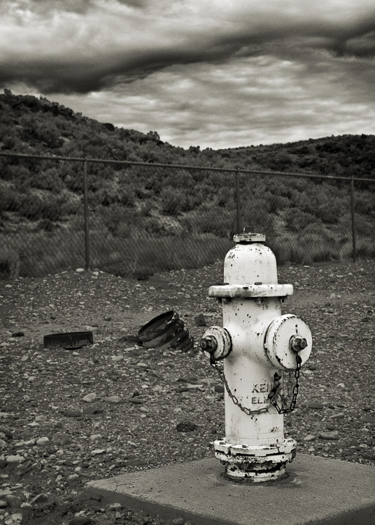
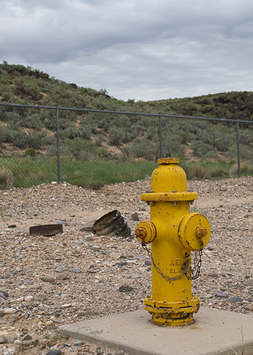
Digging in my archives recently, I found a few photos that seemed worth some PPing time. Here's one of them.

I had difficulty getting good separation between the hydrant and the ground in the The B&W conversion.
Doing so caused many of the foreground pebbles to get very bright. Maybe I should burn them in some.
Or does the messy foreground help add to the 'wasteland' feel?

I welcome any and all comments on title, mood, subject, composition, B&W conversion, etc.

What about the fence? Should I try cloning it away? Thanks.


01-03-2010, 12:58 AM   #2
juu
Veteran Member


Join Date: Sep 2008
Posts: 680
I have very little experience w/ B&W, so take it with a grain of salt, but for me personally the pump does not stand out in the scene well enough, there just seems so much stuff crowding it (pebbles, the barrel, the fence). Also, can you do anything about the sky to make it more dramatic?

It is a nice picture though and I like it. I wonder what the colour version looked like.
01-03-2010, 02:35 PM   #3
Ash
Loyal Site Supporter
Ash's Avatar

Join Date: Mar 2007
Location: Toowoomba, Queensland
Photos: Gallery | Albums
Posts: 23,920
Mark, the subject's clear and well focused but the remainder of the image doesn't add much to the look. In this regard it lacks impact. The B&W conversion is also quite flat and could have done with more contrast and a bolder rendition of the greens.

The scene doesn't quite give me the impression of 'wasteland' - there are too many other competing elements.
The sky is a little ordinary, but with a stronger B&W job it may have come out more dramatic.
The fence would be a big job to clone out with probably little to gain - the background doesn't quite bring out the best in the scene.
But keep at it - getting a suitable scene to photograph is not easy.
01-03-2010, 08:49 PM   #4
Veteran Member


Join Date: Oct 2006
Location: Albuquerque, NM
Photos: Gallery | Albums
Posts: 308
Original Poster
Thanks juu and Ash for the feedback.

I tend to be subtle with my edits. Too subtle in this case. Here's a revision following my own advice on the pebbles and both of your regarding contrast. I'm still not sure about the sky. Maybe it needs cropped out to keep from competing with the rest of the image. And Ash is right: cloning away the fence is a fool's errand. Overall I think the result is much better, but maybe still not worthy of the title.


Here's the original, color version for juu:


01-03-2010, 11:53 PM   #5
juu
Veteran Member


Join Date: Sep 2008
Posts: 680
I like the 2nd B&W version better than the first.
01-04-2010, 01:15 AM   #6
Damn Brit
Guest


If you do try cropping it Mark, I'd suggest keeping the ratio the same.

You invited comments on title, it doesn't really work for me. I'd be tempted to go for something more humorous like "Water you looking at?".
Reply

Bookmarks
  • Submit Thread to Facebook Facebook
  • Submit Thread to Twitter Twitter
  • Submit Thread to Digg Digg
Tags - Make this thread easier to find by adding keywords to it!
conversion, critique, foreground, photography

Similar Threads
Thread Thread Starter Forum Replies Last Post
LCD protector Warren s Pentax Camera and Field Accessories 13 03-29-2010 04:46 PM
Screen protector, any recomendations? jeenyus Pentax Camera and Field Accessories 6 01-14-2010 01:31 PM
LCD protector kibipod Pentax DSLR Discussion 6 12-27-2008 01:27 PM
Palm Protector rormeister Post Your Photos! 3 03-29-2008 05:44 AM
UV filter vs Protector Snowcat Pentax SLR Lens Discussion 7 12-12-2007 10:17 AM


All times are GMT -7. The time now is 04:26 PM. | See also: NikonForums.com, CanonForums.com part of our network of photo forums!
  • Red (Default)
  • Green
  • Gray
  • Dark
  • Dark Yellow
  • Dark Blue
  • Old Red
  • Old Green
  • Old Gray
  • Dial-Up Style
Hello! It's great to see you back on the forum! Have you considered joining the community?
register
Creating a FREE ACCOUNT takes under a minute, removes ads, and lets you post! [Dismiss]
Top