Forgot Password
Pentax Camera Forums Home
 

Reply
Show Printable Version Search this Thread
02-27-2010, 06:06 PM   #1
Inactive Account


Join Date: Jan 2010
Location: Ohio
Photos: Gallery | Albums
Posts: 169
Portrait Jason
Lens: 85mm Camera: K-x Photo Location: my livingroom ISO: 1600 Shutter Speed: 1/60s Aperture: F2.8 

Any comments or suggestions on this one?
I'll save my comments so you all can just "let me have it"
Thanks - Tim


02-27-2010, 10:21 PM   #2
Forum Member


Join Date: Nov 2009
Location: Idaho
Posts: 95
I like the exposure, face lighting and the expression you captured. The vertical line (transition from black to white) with the white fading to dark gray is nice. Good B&W conversion. I personally like everything about this photo. Some may say that whatever is in the lower right corner (a stegosaurus?) is a distraction, but I don't think so. Cropping it out--either from the right or the bottom--would, in my opinion, cause the picture to lose more than it would gain.
02-27-2010, 10:23 PM   #3
Veteran Member
GoremanX's Avatar

Join Date: Dec 2009
Location: Georgia, VT
Photos: Albums
Posts: 1,657
I like this shot a lot, it seems to speak volumes with its silence (wow, I'm all poetic and stuff). The contrast looks good, the exposure is great. I especially like how I can clearly make out the subject from the background, and yet the shadows are clearly perceptible too.The shadow on the right side of the picture makes a great companion for its opposite on the boy's (Jason's?) face. The limbs don't appear to be cut off at any awkward places, the boy's face stands out clearly from the rest of his features.

You've got a fan! I'm sure others will find faults that I missed, but I think it's great as-is.
02-27-2010, 10:39 PM   #4
Ash
Loyal Site Supporter
Ash's Avatar

Join Date: Mar 2007
Location: Toowoomba, Queensland
Photos: Gallery | Albums
Posts: 23,920
Expressive and crisp, it's a good candid.
Nicely framed - is also emotive.

Its B&W conversion is a little flat, though - low in contrast and a lack of good tonal range to suit the image style. So texture's not quite portrayed well here - more a lighting issue than an exposure issue. Nevertheless, it can be improved with a boost in brightness and contrast.
Well done.

02-27-2010, 10:42 PM   #5
Site Supporter
Site Supporter
Bob Harris's Avatar

Join Date: Feb 2010
Location: Canon City, Colorado
Photos: Gallery | Albums
Posts: 18,477
Tim, I think I would of chosen a background that was consistent, it is a little distracting to view the photo with black on one side, white on the other. I assume this wasn't a staged photo, because I think his hands take away from the shot a bit, but I do realize he is concentrating on something. What mode did you use to shoot this photo, just curious, recently purchased a K-x. For that high of ISO, the shot does not have any noise. I like the light that the photo was shot in, shows how handsome Jason is and I like your photo. Thanks for sharing. Bob
02-28-2010, 09:38 AM   #6
Inactive Account


Join Date: Jan 2010
Location: Ohio
Photos: Gallery | Albums
Posts: 169
Original Poster
Thanks all for the kind words and helpul criticism. I was afraid some might think it was too dark. I tried it a little lighter and the textures did come out a bit, but the moodiness wasn't the same. The shot wasn't staged at all besides just getting a 10 year old to just sit still for a few seconds...
Bob - I shot this in AV mode. noise wasn't bad right out of the camera but better with the included - Ulead Photoimpact 12se software. It's just the default noise reduction - no adjustments made. I've still got a ton to learn about working the softwares.
Tim
02-28-2010, 01:13 PM   #7
Damn Brit
Guest


QuoteOriginally posted by timo4352 Quote
... so you all can just "let me have it"
Thanks - Tim
I want to slap you every time I look at you avatar. How's that? you said to let you have it.


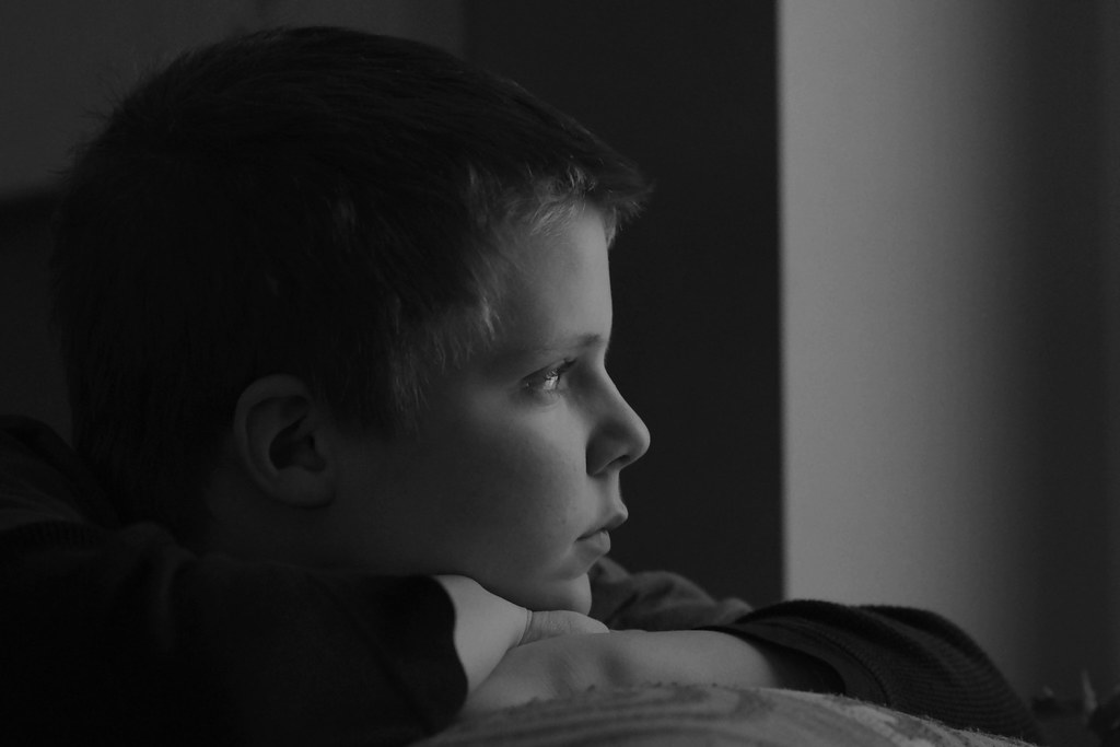
On to the picture, I think you've done a great job, the exposure and the lighting help set the narrative - "What is the boy thinking about/looking at?". Just be aware, if you print it, it might come out a little too dark so you might have to boost the highlights and midtones a little. I like the use of the contrasting background, it works with the mood of the picture.

Now for what I think is wrong with it. The first one is minor, it's where the background changes colour above his head. Like I said, it's minor and doesn't spoil the picture, I'm just pointing it out and most people probably wouldn't notice it.
The space behind his head is unnecessary and can be considered a distraction, that can be fixed by cropping.
The object in the bottom right corner next to his elbow is distracting, that can be fixed by cropping.
The final thing is the worst thing, the object at the bottom of the frame. It's bad for the picture on several levels, it shouldn't be there, it's a distraction, it introduces a curved line that spoils effect of the straight lines and it introduces a pattern into an image that is otherwise devoid of pattern and a texture that conflicts with the rest of the image. You might get away with including it if there was a little more of it, you covered it with some plain material and all of it was in focus (the slight blur attracts the eye). A tabletop would be better though, you keep the straight lines and you get some reflection to work with.

I've gone into this in detail because I think it's a great image and worth re-shooting.

02-28-2010, 01:48 PM   #8
Veteran Member
GoremanX's Avatar

Join Date: Dec 2009
Location: Georgia, VT
Photos: Albums
Posts: 1,657
QuoteOriginally posted by Damn Brit Quote
I want to slap you every time I look at you avatar. How's that? you said to let you have it.
I like that avatar. For some reason I can't understand, it reminds me of old British TV comedies. Like Blackadder and stuff.
02-28-2010, 02:05 PM   #9
Damn Brit
Guest


QuoteOriginally posted by GoremanX Quote
I like that avatar. For some reason I can't understand, it reminds me of old British TV comedies. Like Blackadder and stuff.
It reminds me of Marty Feldman. Ever see 'Young Frankenstein'?
02-28-2010, 02:08 PM   #10
Veteran Member
GoremanX's Avatar

Join Date: Dec 2009
Location: Georgia, VT
Photos: Albums
Posts: 1,657
QuoteOriginally posted by Damn Brit Quote
It reminds me of Marty Feldman. Ever see 'Young Frankenstein'?
Stop it, you're making me feel old (even though that movie predates me by 2 years)
02-28-2010, 03:12 PM   #11
Inactive Account


Join Date: Jan 2010
Location: Ohio
Photos: Gallery | Albums
Posts: 169
Original Poster
Thanks for all the input. I might have better luck trying to do some more work on this one than trying to get him to sit and pose for another.
The shot was him sitting kind of backwards on the couch looking out the front window. It's like a window box deal and that gave the different lighting contrast there. The window faces east and it was early evening so not too much light.
Wish I could say I planned it all but it was just one of a few quick shots.

The avatar is the character Crazy Eyes from the Adam Sandler movie Mr. Deeds.
Glad you like him
02-28-2010, 08:13 PM   #12
Damn Brit
Guest


QuoteOriginally posted by timo4352 Quote

The avatar is the character Crazy Eyes from the Adam Sandler movie Mr. Deeds.
Glad you like him
That's a relief to me, I had a slight concern that it was a self portrait.
I'd hate to have been mocking the afflicted.
02-28-2010, 09:51 PM   #13
Veteran Member


Join Date: Jun 2008
Location: Flyover America
Posts: 4,469
One of the best I've seen on the forum.

As far as over-all exposure I wouldn't touch a thing - at least as it appears on my screen. You nailed it.

As this is a strong mood shot and not a technical shot I wouldn't hesitate to do some pp if I thought it would strengthen that mood.

A few things that MIGHT improve it:

I'd try darkening the background in the upper left corner to the point where the back of the head's outline against the wall is no longer discernible. It would add a bit to the mood and remove a distracting unnecessary detail. This would add a bit more mystery to it as well. This is the kind of shot that can be hurt by being made too clear and explicit.

I'd try smoothing out the transition in tone of the vertical black to white transition in the front. It's works ok but it's just too strong and detracts from the main subject.

I would not crop anything away - the subject needs space to be in. Cropping would give it a claustrophobic cramped look I think. All the black space defines it and works well.

All in all it's the kind of shot I wish I had taken - well done.

Last edited by wildman; 02-28-2010 at 10:21 PM.
03-01-2010, 12:55 PM   #14
Inactive Account


Join Date: Jan 2010
Location: Upstate New York
Posts: 203
I like it a lot, but it looks a bit too grey and dull, and the framing doesn't work for me. I gave it a quick once-over, see what you think of this:

Attachment 55740

Cropped top, left, and right. Levels adjustment on the face. Burned top left corner and under the arms. Could be better with more work. Excellent shot to work with though.

Last edited by slinco; 06-03-2010 at 12:10 PM.
03-02-2010, 11:04 PM   #15
Veteran Member
FHPhotographer's Avatar

Join Date: Jul 2008
Location: Fountain Hills, AZ
Photos: Gallery | Albums
Posts: 1,297
Good composition and B&W conversion. I don't want to belabor the message of the image, but it's a powerful evocation of childhood on the verge, looking from forward, etc. To make coming of age, moving out of the darkness and into the light blah blah I think it would be even more powerful with visual transition from dark to light in the boy's hair. Like Brit, I also have trouble with the lower right, the curve and texture pulls the eye too much. My biggest issue is the balance of dark to light back to dark on the right. I want to follow the boy's gaze but get stopped at the dark right side; some judicious cropping at the right and would turn this into a top notch image,
Brian
Reply

Bookmarks
  • Submit Thread to Facebook Facebook
  • Submit Thread to Twitter Twitter
  • Submit Thread to Digg Digg
Tags - Make this thread easier to find by adding keywords to it!
comments, critique, photography
Thread Tools Search this Thread
Search this Thread:

Advanced Search


Similar Threads
Thread Thread Starter Forum Replies Last Post
When you take a picture in a portrait shot do you rotate it back to portrait and save rustynail925 Troubleshooting and Beginner Help 24 08-22-2010 08:29 AM
Jason in Japan - Asakusa inferno10 Video Recording and Processing 3 04-14-2010 08:33 PM
Jason is here! Jason ON Welcomes and Introductions 3 07-08-2009 06:28 AM
Portrait, Self-Portrait and a Bonus, all in one shot! Buddha Jones Post Your Photos! 7 05-07-2007 05:52 AM
Jason DSLR newbie :) guy007 Welcomes and Introductions 6 04-17-2007 03:28 AM


All times are GMT -7. The time now is 06:48 AM. | See also: NikonForums.com, CanonForums.com part of our network of photo forums!
  • Red (Default)
  • Green
  • Gray
  • Dark
  • Dark Yellow
  • Dark Blue
  • Old Red
  • Old Green
  • Old Gray
  • Dial-Up Style
Hello! It's great to see you back on the forum! Have you considered joining the community?
register
Creating a FREE ACCOUNT takes under a minute, removes ads, and lets you post! [Dismiss]
Top