 Originally posted by cb750r
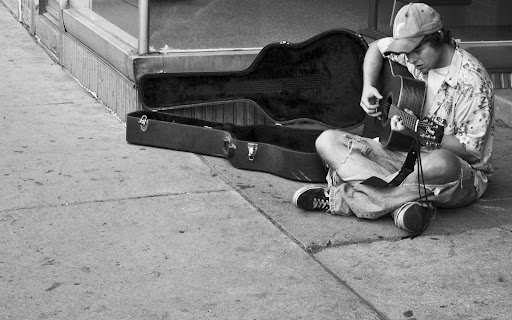
I'd say somewhere between first and second, just a little more space around the head would do it for me personally.
Originally posted by AOShep Using #1, a little more space above the head. Lop off about half way between the left edge and the guitar case and a simular amount off the bottom.
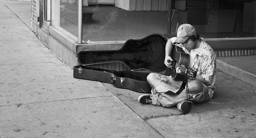
I agree that some more room above his head would be good. I didn't say in the OP, but the one I was leaning towards more was #2, partly for this reason.
Originally posted by jct us101 The second crop is my favorite, I think it works the most for the style of image that it is. I would also recommend maybe a vertical crop with him kind of at the middle of it, but I can only assume that would look good from some mental cropping I did. It looks kind of dull too, more contrast perhaps?
I hadn't thought of using a vertical crop, maybe I'll try it out. Contrast, I don't think can go any higher. I think I have it at +100 in ACR already

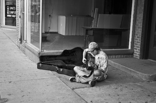
Originally posted by smf Perhaps something like this would work.
I think you're going for something like my #1, with more of a focus on the guitarist. I like this crop, more emphasis on the subject.
Originally posted by Tuner571 Very nice shots here however, there are a few things that you could do to make them better. Firstly, I would try and add some contrast to the image so that details and shadows pop more. Secondly, I would try and add a little sharpening to the image. It looks like the image is slightly blurry and some sharpening would help that out. As other of mentioned a tighter crop of the subject would be good as well as it would be a much clearer photo as to the subject. Another I would recommend is that if you get to shoot this man again try getting down lower to the ground and on his perspective. So many people see this man from your height and coming down lower would give a much more unique perspective on the person. I hope this helps in your future photographs, but I really like this shot and you did a great job capturing this man in public.
Cory
Again, I'm a bit surprised that you guys think this needs more contrast... I'll try to bump it up. Good idea dropping low, also. I usually try to do that, but I guess I was more worried about keeping up with the people I was with than taking photos.


 Similar Threads


