Okay, so, I had some time to kill on the train this morning and did some in-camera raw conversions of a snapshot I took this morning -- all the same image, but with contrast from -3 to +3 going across and saturation -3 to +3 going down. This is a near-center crop converted at 2mpixels and then scaled down further -- click for the unscaled version in PNG format (warning: huge, at about 60mb each) to really view the experiment, because a lot is lost in the thumbnailing. Sharpening is left at +0. More comments below.
Bright mode 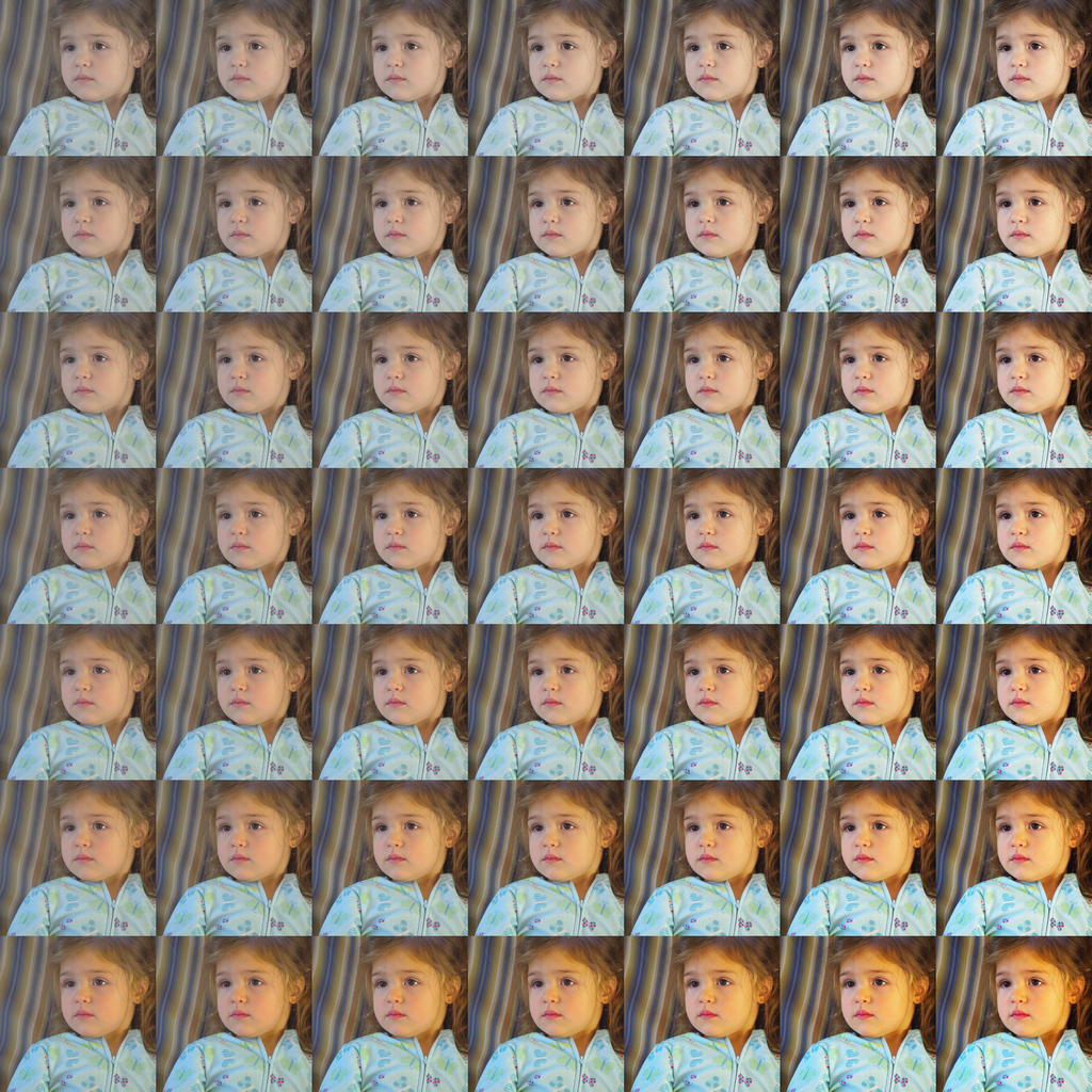 Natural mode
Personal views: I think it's still pretty clear that saturation +2 or +3 is off the table if you're not purposely trying to go for weird colors. +1 might be okay in natural mode. I'm drawn to the low-saturation high-contrast quadrant, particularly in bright mode.
If I look at just the extreme corners, top-right seems not only pretty nice, but the only one of the four that's even usable. Is this just some personal artistic bias of mine? The center-top and center-right images look pretty decent for extremes too. Actually, although I did declare it "off the table" just a paragraph ago, center-bottom isn't
too bad in natural mode (but veryf oompah-loompah-like in bright mode).
I also kinda like the overall Andy Warhol effect of the grid itself.

Anyway, I'm posting this in hopes that my little moment of obsession is useful to someone else, and also because I'd like to hear your thoughts.


 Similar Threads


