| Pentax/Camera Marketplace |
| Pentax Items for Sale |
| Wanted Pentax Items |
| Pentax Deals |
| Deal Finder & Price Alerts |
| Price Watch Forum |
| My Marketplace Activity |
| List a New Item |
| Get seller access! |
| Pentax Stores |
| Pentax Retailer Map |
| Pentax Photos |
| Sample Photo Search |
| Recent Photo Mosaic |
| Today's Photos |
| Free Photo Storage |
| Member Photo Albums |
| User Photo Gallery |
| Exclusive Gallery |
| Photo Community |
| Photo Sharing Forum |
| Critique Forum |
| Official Photo Contests |
| World Pentax Day Gallery |
| World Pentax Day Photo Map |
| Pentax Resources |
| Articles and Tutorials |
| Member-Submitted Articles |
| Recommended Gear |
| Firmware Update Guide |
| Firmware Updates |
| Pentax News |
| Pentax Lens Databases |
| Pentax Lens Reviews |
| Pentax Lens Search |
| Third-Party Lens Reviews |
| Lens Compatibility |
| Pentax Serial Number Database |
| In-Depth Reviews |
| SLR Lens Forum |
| Sample Photo Archive |
| Forum Discussions |
| New Posts |
| Today's Threads |
| Photo Threads |
| Recent Photo Mosaic |
| Recent Updates |
| Today's Photos |
| Quick Searches |
| Unanswered Threads |
| Recently Liked Posts |
| Forum RSS Feed |
| Go to Page... |
PentaxForums.com → Digital Cameras → Pentax DSLR Discussion
→
Modern LED Stage Lighting & photography problems
 |
| 2 Likes | Search this Thread |
| 07-29-2010, 02:21 AM | #121 |
|
Before leaving home I did a "quick and dirty" try with the DNG in
Didn't have time to fire up Lightroom in virtual machine and couldn't find Rawstudio (neither on my pc, nor in the repos to install it). No pictures this time, I didn't created jpegs and typing this on a different pc anyways. Gimp with Ufraw-plugin gave the best result (no wonder), both RT versions gave acceptable (but quite noisy) result. | |


| 07-29-2010, 10:02 AM | #122 |
 Before leaving home I did a "quick and dirty" try with the DNG in
Didn't have time to fire up Lightroom in virtual machine and couldn't find Rawstudio (neither on my pc, nor in the repos to install it). No pictures this time, I didn't created jpegs and typing this on a different pc anyways. Gimp with Ufraw-plugin gave the best result (no wonder), both RT versions gave acceptable (but quite noisy) result. in which case I am surprised that ACR (Adobe Camera RAW) 5.6 and similarly LightRoom 3 Beta2 didn't manage it so well on the RAW/DNG and PS Elements 7.0 and PhotoImpact 8.0 failed so miserably on selecting a white point on the T-shirt resulting in those psychedelic overall green images shown in post #105. Because of your good report - I tried UFRaw on the RAW/DNG file - the Auto White balance did not get me anything acceptable - it just balanced more toward blue. However using Manual White balance and the eye-dropper to select a white point did get me a reasonable looking result. Bear in mind this is the very first time I have ever touched UFRaw so I am a complete novice - eg: initially I couldn't even figure out a way to save a JPG copy of the result(s) to show - it does save a .ppm file which I assume is the non-destructive "script" of the UFraw editing. Then eventually I figured that opening GIMP from within UFRaw got the image into GIMP where I could save a JPG copy..... These are the results UFRaw 0.17 Auto WB -  not really acceptable - looks to me worse than the camera settings version. UFRaw 0.17 Manual WB selecting white point on T-Shirt - 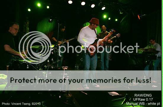 looks good BUT what is that extraneous green edge on the right side doing on the photo(s)? enhancements to get a post-able result from the UFRaw Manual WB version -  This is a a pretty good result - comparable to the others - although I did have to work at it a bit more than the Pentax DCU versions - but it was still relatively simple - enhance lighting (fill-flash and enhance shadows), brightness/contrast, sharpening - then added red in color balance, and a final step of Auto-Levels. To me by a very slight margin this is the best of the non-Pentax DCU versions so far (with exception of that mysterious green edge on the right - in the pp version because of the increase in brightness it is now white with a tinge of green)...... and in the Pentax DCU corrected versions I actually prefer the JPG version over the RAW/DNG converted version - Pentax DCU on RAW/DNG  Pentax DCU on JPG  | |
| 08-02-2010, 04:06 PM | #123 |
|
JPG compression can play quite significantly in how the photo is presented - as seen in the opening post #1 . I did an experiment to demonstrate this a bit more objectively and consistently. Opened a new image filled half with black and the remaining white. Then typed in the main colors of my photo editor (PhotoImpact 8) in each half and saved it as a PNG which is lossless. (for some reason PhotoBucket will no longer upload TIFF images):  Using my usual JPG compression level PI=70 (11Kb)  we can see degradation in the Magenta - due to the degradation in Red and Blue. Even at PI=100 (highest quality) (34Kb) there is degradation in the loss of vividness in the Red and Blue -  PS Elements seems to fare much better - PSE = 10 (12 is the highest quality) (28Kb)  But if we picked a file size that is similar to the PI=70 images above - it's between PSE=2 (15.4Kb)  and PSE=1 (10.6Kb) the lowest quality level!  So we can see that the "Quality" scale for the JPG compression bears no resemblance to each other between PhotoImpact 8 and PS Elements 7.0 - however PS Elements 7.0 is much more recent than my old version of PhotoImpact 8 (circa 2002) and I would expect that Elements 7.0 should have a better JPG engine and it does seem that way However even PSE=6 (18Kb) is not that great -  It is only by about PSE=7 (22.6Kb) that the image jumps to a better quality - (which PhotoImpact's JPG compression did not attain even at its highest quality)  Last edited by UnknownVT; 08-11-2010 at 11:46 AM. Reason: improved images | |
| 08-12-2010, 01:47 PM | #124 |
| JPG compression can play quite significantly in how the photo is presented - I did an experiment to demonstrate this a bit more objectively and consistently I have come to some degree of consolidation which I think is very appropriate in this thread - I shot some more at the venue with LED lighting the other night - and throughout the evening I thought I was getting good shots (I chimp). But later on when examining and processing them I thought most of the "good" shots kind of looked "soft" - this is probably due to the abundance of magenta shaded LED lighting - but nevertheless I was kind of concerned - Here's an illustrasion of what I mean -   top or left photo is with my standard processing in PhotoImpact 8 saved at my standard JPG quality level of PI=71 - one can see details in the face are kind of soft (file size 57Kb) So I re-did the processing using PS Elements 7.0 which saves JPGs retaining more details in magenta also has other features to preserve detail like Bicubic Sharper in resize and Enhance Sharpen (using remove lens blur to sharpen without emphasizing noise too much) - I then saved using the preview and found that Quality level 8 - High was needed to not show much difference between the original and the saved copy - PSE level 8 - this PSE image has a much bigger file size (88Kb) than the one from my normal editor (57Kb) but just doesn't show much significant improvement (if any) despite all the techniques I applied to preserve details. This is the lower photo or adjacent right (so one can compare them next to each other). I tried to show the details captured by using white or grey point on the guitar's pick-up to get to a more "natural" white balance -   on the top or left is what and got this from my already processed (PI) photo - this seems to emphasize the noise - which was quite acceptable in the magenta versions - but it does show that there is detail even in the post processed magenta version. Notice the file size is now 49Kb which is actually smaller than the file it was derived from at 57Kb Lower or adjacent right is going back to the original JPG and using Pentax DCU (Digital Camera Utility) 4.11 (based on SilkyPix) I used the grey point selection on the guitar pickup and got this result - which look quite a bit better - notice the detail in the face and elsewhere - once the magenta lighting isn't "obscuring" them - the file size is now a mere 39Kb yet visually this looks more detailed. To double-check and make sure this was not just an isolated case - I did a similar thing with another shot that I thought looked good when I took it -   on the top or left again is my standard processing with PhotoImpact 8 and my standard JPG quality PI=71 - but a different shade of magenta - this also seems to make the face look "soft" - (file size 41Kb) Lower or adjacent right - again I re-did the processing using PS Elements 7.0 which has multiple features to retain/preserve detail as outlined above and saved at a level where I could not see much difference between the preview and the image in the editor saved at PSE level 7. Again this PSE version doesn't look that much better in retaining/showing details - yet I applied every technique I knew how to preserve the detail in PS Elements - resulting in a file size of 84Kb Again using white and grey point to correct "white" balance   on the top or left - using my normal editor on the first image - this again really emphasizes the noise - file size 41Kb - but notice the details in the face and elsewhere revealed by removing magenta lighting. Lower or adjacent right - again I went back to the original JPG and used Pentax DCU 4.11 and selected grey point on the guitar pickup - less noisy and shows how much detail was captured once the magenta lighting was removed. File size 39Kb not quite as dramatically smaller - but nevertheless smaller for more visual detail....... So this shows that although JPG compression can play havoc with displaying any magenta photo - the images captured by the Pentax K-x actually still has a large amount of "underlying" detail - which can be revealed when the magenta lighting is "stripped away". I have found that the Pentax DCU (Digital Camera Utility) (based on SilkyPix) 4.11 (the software that comes with the K-x) seems to do the best even when compared to other processors that other posters have very kindly tried - and not only that, it seems that the Pentax DCU can get these results on not just RAW but on the JPGs - in fact I have a preference for the JPG based results. But my problem is that I actually liked the colors on the magenta versions ie: the first shot in each of the illustrating series despite the apparent loss of detail - so those are what I ended up using...... EDIT to ADD - Another thought - if the JPG of the magenta version seems to lose details - how come "stripping away" the magenta from that same JPG still can reveal the underlying detail? Although I have shown JPG compression can seem to degrade detail especially under magenta - but if there is real detail underneath the magenta - perhaps it could be a problem with the display devices we use, or even our eyes? Last edited by UnknownVT; 08-12-2010 at 04:10 PM. | |
| 10-31-2011, 11:34 AM - 1 Like | #125 |
|
I realize this is an old thread - but I thought I'd update it with my more recent attempts to mitigate both magenta (using only red and blue LEDs) and other overwhelming color washes - It just seemed more appropriate to do it in this old thread - rather than starting another thread and having to refer back to this thread anyway. LED stage lighting is now the norm (rather than the exception when I first started this thread) With the venues I frequent there is a tendency to use a lot of red and blues LEDs only to give that dreaded magenta - what to do?........ look at this shot: Original (resize and sharpen only)  any degree of JPG compression tends to make the pic look mushy/blurry. straight JPG process -  I did every thing I thought I knew how on the JPG to mitigate once saved to JPG - the shot would look blurred - even here it is not that great........ what to do, what to do? yes, I already hear the chorus - well if you shot RAW then you would not have the problem - well, you still would - because there was just NO green in the mix which means even with RAW one is still faced with the spectrum of red and blue only (no green) - please take a look earlier in this thread: and Posts #67, #100 in Kx in Use (  1 2 3 ... Last Page) 1 2 3 ... Last Page)and "Underdone" look of pentax RAW files... ( 1 2 3 ... Last Page)OK what can I do with a JPG then? Open original in PDCU (Pentax Digital Camera Utility) simply use select grey point on white panel of shirt to get - 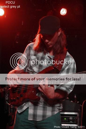 this is almost "normal" lighting - but obviously losing the feel of the actual lighting..... So re-add magenta and blue after brightness/contrast adjust - to get:  adding equal amount of magenta and blue until it looked about right. Original:  corrected all I could to mitigate magenta loss - ie: the best job I knew how -  PDCU grey point correction - 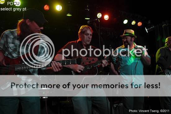 again "over-corrected to almost "normal" lighting - but with some obvious unbalance toward green in the background Re-add magenta and blue -  to get the original feel...... Original: 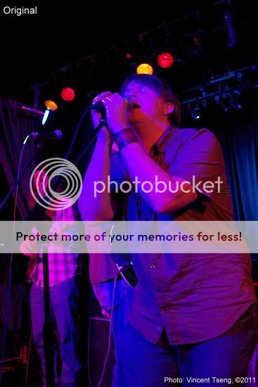 best processing I could to mitigate losses - 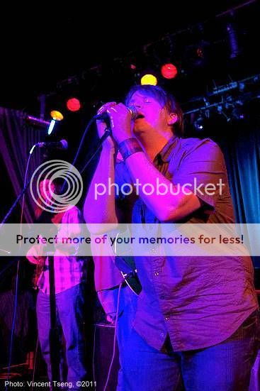 same technique: PDCU grey pt:  re-add magenta and blue -  Original:  best straight JPG process -  same technique: PDCU grey pt: 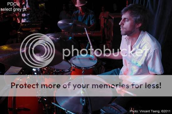 Re-add magenta and blue 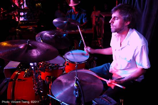 all the originals, PDCU grey pt versions and the "better" final versions have EXIF attached - caveat PhotoBucket sometimes seems to mysteriously drop metadata. Some are more successful than others - but they are all better than the original as-is versions - These days I now use two basic techniques - 1) the Lazy way - I open the photo in Ulead PhotoImpact 8 (a very old version - but my usual editor) - and see if I can mitigate the magenta color wash - by doing a combination of reducing saturation, then using color balance to add green until the photo seems to convey the scene without losing details due to the magenta, then adjust normally for brightness/contrast and sharpen. 2) the way described - use PDCU grey point to get a near "neutral" shot - stripped of the magenta wash - then open PhotoImpact process the shot normally then add magenta (and/or red or blue) to convey the scene as I saw it...... This example from Saturday: Original resize and sharpen only: 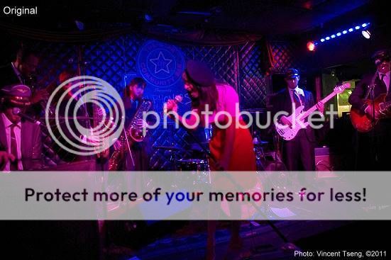 the main subject - center lead singer - looks blurry and out of focus when saved to (higher compression) JPG Use PDCU and grey pt on her blouse - 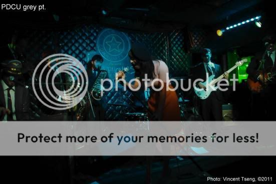 pic now looks "dark" because it is stripped of the main source magenta light. Enhanced by brightening - 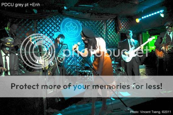 shows clearly the lead singer is not out of focus..... (surprise!  ) )Add back magenta and a bit of blue - to get -  I'd say quite an improvement over the original rendition...... EXIF attached. BUT in this case "proud" as I am over this result - I feel I actually got a better result by my "Lazy" way - simply reducing saturation then progressively adding green (ie: subtracting magenta) and got this - 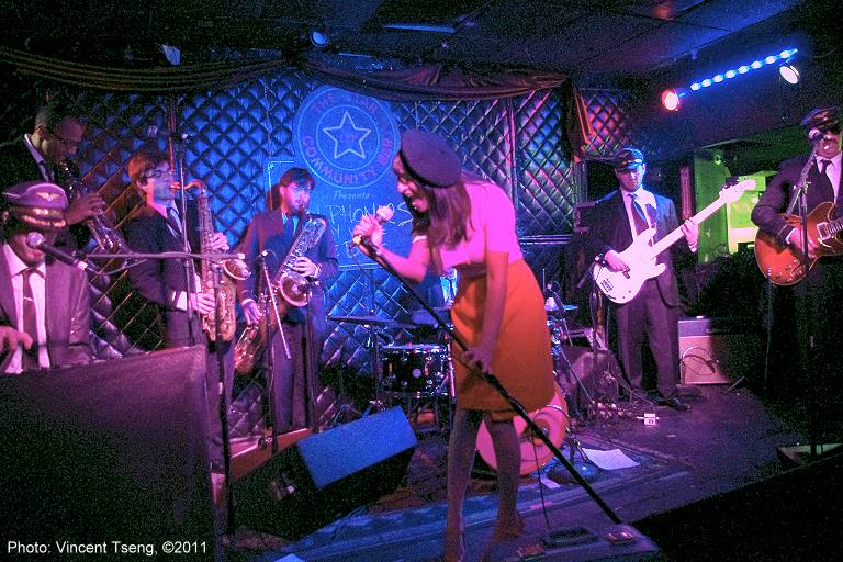 The PDCU pic has better rendition around her face - but this lazy version seems to show better (IMHO) Overwhelming color washes are also now far more prevalent and can be dealt with the same way - Just the other night - Original -  lots of red.... touch of blue JPG has real difficulties rendering red details. PDCU grey pt -  strips the red/magenta Up brightness - 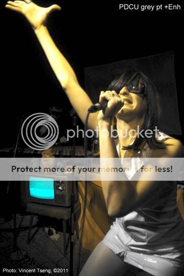 not quite neutral - but amazing - however this shot makes the colors look artificial almost like hand-tinted. Add magenta and red - gets this - 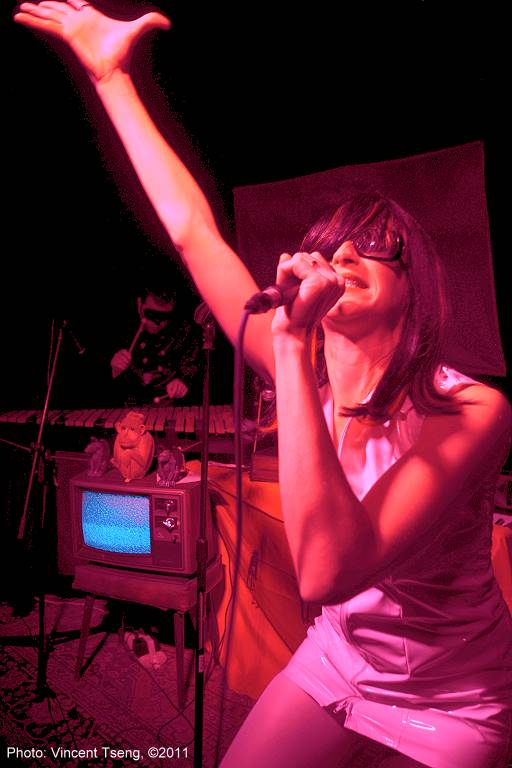 I'd say a substantial improvement over the original. Why another example?  this is complicated by the fact I tried to use weak flash to throw in some neutral white light - as one sees, I was not successful because of the overwhelming color light. PDCU grey pt - but I had to pick a spot on her dress in the shadow (back of her thigh) to account for the flash - so this corrected shot was kind of closer to what one saw....  Brightened to show the details:  pretty good as is - but again a bit artificial like hand-tinted look... Add back red and magenta - to get:  better. Last edited by UnknownVT; 10-31-2011 at 04:18 PM. | |
| These users Like UnknownVT's post: |

| 10-31-2011, 08:22 PM | #126 |
| Veteran Member  |
Nice work and writeup! I'm more fortunate than you in that LED is still the rare exception for me. I think I'd be resorting to desaturation if I were faced with the lighting you are.
|
| 10-31-2011, 09:48 PM | #127 |
| Nice work and writeup! I'm more fortunate than you in that LED is still the rare exception for me. I think I'd be resorting to desaturation if I were faced with the lighting you are. It may also depend on the type of venue - it's hard to imagine the (dark) jazz club I frequent using LED lighting - at least in the color wash or worse the psychedelic way. However most of the "popular" music clubs that cater to more modern pop/rock music have just about all turned to LED lighting around here - I think they are now not too expensive and using only RGB LEDs one can get virtually infinite number of colors - plus they can be pulsed to the music (even strobed) without detriment to the life span. Such is life - I have stopped whinging about these lights and have learnt to suck it up and treat it as a challenge and try to take good photos (in spite of the lights) - whereas at one time I really appreciated good lighting - I still do - but nowadays it seems to have gone by the way of color washes and strobing...... | |
| 02-05-2012, 01:05 PM | #128 |
|
Coming into this a little late but I'm glad this thread exists as unlike Mark, all I run into anymore are these damn lights and have had a hell of a time getting usable shots to the point I didn't think it possible to get a reasonable white balance out of them in post (in camera was a waste of my time to try and sort) and would just desaturate to b/w or some variant thereof due to the overly magenta/purple wash on everything. I'm going to read through your work see if I can adapt the techniques to my workflow (LR3) and post some results. Thanks again for your efforts in finding a workable solution to this lighting. | |

| 02-05-2012, 11:49 PM | #129 |
| Coming into this a little late but I'm glad this thread exists as unlike Mark, all I run into anymore are these damn lights and have had a hell of a time getting usable shots to the point I didn't think it possible to get a reasonable white balance out of them in post (in camera was a waste of my time to try and sort) and would just desaturate to b/w or some variant thereof due to the overly magenta/purple wash on everything. One of the threads I referred to earlier has some very interesting input: "Underdone" look of pentax RAW files... ( 1 2 3 ... Last Page)see Post #34 for a relatively simple, quick and easy method (Post #28 sets the scene) but a very interesting discussion with some very proficient processing examples starting with Post #15, then #25, #28, #29, #31, #34, #35 Please do let us know how you get on - especially if you find methods to mitigate strong LED lighting. Thanks, | |
| 02-08-2012, 11:01 AM | #130 |
|
Vincent, I've downloaded your 'challenge' files and played with them in both LR and PDCU4 and will post the links soon. I also have some of my work to show as well along with before and after screenshots in LR. I will also discuss my observations of working with these files in both applications at that time.
| |
| 02-09-2012, 11:25 AM | #131 |
| I've downloaded your 'challenge' files and played with them in both LR and PDCU4 and will post the links soon. I also have some of my work to show as well along with before and after screenshots in LR. I will also discuss my observations of working with these files in both applications at that time. be very interested in your findings - if you have a copy of the Pentax DCU (Digital Camera Utility) and have time it would be very educational to be able to compare LR and PDCU. PDCU - current version 4.34 Update
Thanks Last edited by UnknownVT; 02-09-2012 at 11:30 AM. | |
| 02-09-2012, 11:59 AM | #132 |
| Good stuff. Thank you so much for following up on this - be very interested in your findings - if you have a copy of the Pentax DCU (Digital Camera Utility) and have time it would be very educational to be able to compare LR and PDCU. PDCU - current version 4.34 Update
Thanks I will say that PDCU produces a better white balance than LR in quicker fashion. I sensed from your examples and from dvest as well that this might be the case, but in playing with them found it to be true. One thing I having the most difficulty with is getting certain colors even close to right. Guitars are especially hard. Being a musician, I know intimately finish hues and such, and balancing them out with skin tones and other items has proven difficult as such. | |
| 02-09-2012, 11:51 PM | #133 |
|
So here's some of my post work with the challenge files of Vincent's along with some before and after screenshots then with some of my own for further discussion. This is the DNG file processed in LR3:  Same file processed in PDCU 4: 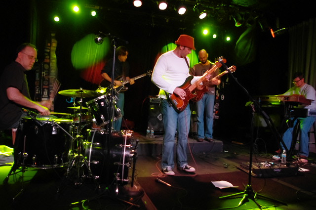 Now the Jpeg file in LR:  And same in PDCU4:  Some things to note (besides the white shirt...): The green spotlights, keeping the same or similar color in LR was difficult, PDCU had little issue. The blue jeans. Now balancing the jeans with the skin tones and the green spots was interesting. The Fender bass. This is the biggest problem for me regarding these lights or at least the use of the magenta/purple ones. Besides making a magenta glow on relevant points of interest (faces and such) that produces a false out of focus look, balancing the color across the board seems nigh impossible. Below are some examples of mine from the other night to illustrate this point. Note the guitar finishes. The Les Paul is a gold top and the Rickenbacker is fireglo: 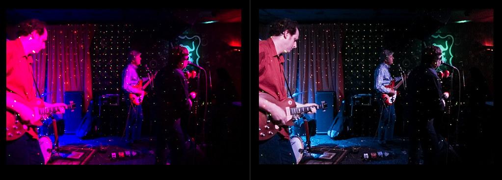 The Les Paul closer to it's actual finish, note the Rick 4001 to the left and the corner of the Rick 6 string. Both should be fireglo (a reddish sunburst): 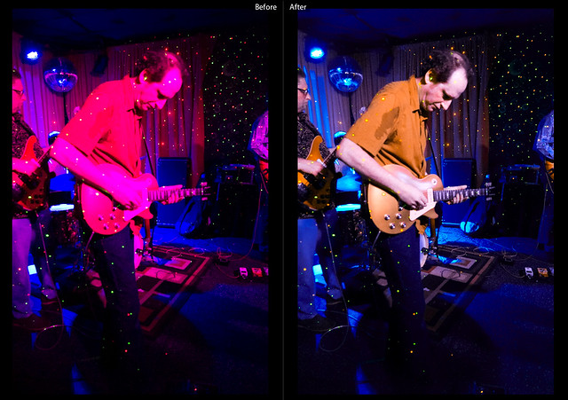 And a closer shot of the Rick 6 string in all it's fireglo glory: 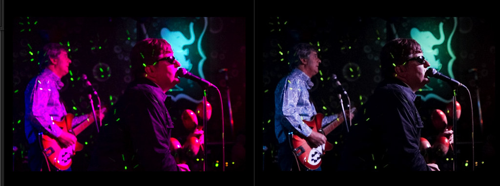 I may be asking too much of everything concerned to get something approximating normalcy, and I have some shots below that prove everything (camera, PP apps, my color vision) is certainly very capable of managing the task at hand.  For the above shot I used the microphone (Shure SM56) as my point of reference for neutral. It was pretty darned close! It could very well be that the lighting was more subdued and hence easier to manage color balancing, but the lighting rigs looked very similar and I suspect they were the same though maybe the second club's setup included more white and such. I'd only been there the one time so I had little to go on in that regard. Most of the shots are at 25000ISO with a 2.8 Tamron zoom, the last one being 12600ISO. I created a preset in LR as a starting place for this type of lighting. Mostly it involves the white balance and the camera calibration and then I tweak the hue/saturation/luminance of various colors as they might influence the scene. I want to add this point: I do not like the color of these particular LED lights, matter of fact I don't like overly strong variants of RGB in hot lights as well. I used to have problems shooting film with overly red spots at one club I frequented (since gone LED...). So to sum up my feelings about all of this; my efforts are in abating the magenta/purple cast as much as possible and restoring some degree of average to the color balance as a whole and that being said, I'm not so sure it's possible. I may have to just find some happy medium that involves the original color spectrum, as you have Vincent with the shots of the girl singer in the vinyl dress. I will of course buck this to the end though... ;-! | |
| 02-09-2012, 11:59 PM | #134 |
| Indeed I do (4.34) and unfortunately running it on OSX is probably the most frustrating of all, I can't believe the product was released with such a poor functionality. It is unbelievably slow! The main thing I had to figure out is NOT using PDCU's own Browser (which I found a pain)- instead going straight to the Laboratory - and opening a photo file using the operating system's regular file manager - Windows Explorer - I then made the folder where I usually store my Pentax photos a Favorite - this way I by-pass the PDCU Browser altogether I will say that PDCU produces a better white balance than LR in quicker fashion. I sensed from your examples and from dvest as well that this might be the case, but in playing with them found it to be true. One thing I having the most difficulty with is getting certain colors even close to right. Guitars are especially hard. Being a musician, I know intimately finish hues and such, and balancing them out with skin tones and other items has proven difficult as such. even though you found PDCU really slow on your computer. Using the quick and easy grey-point method - unless the lighting is exactly the same all over - then many objects are still likely to have different color balances - to correct for a specific object (like guitars) one may have to somehow isolate/select the object and do white balance on that separately. Using my "challenge" JPG sample: Original (no correction)  EXIF still attached. PDCU Grey-Point on T-Shirt - 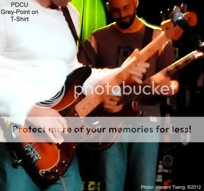 PDCU Grey-Point on bass-guitar pick-guard's white edge:  The second pic with the correction using the T-shirt looks better because the rest of the pic looks kind of right - but the third pic with correction of the pick-guard's edge may be more correct for the bass guitar (look specifically at the fretboard - the t-shirt correction looks too red - whereas the pick-guard edge correction looks about right, although the tail-piece saddle looks too blue) But I think you get the idea - I would find it pretty difficult to mask the right areas to paste in the just the bass guitar into a pic corrected on the T-shirt - but if your audience is going to be fussy about the correctness of the a guitar's finish - then it may be worth the effort However if the person is supposed to be "modelling" the guitar then I would obviously really avoid trying to shoot in such extreme lighting in the first place.  Last edited by UnknownVT; 02-10-2012 at 12:46 AM. | |
| 02-10-2012, 12:24 AM | #135 |
| So here's some of my post work with the challenge files of Vincent's along with some before and after screenshots then with some of my own for further discussion. Now the Jpeg file in LR: And same in PDCU4: Some things to note (besides the white shirt...): The green spotlights, keeping the same or similar color in LR was difficult, PDCU had little issue. ........ So to sum up my feelings about all of this; my efforts are in abating the magenta/purple cast as much as possible and restoring some degree of average to the color balance as a whole and that being said, I'm not so sure it's possible. I may have to just find some happy medium that involves the original color spectrum, as you have Vincent with the shots of the girl singer in the vinyl dress. I will of course buck this to the end though... ;-! you can read my meager input on correcting specifically for guitars with an example in that post. Interesting that your version of the PDCU corrected JPG seems different from mine - can you remember where on the T-shirt you selected the Grey-point? Mine was on the shadow part of the shirt under the right breast area (same for my previous full-frame examples) BTW - those lights in the back were not green spots but regular incandescent white - the correction to magenta is what made them green (look at the original uncorrected JPG) The main problem with LED lighting is that they use separate RGB LED to generate their colors - so they can be "infinitely" variable - and each lighting person's "white" is likely to be different - last night for example the front lighting was set to white - but overall even though it did looks white to me - it was actually quite blue - especially when compared to the gel filtered incandescent lights in the back. Because of the separate RGB LEDs the spectrum is also very spiky/peaky - not quite, but almost discontinuous - with spikes/peaks at each of the discreet RGB LED - I think this could make a difference, especially in color balance corrections. In clubs of any size - most will probably have mixed lighting and use different colors on different parts of the stage - so I think to try to balance things so that the faces are reasonable and giving guitar finishes the equivalent of studio lighting - is probably nigh on impossible with a single correction point - I would imagine having to do multiple isolated/selected corrections - but I am impressed that we can even get what looks reasonable normal lighting out of these magenta lighting pics. Last edited by UnknownVT; 02-10-2012 at 10:47 AM. | |
|
| Bookmarks |


| Tags - Make this thread easier to find by adding keywords to it! |
| camera, compression, details, dslr, file, image, images, jpg, level, light, photography, quality |
| Top Liked Posts |
1  Post #137 by UnknownVT Post #137 by UnknownVT |
| 1 Post #125 by UnknownVT |
 Similar Threads
 | ||||
| Thread | Thread Starter | Forum | Replies | Last Post |
| Need help with exposure problems and snow photography problems, urgent please respond | montezuma | Photographic Technique | 7 | 02-24-2008 05:43 PM |
| First attempt at Stage Photography - Stage Musical Content | -spam- | Post Your Photos! | 7 | 05-29-2007 05:27 PM |
| Stage Photography with K10D | ghegde | Digital Processing, Software, and Printing | 16 | 03-16-2007 10:11 AM |
| where did you guys learn photography and lighting? | zimzum | Digital Processing, Software, and Printing | 17 | 02-02-2007 04:27 PM |
| K100D indoor lighting problems? | slip | Pentax DSLR Discussion | 8 | 10-30-2006 01:57 PM |


