| Pentax/Camera Marketplace |
| Pentax Items for Sale |
| Wanted Pentax Items |
| Pentax Deals |
| Deal Finder & Price Alerts |
| Price Watch Forum |
| My Marketplace Activity |
| List a New Item |
| Get seller access! |
| Pentax Stores |
| Pentax Retailer Map |
| Pentax Photos |
| Sample Photo Search |
| Recent Photo Mosaic |
| Today's Photos |
| Free Photo Storage |
| Member Photo Albums |
| User Photo Gallery |
| Exclusive Gallery |
| Photo Community |
| Photo Sharing Forum |
| Critique Forum |
| Official Photo Contests |
| World Pentax Day Gallery |
| World Pentax Day Photo Map |
| Pentax Resources |
| Articles and Tutorials |
| Member-Submitted Articles |
| Recommended Gear |
| Firmware Update Guide |
| Firmware Updates |
| Pentax News |
| Pentax Lens Databases |
| Pentax Lens Reviews |
| Pentax Lens Search |
| Third-Party Lens Reviews |
| Lens Compatibility |
| Pentax Serial Number Database |
| In-Depth Reviews |
| SLR Lens Forum |
| Sample Photo Archive |
| Forum Discussions |
| New Posts |
| Today's Threads |
| Photo Threads |
| Recent Photo Mosaic |
| Recent Updates |
| Today's Photos |
| Quick Searches |
| Unanswered Threads |
| Recently Liked Posts |
| Forum RSS Feed |
| Go to Page... |
PentaxForums.com → Camera Help Central → Pentax Articles → Post-Processing Articles
→
Colour-Accurate Conversion of Negatives using GIMP 2.10 and RawTherapee 5.8
 |
| Search this Thread |
| 10 Likes | #1 | ||
| |||
| Views: 11,199 | |||


BigMackCam | |
 | View full profile |
| Contact via private message | |
| Find other posts by BigMackCam | |
| Find threads started by BigMackCam | |
| Find threads in which BigMackCam has posted | |
| These users Like BigMackCam's post: |

| 02-18-2022, 04:24 PM - 1 Like | #2 |
|
Thanks for all your hard work, BigMakCam. I am definitely will go through your tutorial. (No frim date yet.). One question: the LED light table which I have has ~10000 temperature grade. How do you evaluate my chances to reproduce good color with it? (As I understand your source is ~5000).
| |

| These users Like jumbleview's post: |
| 02-18-2022, 04:36 PM | #3 |
| Digitiser of Film   Original Poster |  Thanks for all your hard work, BigMakCam. I am definitely will go through your tutorial. (No frim date yet.). One question: the LED light table which I have has ~10000 temperature grade. How do you evaluate my chances to reproduce good color with it? (As I understand your source is ~5000).  Is your light table one of the many inexpensive "LED tracing panels" on the market? If so, I have one of those too  They work fine for B&W, but aren't ideal for colour negatives. It's not just the colour temperature, but more-so the CRI of the light that may be problematic. I haven't even tried my cheap panel with colour negatives, though I may - just for comparison. The best thing you can do is give it a shot! Frankly, it doesn't matter all that much if the colours aren't "perfect" - they just have to be good enough to please you. The camera's white balance should be sufficient to deal with the colour temperature of the panel, but after correction of the film base colour cast and subsequent conversion to a positive image, you may find that certain colours are under- or over-saturated to some extent. If it's really pronounced, you might be able to address this in GIMP's Colour -> Hue Saturation tool... but, as I say, give it a try. You might be pleasantly surprised. They work fine for B&W, but aren't ideal for colour negatives. It's not just the colour temperature, but more-so the CRI of the light that may be problematic. I haven't even tried my cheap panel with colour negatives, though I may - just for comparison. The best thing you can do is give it a shot! Frankly, it doesn't matter all that much if the colours aren't "perfect" - they just have to be good enough to please you. The camera's white balance should be sufficient to deal with the colour temperature of the panel, but after correction of the film base colour cast and subsequent conversion to a positive image, you may find that certain colours are under- or over-saturated to some extent. If it's really pronounced, you might be able to address this in GIMP's Colour -> Hue Saturation tool... but, as I say, give it a try. You might be pleasantly surprised.If you're looking for the best possible reproduction of the film's original colour character, I'd recommend investing in a light panel with ~5,000K colour temperature and a CRI of at least 90%, preferably 95%+. Recently-manufactured Kaiser panels are excellent, but there are some LED video lights that produce very good quality and brighter illumination at much lower prices... Last edited by BigMackCam; 02-19-2022 at 01:31 AM. |
| 02-19-2022, 02:07 AM - 1 Like | #4 |
|
Thanks for an exemplary tutorial, Mike. Is your light table one of the many inexpensive "LED tracing panels" on the market? If so, I have one of those too They work fine for B&W, but aren't ideal for colour negatives. It's not just the colour temperature, but more-so the CRI of the light that may be problematic. I haven't even tried my cheap panel with colour negatives, though I may - just for comparison. The best thing you can do is give it a shot! I've been using one of the cheap LED tracing panels and it works fine, although it does need a diffuser placed on top of it to keep the quite large individual LEDs from showing through. And I'm probably less concerned about colour precision than others, because I'm not really interested in whether or not my "scans" demonstrate the character of the film used. I just want to end up with snaps that I like. Hopefully my latest roll of colour negatives should be back from the lab today so that I can give your technique a try, slightly modified for Photoshop rather than GIMP. Although, thanks to Storm Eunice, the post might have been delayed. So although the negs were posted back to me yesterday 1st class, there's no guarantee they'll arrive today. Thanks, Eunice! | |
| These users Like Dartmoor Dave's post: |
| 02-19-2022, 02:41 AM | #5 |
| Digitiser of Film Original Poster | Thanks for an exemplary tutorial, Mike. I've been using one of the cheap LED tracing panels and it works fine, although it does need a diffuser placed on top of it to keep the quite large individual LEDs from showing through. And I'm probably less concerned about colour precision than others, because I'm not really interested in whether or not my "scans" demonstrate the character of the film used. I just want to end up with snaps that I like. Hopefully my latest roll of colour negatives should be back from the lab today so that I can give your technique a try, slightly modified for Photoshop rather than GIMP. Although, thanks to Storm Eunice, the post might have been delayed. So although the negs were posted back to me yesterday 1st class, there's no guarantee they'll arrive today. Thanks, Eunice! As for Storm Eunice... I've had to miss out on my morning shower today and make do with an all-over sponge bath in slightly-brownish water  Our water pressure is way down, as Northumbrian Water carried out some emergency diversion works due to storm damage. In the scheme of things, we're lucky to have got off so lightly... Our water pressure is way down, as Northumbrian Water carried out some emergency diversion works due to storm damage. In the scheme of things, we're lucky to have got off so lightly...
|
| 02-19-2022, 02:54 AM - 1 Like | #6 |
|
Out of interest, Mike, what profile are you using for the DSLR that you're doing the scanning with? The embedded profiles in Pentax DSLRs tend to be more about producing a "Pentax look" rather than strict colour accuracy, so that might have an impact on this process. Perhaps you could photograph a colour check card illuminated only by the light of the LED panel that you're using for scanning, then create a custom .dcp for the DSLR purely for this job? That should take the colour accuracy up yet another notch. In fact, come to think of it, I should really be trying that myself.  | |
| These users Like Dartmoor Dave's post: |
| 02-19-2022, 03:23 AM | #7 |
| Digitiser of Film Original Poster | Out of interest, Mike, what profile are you using for the DSLR that you're doing the scanning with? The embedded profiles in Pentax DSLRs tend to be more about producing a "Pentax look" rather than strict colour accuracy, so that might have an impact on this process. Perhaps you could photograph a colour check card illuminated only by the light of the LED panel that you're using for scanning, then create a custom .dcp for the DSLR purely for this job? That should take the colour accuracy up yet another notch. In fact, come to think of it, I should really be trying that myself. Per step 10 in the tutorial, "I set the Colour Management Input Profile to Camera Standard". There seems to be quite decent consistency in RawTherapee's Camera Standard profiles. They're fairly neutral and accurate across brands and models, at least for the cameras I own (they're rather like Adobe Standard profiles in Lightroom / ACR). This doesn't seem to be the case with some of the Auto-Matched profiles, which is why I stick with Camera Standard. A custom single-illuminant .dcp produced at the same colour temperature and light quality as the light source should be superior, at least theoretically - but if using such, I think you'd want to uncheck the tone curve, base table, look table and baseline exposure boxes in RT's Colour Management Input Profile section, so that only the basic colour matrix is applied... plus, of course, you'd still set the linear / standard tone curve in the Exposure section. I'm not entirely certain, but I've a hunch that the Colour Toning tool adjustments are applied after the input profile and tone curve in order of processing. As such, a basic colour matrix and linear tone curve make sense at this stage of the workflow, in support of the film base colour cast removal. The Camera Standard profile seems to work well enough, but your suggestion definitely merits some thought and experimentation Last edited by BigMackCam; 02-19-2022 at 04:03 AM. |
| 02-19-2022, 07:48 AM | #8 |
| Digitiser of Film Original Poster | the LED light table which I have has ~10000 temperature grade. How do you evaluate my chances to reproduce good color with it? I've been using one of the cheap LED tracing panels and it works fine, although it does need a diffuser placed on top of it to keep the quite large individual LEDs from showing through. And I'm probably less concerned about colour precision than others, because I'm not really interested in whether or not my "scans" demonstrate the character of the film used. I just want to end up with snaps that I like. I must try mine and compare the results to the Kaiser, purely for curiosity's sake. As with most things in our hobby, some folks can become too pre-occupied with achieving near-perfection, when "good enough" really is good enough in most situations. The additional costs of near-perfection are often difficult to justify.  With the tracing panel, the mid-tones have a cooler, slightly bluey-green look to them. There is a significant difference, IMHO... but the results aren't at all bad, and they're most-certainly useable. Just for kicks, I adjusted the colour balance of the tracing panel shot slightly toward magenta and yellow. I didn't take a great deal of time over this - it was just a quick adjustment, based on my interpretation of the colours. Now the comparison looks like this:  It's still far from identical, but definitely getting closer. If I'd spent longer tweaking the colour balance, I could probably have improved it further still. Perhaps a tad less yellow... I think a decent high CRI panel or video light and diffuser is a good investment - but in lieu of that, I say "use what you have". The results are, in either case, subjective to some extent, and if all you're aiming for is a good-looking image rather than best possible colour accuracy, both the high CRI and cheap tracing panels work well enough - and you can always tweak the colour balance a little after conversion to suit personal tastes Based on these results, I suspect David's suggestion of a custom .dcp profile - where the light panel is used to illuminate the colour chart - could work very well... Last edited by BigMackCam; 02-19-2022 at 02:09 PM. |
| 02-19-2022, 12:49 PM | #9 |
| Digitiser of Film Original Poster | Out of interest, Mike, what profile are you using for the DSLR that you're doing the scanning with? Camera Standard A conversion takes place based on profiled information from either of three sources, in decreasing priority: The dcraw_matrix field in the camconst.json data file available in RawTherapee's installation directory; Hard-coded values provided by the dcraw library embedded within RawTherapee; The raw file itself. There is one exception: when a DNG raw file has a ColorMatrix2 Exif tag and was not generated by the Adobe DNG Converter, the matrix from the Exif data is prioritized above all others. Applying an input profile is nothing more than a linear algebra operation on the image data. The input profile consists of a square matrix (3×3 for RGB based sensors) that is multiplied with the pixel vectors of camera-native RGB values. These matrices are specifically calibrated for a specific illuminant (D65, i.e. 6500K) and provide the most accurate color reproduction if the scene illuminant matches the calibration illuminant. However, the color accuracy is usually still good enough for very different light sources and white balances. The benefit of a matrix profile over other profiles (e.g. table-based DCP or ICC profiles) is its linearity. Because no non-linear functions are applied to the data, the scene-referred linearity of the light intensities is kept intact. This is important for several image processing operations and for example when exporting for further editing (e.g. HDR applications usually require a predictable linear color response). Based on the quoted paragraphs, when using Camera Standard profile the most accurate results would be achieved using a light source with 6500K colour temperature, so my Kaiser panel is a bit off at 5300K... however, as the text suggests, it should be "good enough" for other temperatures. 5300K isn't too different from 6500K... Indeed, even my tracing panel at 8979K, whilst some way off, isn't wildly different (I believe the light's CRI is more of an issue than its colour temperature). Of course, now I wish I had one of the popular CRI 95+ LED video light panels with adjustable colour temperature. I'd really like to see how the results from one of those, set to D65, would differ compared to my Kaiser panel @ 5300K, when using the Camera Standard profile... but I'm not about to spend £50 - £60 just to try it The cheaper and probably better option - the one I'll try when I have time - is your excellent suggestion of creating a custom profile using the panel as illuminant for the colour chart... but then, with angled side-lighting from the panel, flat field inconsistency of target illumination isn't taken into account (sigh...) Nothing's easy, is it?  Maybe I'll just trust the results I'm getting thus far as being "close enough" Maybe I'll just trust the results I'm getting thus far as being "close enough" Last edited by BigMackCam; 02-19-2022 at 03:00 PM. |
| 02-19-2022, 02:26 PM | #10 |
| Digitiser of Film Original Poster |
I've done a bit more testing, and with the tracing panel shot I get slightly (but only slightly) "better" results by setting RawTherapee's Input Profile to Auto-Matched Camera, with the Base Table box checked and all others unchecked - but please bear in mind, this is with my camera - in this test, a Pentax K-3. The results with other cameras may (and probably will) differ. The potential problem with these Auto-Matched Camera profiles - and a major reason why I'm not keen on them in this application - is that they're user-submitted and designed for "general use" - a vague term not defined anywhere in the RT documentation. "General use" doesn't necessarily mean they're colour-accurate, or more colour-accurate than the simple Camera Standard matrices. There is, IMHO, more opportunity for variance between camera models using these bundled matched profiles (for example, they may or may not be dual-illuminant profiles, and they may or may not be designed to accurately - rather than artistically - reproduce certain colours... indeed, they may not even have been created in a consistent, well-controlled manner by the various submitting users). Hence, my preference for now is still to use the Camera Standard profile, which should be more predictably consistent (if not perfectly so) between camera models. But, for those using a light panel with a very high or low (most likely high) colour temperature and unknown CRI, the Auto-Matched Camera profile (if available) with Base Table selected is worth trying as an alternative... From RawTherapee's documentation on the Auto-Matched Camera profiles: Auto-Matched Camera Profile RawTherapee allows you to use custom DCP (Adobe DNG Camera Profile) or ICC (International Color Consortium) color input profiles. These can be tailor-made to specific scene conditions to provide the most accurate color rendition, or to generally improve upon the standard matrix profiles available. RawTherapee ships multiple high-quality, custom-made, general-purpose DCP profiles that can be automatically matched when an image from a supported camera is opened. The available profiles are found in the dcpprofiles folder in your installation directory. It is possible to add your own DCP or ICC profiles to this folder. Matching only works on the exact name of the camera (case-sensitive) as is present in the image metadata. Most provided DCP profiles are dual-illuminant (see below) and some provide tone curves and looks as well. New profiles are added exclusively based on user submission. Last edited by BigMackCam; 02-19-2022 at 02:47 PM. |
| 02-19-2022, 03:50 PM | #11 |
| From RawTherapee's documentation on the Auto-Matched Camera profiles: It's all way over my head at this point, Mike. I'm a literature and philosophy guy, not a mathematics and engineering guy. Reading through those documentation excerpts reminds me why every time I've given RawTherapee a try I've ended up going back to Camera Raw. | |
| 02-19-2022, 04:07 PM | #12 |
| Digitiser of Film Original Poster | It's all way over my head at this point, Mike. I'm a literature and philosophy guy, not a mathematics and engineering guy. Reading through those documentation excerpts reminds me why every time I've given RawTherapee a try I've ended up going back to Camera Raw. Please don't be put off, David... you can treat RawTherapee as a black box, at least for this exercise - if you should decide to try it. For our purposes, it's merely a raw-to-TIFF converter like ACR, and a vehicle for removing the film base colour cast using the Colour Toning tool... nothing more - at least in this case. If ACR offered the Colour Toning tool, I'd suggest you use that instead. Alas, that's not the case... For what it's worth, I'm only discovering much of what RawTherapee can do quite recently. Until these last couple of weeks or so, my knowledge and use of it was very basic. The thing is, 99% of the time, most folks will only need 1% of what it can do. It's just that all the other clever stuff that's normally hidden in other raw converters is exposed for those who like to fiddle It's a geek's dream, really...
|
| 05-13-2022, 12:52 AM - 1 Like | #13 |
| I recently posted my personally-developed method for converting camera-digitised colour film negatives to positives using GIMP and RawTherapee, but this was an overview and largely reliant on an off-site YouTube video I created. I felt a more-thorough and descriptive tutorial was warranted - hosted entirely on PentaxForums, without reliance on external video (especially given my poor video production skills )... so here it is! ----- Colour-Accurate Conversion of Camera-Digitised Film Negatives using GIMP 2.10 and RawTherapee 5.8 There are numerous software methods available to assist with conversion of camera-digitised colour negatives - commercial plug-ins for Lightroom and Photoshop such as Negative Lab Pro, Negmaster and ColorPerfect / ColorNeg, as well as integrated tools in open source raw converters and image editors like Darktable, RawTherapee and DigiKam. I'm sure there are others I've not listed or discovered yet. Then, of course, it's possible to manually invert negatives in editors such as Photoshop and GIMP, and fine-tune colours using curves, colour balance and other adjustments. There are plenty of tutorials on the web for this, employing a variety of different methods. Of these, I've personally tried RawTherapee's "Film Negative", Darktable's "Negadoctor", and DigiKam's "Color Negative" tools. I've also used the commercial Negative Lab Pro plug-in for Lightroom. Finally, I've carried out manual conversions in GIMP. RawTherapee, Darktable and DigiKam's negative tools can work well, but the results are inconsistent and highly dependent on the elements within the captured negative. Colours will sometimes look OK, other times not, and in many instances you need to find neutral tones within an image to help the tools adjust for white balance and colour accuracy - the problem being, such neutral tones don't occur in every photo. Negative Lab Pro is an excellent tool, and usually results in good-looking colours and tones... but it's not perfect. Skies will sometimes look unnaturally turquoise instead of blue, reds may look over-saturated, and shadows can have an occasional colour cast that needs to be dealt with after conversion. My biggest bug-bear with NLP is that some of its inner workings and adjustments are hidden behind poorly-explained presets that don't work consistently for every photo, or even every photo from the same roll - so you may have to go through them one by one to find the best for each individual photo. Complaints aside, NLP is an excellent tool, and it's very quick to use - so for those who want good results fast and with a minimum of effort, I recommend it. Of course, you need to own a copy of Lightroom or subscribe to one of Adobe's plans in order to use it, as it's a plug-in - and it's a commercial product, priced at USD $99 (at the time of writing). Manual conversion in image editors such as GIMP and Photoshop works fine for inversions, but removal of the inevitable colour cast from the film base is always problematic. Curves adjustment of the R, G and B channels is perhaps the most common approach, and it can work reasonably well, but the results never seem to be spot-on - and the entire "colour character" of the film can be lost with such adjustments, so even if a nice-looking image is produced, it may not accurately represent the film stock used. For all the difficulties with manual conversion, I very much like the complete control it provides. I also like the fact that GIMP - an open source application - is available for Windows and Linux, since I run Windows 11, Windows 10 and Ubuntu 20.04 LTS environments and like to mirror the tools I use in all three where possible. GIMP is even available for Mac, so in the (unlikely, but not impossible) event that I should end up with one of those at some future date, I'm covered. A few weeks ago, I decided to experiment further with GIMP, to see if I could improve upon the various well-documented manual approaches to colour negative conversion. The biggest issue with all of these is colour inaccuracy - specifically, the colour cast resulting from the film base. In negatives, this is typically a strong orange, red or magenta cast, which - after inversion of the tone curve - results in a blue, cyan or green cast in the positives. I tried a variety of approaches to deal with the colour cast in negatives: - Colour balance slider adjustments - R, G and B curves adjustments - Sampling the border colour and applying a layer mask in "Divide" mode - Sampling the border colour and applying a layer mask in "Difference" mode - Sampling and inverting the border colour and merging a monotone copy of the image in that colour with the original based on luminosity - All manner of other masks in different modes A couple of these showed some promise, but all were ultimately unsuccessful. Having reached the limits of my skills with GIMP, I decided to look elsewhere for other methods of removing the colour cast. Since I use RawTherapee as a raw converter when loading DNG files into GIMP, I began to examine the various colour adjustment tools it provided. After a good deal of experimentation, I discovered that the Colour Toning tool - when set to "Colour correction regions" mode - works very much like coloured acetates or a dichroic head in traditional darkroom wet-printing. By sampling the border's RGB values and using the Colour Toning to equalise these (i.e. the same value for R, G and B), the colour cast is removed from the negative. The adjusted image can then be transferred to GIMP for inversion, brightness and gamma adjustments, leading to a tint-free positive that more-accurately reproduces the captured scene according to the film's own colour characteristics. There are a few additional factors in ensuring good colour. RawTherapee must be set to use the correct colour input profile and a flat tone curve, with no clipping of out-of-gamut colours or recovery of highlights. Lastly, I find it best to add a little saturation to the negative, as the neutral colour profile and tone curve can otherwise result in slightly bland colours. This is an optional step, but recommended. Before the conversion workflow in GIMP and RawTherapee, it's essential to digitise negatives in the correct way. When digitising: - set the camera to DNG file format - set custom white balance against the naked light source (with diffuser, if applicable) which is used to illuminate negatives - frame the negative to include some of the border (the importance of this will become clear later in the article) - use the lowest available ISO setting (but not extended) to minimise colour noise in the captures - set the camera's exposure so that the tonal range of the exposed and unexposed film (image and border) are more-or-less central in the histogram - use the camera's highlight alert feature to show areas of over-exposure, and adjust exposure to ensure there are no "blinkies" in the photo and border (sprocket holes, if included, can and probably will be over-exposed) - use the same exposure settings for all frames in the same roll of film Let's now step through an example conversion. The negative used for this was digitised using a Pentax K-5 and D FA100/2.8 Macro WR lens, mounted to a copy stand, with an EFH Essential Film Holder and Kaiser 2453 Slimlite Plano light panel. The K-5's custom white balance was set against a shot of the Kaiser light panel prior to digitising the negative. Colour Film Negative to Positive Conversion - EXAMPLE 1. In GIMP, I navigate to and open the raw negative to be converted: 2. GIMP automatically loads the RawTherapee plug-in and selected image file: 3. I click the Exposure tab: 4. I un-check the Clip out-of-gamut colours check-box: If this is left checked, RawTherapee may alter the representation of colours in the file to match the output profile. Whilst this would be beneficial for normal raw image processing, here it might cause colour inaccuracies further downstream in the conversion. 5. I un-check the Highlight reconstruction check-box: As with step 4, this ensures that RawTherapee doesn't attempt to alter the representation of captured colours. In a well-exposed negative capture, this should have no effect, but it's best to un-check it anyway. 6. I set Saturation to +10: Setting Saturation is an optional step that's also available in Negative Lab Pro where it's called "pre-saturation" (because it occurs before the conversion to positive). I've found that a value of +10 is enough, but depending on the film stock and quality of the developed negatives, I may go a little higher (up to +15 or even +20), a little lower (perhaps +5), or leave it set to zero and tweak saturation in the final positive. It depends on the individual film... but a value of 10 seems to work well across the negatives I've processed thus far. 7. I set Tone Curve 1 & 2 to Linear / Standard: With a Linear / Standard tone curve, RawTherapee doesn't modify the captured colours, but simply represents them as the camera saw them. In normal raw processing of digital images, this would result in very flat-looking output, but for negative conversion it's an essential step in achieving colour accuracy, prior to and post the film base colour removal. 8. I click the Colour tab: 9. I set White Balance Method to Camera: By setting the camera's cusom white balance to the light source and the white balance method in RawTherapee to Camera, the true colour of the negative is represented. The image on screen will have a noticeable colour cast according to the film base, and will typically be orange, red or magenta in hue (though other hues are possible). 10. I set the Colour Management Input Profile to Camera Standard: Camera Standard is a relatively simple, neutral profile that's quite consistent between different camera models. The resulting colours are an honest and generally-accurate representation of those captured by the camera. This is rarely the best profile to use in normal raw processing of digital images, but for reproduction of negatives at this stage of the workflow and ahead of further adjustments, it's ideal. 11. I view the image at 1:1 reproduction: 12. I navigate to an area of the film border: 13. I select the Lockable Colour Picker tool: The Lockable Colour Picker allows me to select a small area of an image and see the R, G and B channel values for the averaged colour in that area while I continue to work on it. As adjustments that affect colour are made, the R, G and B values will change accordingly. 14. I place the Lockable Colour Picker on the film border: The Picker's circle is positioned so that it doesn't cover or touch anything but the border area. The average R, G and B values for the selected area are displayed. In the next steps, I will adjust the colour of the image so that these values are close to equal. 15. I enable the Colour Toning tool: 16. I set Colour Toning Method to Colour correction regions: This is the most effective and easiest to use tool for removal of the film base colour. As previously mentioned, it appears to work in a similar manner to colour acetates or a dichroic head in traditional darkroom wet-printing. It's a clever tool that alters colour according to the American Society of Cinematography's Color Decisions List - which is worth reading up on for those who are interested. 17. The Colour correction regions tool: Colour adjustments are made by clicking and dragging the white dot in the tool's colour matrix. Moving the dot LEFT increases the (G)reen value and decreases the (R)ed simultaneously, while moving it RIGHT increases (R)ed and decreases (G)reen. Moving the dot UP increases (G)reen and decreases (B)lue, and moving it DOWN increases (B)lue and decreases (G)reen. The aim here is to move the dot until the R, G and B values in the Lockable Colour Picker on the border are more-or-less equal. I like to achieve an accuracy of +/- 1% or better, but in practical terms this may not be so critical. Still, I recommend aiming for +/- 1%. Final adjustment of the dot requires small, careful movements of the mouse, as the smallest inputs can have a considerable effect on the R, G and B values. It takes a little practice and a steady hand. Since most films will have an orange, red or magenta film base, my standard approach here is to start by moving the dot to the left until the R and G values are similar. Then, I move the dot up or down until the G and B values are similar. I then make very small adjustments up, down, left and right until the values of R, G and B closely match. 18. Matching (R)ed and (G)reen approximately: Here, I've moved the dot to the left until the R value is 82.7% and the G value is 81.2%. That's close enough at this stage. 19. Matching (G)reen and (B)lue approximately: Here, I've moved the dot down until the G value is 81.2% and B is 78.4%. Again, that's close enough for now. 20. Fine adjustment of R, G and B: By making very small up, down, left and right inputs to the dot, R is 80.8% while G and B are both 80.4% - within a 0.4% tolerance. That's very close indeed, and perfectly good enough for the intended purpose. Note how the border now appears white (or bright grey). This is what I'm looking for... However, I judge this from the RGB values, not just by sight, as our eyes can be deceiving. 21. I close RawTherapee: The RawTherapee section of the workflow is complete, so I can close it. When I do so, the image is transferred to GIMP for further processing. 22. I keep the embedded colour profile: It's important that the colours in the adjusted image from RawTherapee remain consistent for the remaining workflow in GIMP, so here I choose to KEEP the colour profile already embedded in the image, rather than converting to GIMP's own. 23. Negative now loaded in GIMP: The negative image has been transferred into GIMP and I'm ready to continue my work. 24. I select Colour -> Invert: This inverts the colours in the negative to create a positive image. 25. The inverted image: Here's how the positive looks to begin with. At this stage, it appears flat and lifeless as a result of (a) the narrow dynamic range of the back-lit transparent negative, and (b) the linear tone curve applied earlier. When you process your own negatives, they may look either too dark or bright at this stage. That's OK, and expected. 26. I click the Rectangle Select Tool: As its name implies, this tool allows me to select a rectangular area of the image. I'll use it to select as much of the exposed photo as possible, and a little of the darker, unexposed border. 27. I select the exposed photo and border: See how the selected area includes most of the exposed photo, plus some of the border just to the right in this example. Within this selection, the entire tonal range of the image and film base has been captured, which is critical to the next steps. Note that the sprocket holes and film-holder border have NOT been included in the selection. This is very important, as inclusion of these would be detrimental to the semi-automated steps which follow. 28. I select Colour -> Levels: Levels is a powerful tool for adjusting overall white point, black point and gamma in images, as well as the same three properties for individual R, G and B channels. Behind the scenes, it actually adjusts the curves for each of the respective channels, but is much easier to use than manual curves adjustment and extremely effective. 29. I click the Auto Input Levels button: The Auto Input Levels function is quite clever. It automatically sets the black and white points of the R, G and B channels, and discards a small percentage of outlying pixels unique to each channel. This "stretches" distribution of the tonal range from pure black, through mid-tones, to pure white, and balances the colour - a kind of white-balancing function that takes care of any remaining inaccuracy in the colour reproduction. On its own, this white-balancing would be insufficient to deal with film base colour cast, but in combination with the Colour Toning adjustments earlier, it ensures good colour accuracy in the converted image. Since I included some of the border in my selection, the result of Auto Input Levels will be that the border is rendered pure black. This is entirely appropriate, since the border is an unexposed area of the film. As such, it perfectly represents the black point for the photo, since no tone in the photo can be darker than the unexposed film. The brightest points in the photo are now rendered pure white. Most of the scenes we capture have a broad range of tones, from dark shadows to bright highlights. In such instances, the tonal range after Auto Input Levels is applied will be more-or-less accurate. However, if the scene contained no highlights, the lighter mid or dark tones will be rendered brighter than they really were. I'll adjust for this in later steps. 30. Auto Input Levels applied: Here's how the photo looks after Auto Input Levels has been applied. Note that the border appears black, and the highlights - for example, the sun-lit white walls of the building - are white. This is broadly accurate, although those white areas are just a little brighter than they were in the original scene, and the image doesn't look correct yet. The tonality is all wrong. 31. I adjust Output Levels white point: The Output Levels slider control has two moveable pointers. The one at the left of the slider adjusts the black point, or darkest point in the selected area. Moving it right will increase the brightness of the black point. The pointer at the right adjusts the white point, and moving it left will reduce the brightness of that white point. Here, I've made a small adjustment to reduce the brightness, bringing the white highlights of the building to a more realistic level. When a scene contains no bright highlights, it will be necessary to make bigger adjustments to this white point in order for the mid and dark tones in the scene to be rendered correctly. This requires some judgement by the user. 32. I adjust Input Levels gamma: The black point of the selected area is correctly set to the unexposed border reference, and the white point was adjusted in the previous step. I now adjust the gamma - this is effectively the curve in luminosity for the tonal range, relative to the black and white points. The middle pointer of the Input Levels slider control adjusts gamma. If the image looks too dark and "thick" or "heavy", I drag this pointer to the left. If it looks too bright and "thin" or "washed out", I drag it to the right. Here, the image looked too bright and thin, so I dragged the middle pointer to the right until the tones looked accurate. I aim for a balanced, realistic representation of tones in the captured scene. As with white point adjustment, this requires some judgement by the user. 33. Auto Input Levels complete - Click OK: The colours and tonal range of the selected area look good now, so I can close the Levels tool by clicking OK. It's important to choose OK rather than Cancel, as I want GIMP to remember the Levels adjustment steps for later use. 34. I select Edit -> Undo Levels: Why am I undoing my Levels work? Because the adjustments were only applied to a selected area of the captured image! 35. I Select All: I select the entire image so I can re-apply the previous adjustments across this wider selection. 36. I re-open the Levels tool: 37. I select the previous Levels adjustments: The Presets drop-down box in the Levels tool contains any named presets created by the user, but also the last-used adjustments. I want to select the most recent adjustments - as shown by the date and time stamp (in my drop-down box, it's the item at the top of the list). 38. Adjustments re-applied: After selecting the last-used adjustments, they have been applied to the entire selected image, and I can click OK to close the Levels tool. 39. Conversion complete: The conversion is complete and I have a positive image with accurate colours and black point, and realistic tonal range! 40. I select File -> Export As: Having completed the conversion, I create a master TIFF file. This can be used as the starting point for any future exports in different formats, resizing, crops etc. 41. Naming the master positive file: The master positive TIFF should be named according to the user's preferred conventions. I like to add "_positive" to the file name. The extension must be ".TIF". When the file has been named, I click Export. 42. Export the master TIFF: Here I can choose the options for the TIFF file. I always accept the defaults, but if you have other preferences, feel free to select them as required. And that's the end of the conversion workflow Presented here, it seems like a lot of work - but that's because I've laid out every step with an accompanying screen-shot. With a little practice, it takes just a couple of minutes or so to convert a negative in this way, from opening the negative DNG to exporting the master positive TIFF. But you can make the workflow even more efficient... After steps 1 through 10, you can save the current settings as a Processing Profile in RawTherapee. I'd recommend naming it something like "Colour Negative Conversion". For each subsequent negative that you wish to convert, simply apply this saved Processing Profile in RawTherapee and you can move straight on to the Colour Toning steps. If, as I recommend, you use the same exposure settings to capture all the negatives from the same roll of film, there's one more level of efficiency you can bring to the workflow... After completing the Colour Toning steps to remove the film base colour, save the Processing Profile with a name relevant to the roll of film you're processing. This profile can then be applied to every frame from that roll - meaning you won't need to repeat any of the manual RawTherapee steps for subsequent frames. Since the Colour Toning steps can be a little tricky and time-consuming, this is a huge time-saver. However, don't be tempted to use this profile for other rolls, as even for the same film stock, the properties of the film can change slightly  I hope this tutorial proves useful to some of my fellow members. Please let me know what you think, especially if you've tried it for yourself or you're thinking of trying it. I'd be delighted to answer any questions to the best of my ability, or to help if you run into problems. I will post any updates to this method in both the original post and the end of the thread, so please check back from time-to-time. Enjoy, take care, and best wishes Mike However I'm not familiar with Raw Therapee and GIMP. Is there a similar to Colour Toning tool in Photoshop? | |

| These users Like skyer's post: |
| 05-14-2022, 12:17 AM | #14 |
| Digitiser of Film Original Poster | BigMackCam, thank you so much for your tutorial! It looks like really the best way of converting negatives. However I'm not familiar with Raw Therapee and GIMP. Is there a similar to Colour Toning tool in Photoshop? I'm not a Photoshop user, but I've had a quick dig around online and found there's a tool called "Photo Filter" in Photoshop that can be used, amongst other things, to remove colour casts. I don't know if it works in exactly the same way as RawTherapee's "Colour Toning" tool, but it seems quite similar and it's definitely worth trying. Here's an article you might find useful: Neutralizing Color Casts With The Photo Filter In Photoshop Once you have the negative image - with border - loaded into Photoshop, use the Photo Filter tool as described in the article to apply an adjustment layer that neutralises the colour cast in the border area (you might have to keep sampling the border area whilst applying adjustments, to check that the RGB values have been equalised). Once the border area is neutral (RGB values equal or very close to equal), you're ready to invert the tone curve, set black and white points and adjust the gamma as required. If it doesn't work out, I really do recommend downloading and installing RawTherapee and GIMP. You don't need to understand how to use them... Just follow the instructions provided in my original post Last edited by BigMackCam; 05-14-2022 at 12:22 AM. |
| 05-14-2022, 08:44 AM | #15 |
|
BigMackCam, thank you for the feedback! I've just tried to use the Photo Filter in Photoshop, following the link you provided. It worked but maybe not the way like it's in Raw Therapee. It seems to me that the colours are shifted somehow. They are like not evenly saturated. For instance, the reds are saturated more than the greens or blues. Below are the screenshots of what I did. The last screenshot is result of my manual conversion by eye using the Levels tool.     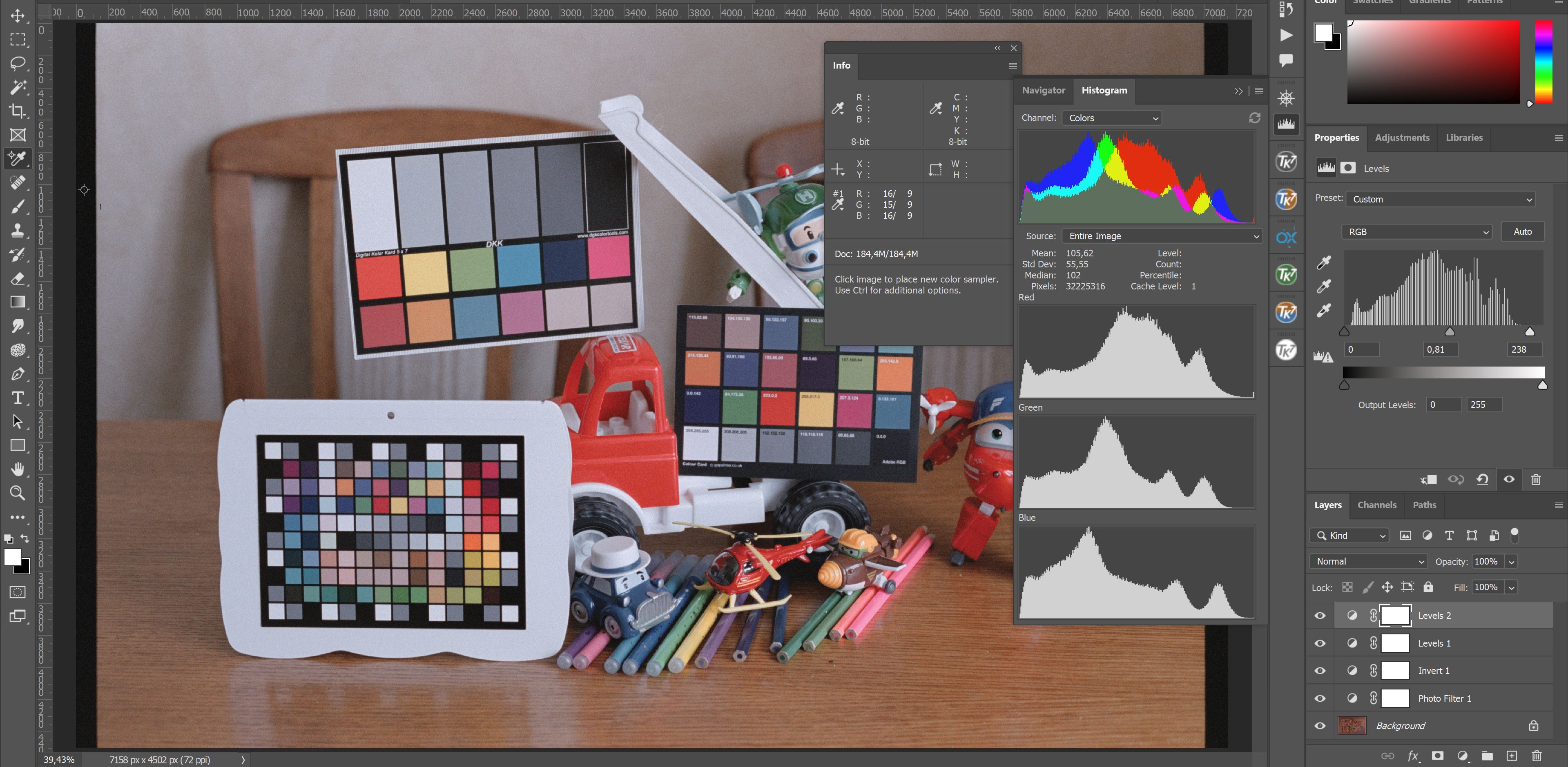   | |
|
« Colour-Accurate Conversion of Negatives - Darktable variant
|
Creating a DSLR-based film negative digitising rig »
| Bookmarks |


| Tags - Make this thread easier to find by adding keywords to it! |
| adjustments, border, colour, conversion, film, gimp, image, levels, rawtherapee, tool |
| Thread Tools | Search this Thread |
| |
 Similar Threads
 | ||||
| Thread | Thread Starter | Forum | Replies | Last Post |
| "Perfect" colour negative film conversions using GIMP and RawTherapee | BigMackCam | Film Processing, Scanning, and Darkroom | 26 | 02-18-2022 04:38 PM |
| Night Post processing in Rawtherapee & Gimp | Kodiak | Photo Critique | 3 | 10-28-2017 12:48 AM |
| GIMP 2.6.12 vs. GIMP 2.8.0 | Vasyl | Digital Processing, Software, and Printing | 13 | 06-19-2012 02:00 PM |
| K7 - colour settings for accurate RAW histogram? | cezarL | Pentax DSLR Discussion | 17 | 03-18-2010 04:57 PM |
| K7 RAW conversion with Rawtherapee | Workingdog | Digital Processing, Software, and Printing | 5 | 02-01-2010 12:16 PM |


