 Originally posted by LFLee
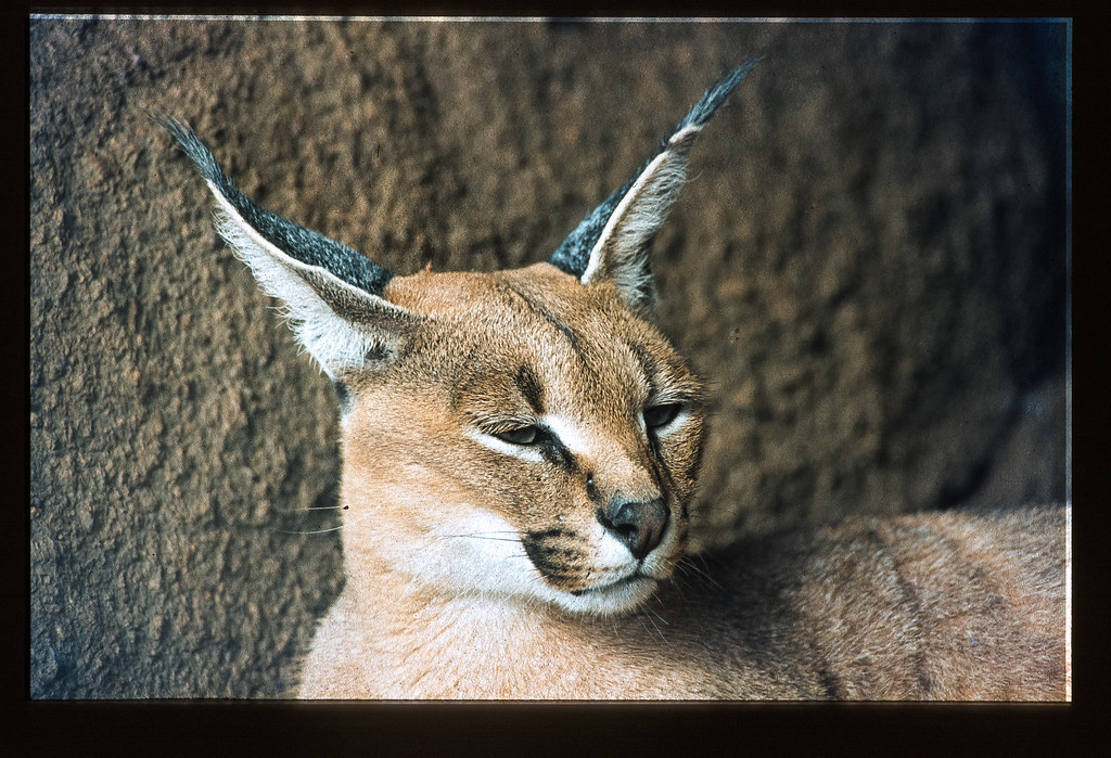
So far, your picture came out really great.
On this one, i just feel, the color seems washed out, because the lack of contrast.
When i look at the left part (the wood / branch block on the left of the picture), it's like the black ain't black / dark.
Just playing a bit with the curve to just give a small boost to black will help.
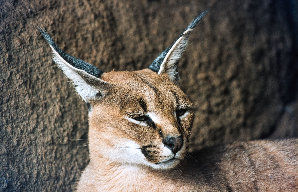
I took the liberty to give it a fast try. 1st is original picture, 2nd is with a small play with curve to give it a "S" look.
Original  Change in curve
It just remove the white fog, and increase the feeling of contrast, and keep overall the same color / contrast on the whole scene. It just boosted the "black".
It's just a suggestion.
Remember, as i said before, all your picture came out really great so far*. This one, just stands out, as less contrasty and with less pastel colors than the previous ones.
*And because of you, my next christmas wish is a P67 


 hm.... it was scanned by lab, I think I need to talk to the lab about the 'doesn't look so much film-like look'... I personally also think it loses a lot of colors.


 Post #4 by Nesster
 Similar Threads


