So, tonight I was taking a few pictures of my daughter at the science museum. They've got very challenging lighting from a color balance perspective, because it's a mix of many different kinds of fluorescent tubes. So, in this area I set my wb using a shutter click and a neutral gray card. I also hit the RAW button, because I know from experience color is tricky here. My initial result was this:
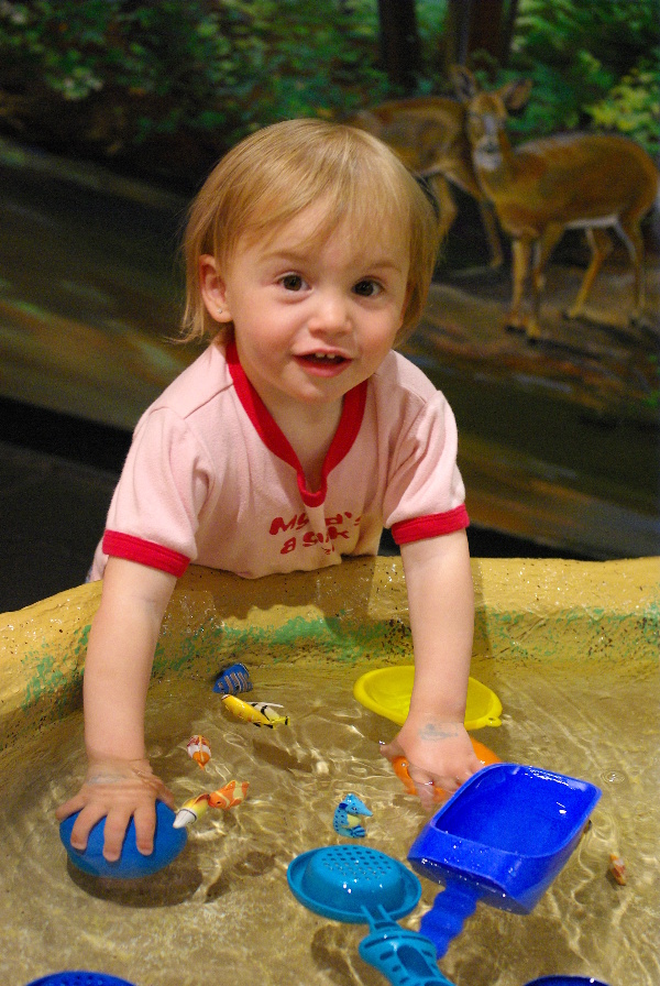
and, yeesh, that blue shovel sure looks unnatural, eh? In fact, all of the blue toys in the area got that way. It's not that the blue is wrong, exactly it's shoved to the right but the peak isn't clipped. It's that the red component is entirely dropped out, making it look like nothing in nature (and very few things in unnature). And clearly it's not just miscolored but missing detail. This is with saturation at -1, my standard setting, by the way. So, I switched to the natural tone curve:
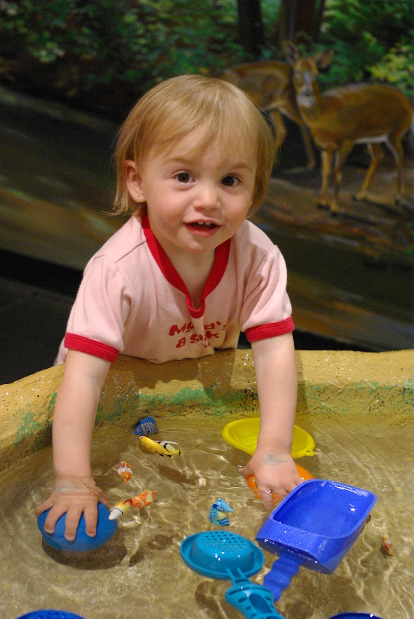
Ah! Much better.
I still tend to like Bright in good outdoor light, but I'm going to have to keep my eye out for this effect in that situation too. And when I'm in fluorescent-lit areas, Natural it is.
(No postprocessing except for the downsizing. Didn't sharpen after resize. ISO 1250, shutter speed 1/50th, and f/4.)


 Similar Threads


