 Originally posted by rparmar
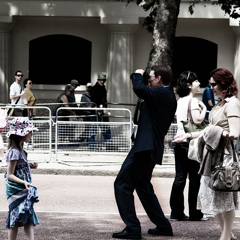
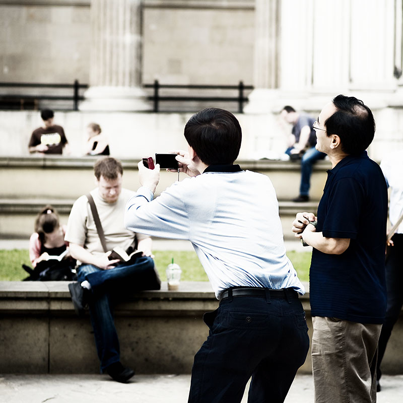
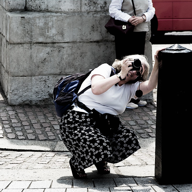
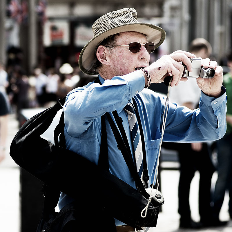
Wow! The contrast is already hyped to the max and the exposure cranked too... this was deliberate. Also I muted the colours to get more of a "graphic" look. (The originals are properly exposed, more or less.)
Thanks for all the comments.
Exposure - lowered not highered

As I said they look over-exposed to me (especially the new ones where the blown highlights are obvious) although I did think that maybe you were going for a specific look & feel, you have confirmed that.
I do like your subject matter, just personally I would have handled it in a different way.
That's fine, to each his own !

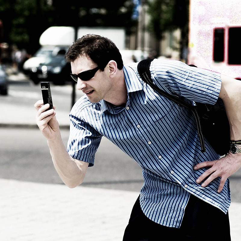


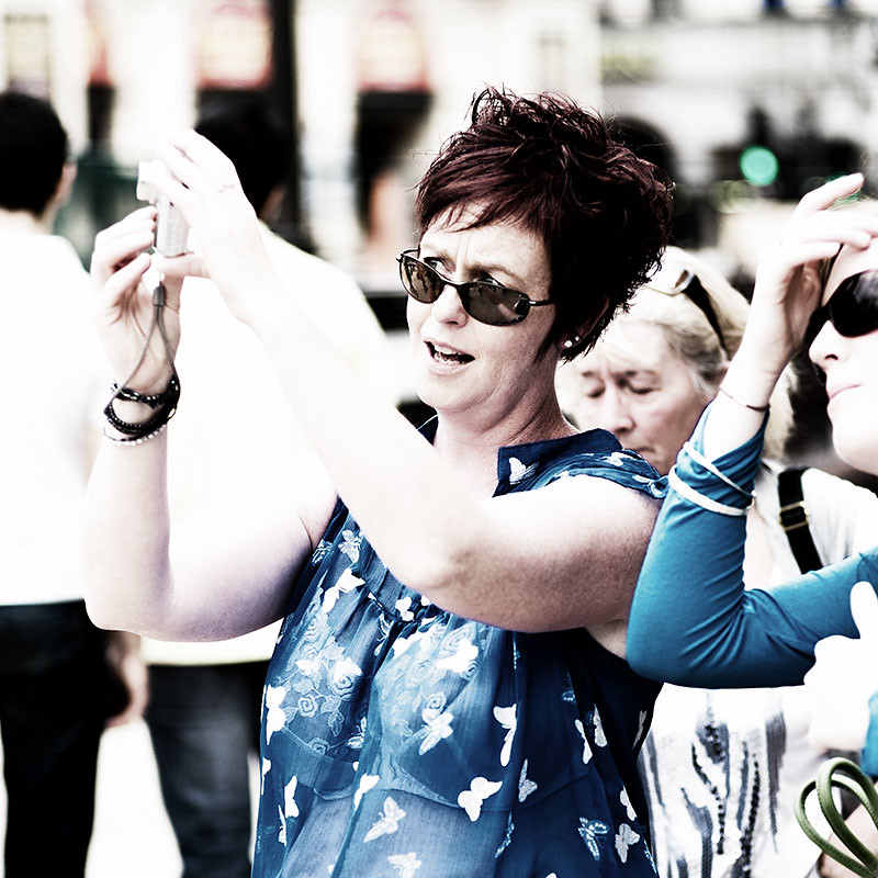
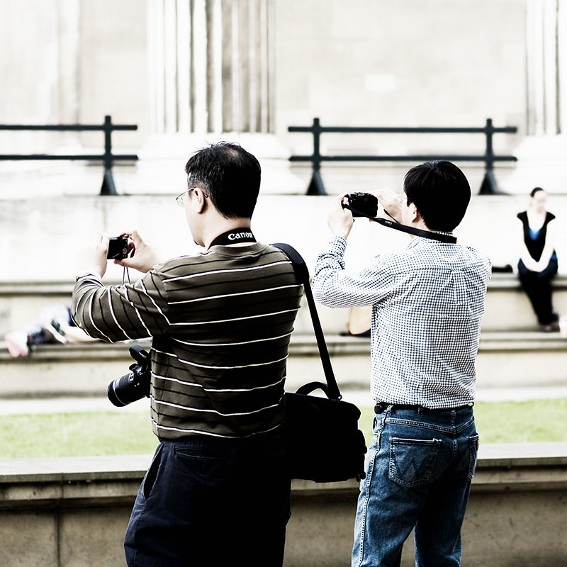
 The girl in the 'blue' top ... that has a surreal, 3D quality to it. Great shot !


 Similar Threads


