|
Forum: Post Your Photos!
06-09-2011, 08:27 AM
|
| |
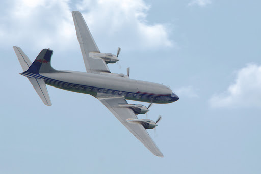
A great experience to see an aircraft like this one airborne.
|
|
Forum: Photo Critique
05-31-2011, 01:13 AM
|
| |
I think the water droplets themselves are distracting. The blue splotches don't look like drops. But without them, the chain is interesting. Long exposure and multiple flashes made it into almost an impossible structure made of interesting material. Also, blurred water inside is good.
So maybe you could filter out the droplets, the are the only blue-ish and sharper element in the image.
|
|
Forum: Photo Critique
05-31-2011, 01:05 AM
|
| |
The set up is changed slightly in this (and subsequent) shot. I've lowered the f-number and put the vase further from the wall, whic led to different perspective. The lighting is a result of many attempts, but it was a useful experience. And he vase not cleaner, only the lighting affected it.
White wall and light painting (and of course processing) helps to create strong shadow.
Thank you all for your suggestions, it really helped me to improve.
|
|
Forum: Photo Critique
05-31-2011, 12:41 AM
|
| |
I think the window frame helps to separate the figure and fits with the title, the frame makes the person outside alone. But at the same time, there might be something inside (other than the photographer :)). The facial expression (or the lack of any expresion) is also fine. But what is distracting is the small bright line in the frame and the A-like sign on the corridor wall (or what it is).
|
|
Forum: Photo Critique
05-30-2011, 02:54 AM
|
| |
Another attempt, this one with the right white balance. Instead of trying to connect the shadow with flowers, this one separates them. The improved and impredictable light painting effect together with dead subject allows various different interpretations.

Only RAW file processed (curves and WB), cropped and scaled down.
|
|
Forum: Photo Critique
05-25-2011, 01:45 AM
|
| |
Thank you all for your helpfull comments and kind words!
Originally, my only intention was to play a little with light. I've tried to redo the scene, but I was not able the create a better picture during single exposure. Next time, I'll try to combine the background with shadow and the roses in computer, because to paint it in one go is pretty hard or maybe even impossible. Even at the expense of genuine light painting.
Time shorter than 30 seconds would be too short to light the scene from 4-5 different angles. There are lots of hot pixels, but I can live with it. I controlled the exposure with flashlight and it's indeed quite hard to guess the right amount or even to project shadow on a desired spot.
The fuzzyness might be caused by either bad focus or movement of the subject during long exposure. The lightning might be a little flat in some places. I tried the correct white ballance, but the picture looked strange, although it helped the flowers to stand out. I think the yellowish tint connects the flowers with their shadows better.
I've tried to make to shadow more visible without computer, but the physics... Maybe I'll play with the original photo in computer, because I did only global adjustments.
A little darker RAW development is not a problem. I illuminated it mostly from sides to get a dark background. Truly, there are so many possibilities...
I think the neglected vase and long dried roses with their shadow is a good combination. I´m not sure it needs something else in background. But clean glass and dead flowers could create an interesting contrast.
Here is another one. I've tried to preserve softly lit wall while making the shadow more visible and with a little softer edges. It was quite difficult and I ended with rather hard blobs of light. This one is unique, because it has the shadow as main subject. There is a rather distracting hole in the wall and it might be better to illuminate table under the vase. What do you think of this different composition?
 |
|
Forum: Photo Critique
05-21-2011, 12:47 PM
|
| |
Definitely on the right spot, I'd say. The framing is good, I think a lot of space on left side suggests high speed. Also, contrast os fine, grey bird on blue backgound, finely textured animal on soft waves is a nice combination. Excellent picture!
|
|
Forum: Photo Critique
05-20-2011, 05:45 AM
|
| |
It seems there are two lines in the picture: the bridge and light leaves on top of trees, that take my eye to distance. This one looks better than the darker one, but I think it's too flat. Maybe shadows could be a little bit darker in this picture. Or maybe vignetting could work for this picture.
Do you have this scene framed in some other way?
|
|
Forum: Photo Critique
05-18-2011, 11:55 PM
|
| |
The link actually proves it is light painting. And I expected a constructive comment.
|
|
Forum: Photo Critique
05-18-2011, 04:35 AM
|
| |

It's a little experiment: just one flashlight and 30 seconds. Any comments?
|
|
Forum: Photo Critique
05-14-2011, 12:15 AM
|
| |
The white fence is very dominant, it literally blocks the view and the sun itself. It would be better if shot from another point, if possible from a higher one. Or try making a B/W conversion.
The second picture is too overdone for my taste, so the original version is maybe better (with little foreground cropping?).
|
|
Forum: Photo Critique
05-10-2011, 01:59 PM
|
| |
I like it more in color. Brown on blue is a nice contrasty combination. As it was said already, level the horizon. There are lots of lines in the picture, maybe could crop the shore, so there are only straight lines.
|
|
Forum: Digital Processing, Software, and Printing
05-07-2011, 02:49 AM
|
| |
It depends on the scene. It is possible to learn how to rotate the camera to reduce visible seams. As for the software, I use Hugin, it it good indeed.
|
|
Forum: Photo Critique
05-05-2011, 12:19 AM
|
| |
I think the first one is better. But I would crop the houses on the left, so the picture ends on the wall. Maybe you could also lower saturation a little bit.
|
|
Forum: Photo Critique
04-28-2011, 01:13 AM
|
| |
Yes, what's with the corners? They're distracting.
I too like the composition, but I think it might be interesting if you cropped the top and bottom of the blue skyscraper, so it would look like it is way higher.
|
|
Forum: Photo Critique
12-23-2010, 01:15 PM
|
| |
I would try also a square crop. The trees would propably show well the distance to the mountains.
|
|
Forum: Photographic Technique
12-23-2010, 12:57 PM
|
| |
I've also experienced similar purple coloring in upper corners and one left of center on a K200D. First I thought it was caused by light coming thougth viewfinder, but now I think it might be related to camera...
|
|
Forum: Photographic Technique
11-23-2010, 02:22 PM
|
| |
I think the composition depends on the angle of view, because you can make an image with unusual aspect ration also with very narrow angle of view. One very important aspect of wide panoramas is the distartion caused by projection. I think rule of thirds might work well in the narrow angle, but ultrawide is very different from that, always different from "normal". And any straight lines are going to look very strang with ultrawide, therefore I think the chosen projection is also an important part of composition.
|
|
Forum: Photo Critique
11-23-2010, 01:45 PM
|
| |
Greetings,
nice picture and very interesting weather conditions, I like bridges in mist. But I think the bicycle sign in lower left corner is distracting.
Considering the weather, was it necessary to do HDR?
|
|
Forum: Post Your Photos!
11-23-2010, 01:28 PM
|
| |
I like these images, especially the third and last one. The boat stands out nicely in the pictures.
|
|
Forum: Photo Critique
11-19-2010, 01:41 PM
|
| |
The first one is excelent!
The compostion works very well, inobtrusive background, darker, brown strip to help separate the subject even more, and the different textures in foreground all go very nicely together. I like very much.
|
|
Forum: Photo Critique
10-29-2010, 11:01 AM
|
| |
I'm constantly distracted by the pedestal, which is too bright. I like everything else about the picture, especially the idea behind.
|
|
Forum: Photo Critique
10-26-2010, 03:24 AM
|
| |
Excellent one! I personally would also try a wide (e.g 16:9, or even better 2:1) crop, I think the sky is not that important here. On the other hand, the rim of clouds is interesting. The colorful trees agains this backgound look great.
|
|
Forum: Photo Critique
10-25-2010, 07:58 AM
|
| |
I think cropped version is better. Much cleaner,
|
|
Forum: Photo Critique
10-19-2010, 12:00 PM
|
| |
Thanks for replies. I might write a short tutorial in future (thanks for offer), but I think the technique is really simple. All nine pictures were during RAW development normalized to EV 12,2 (f11, 1/40s, ISO100) and the few last ones were shot in night (3s exposition). I've shot a few more after that, some with star trails, but those would be totally dark if normalized to the selected exposure value.
|


