|
Forum: Weekly Photo Challenges
04-26-2011, 08:44 PM
|
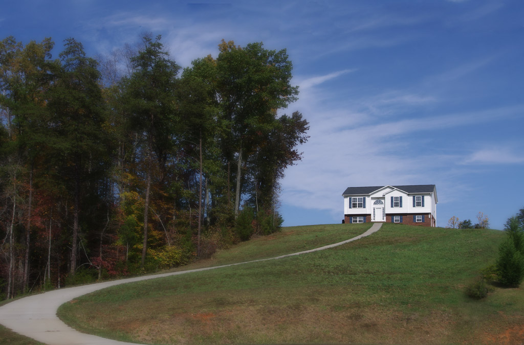
| |
"Algodones View"
 |
|
Forum: Mini-Challenges, Games, and Photo Stories
04-23-2011, 11:22 AM
|
| |
Great start to this round. Good to see the PPC alive and thriving. I hope to enter again, time permitting.
-Mark
|
|
Forum: Mini-Challenges, Games, and Photo Stories
04-09-2011, 08:32 PM
|
| |
Here's my entry: lots of small changes and one large one. :)
 |
|
Forum: Mini-Challenges, Games, and Photo Stories
04-24-2010, 04:03 PM
|
| |
I may as well join with one of my Pentaxium shots. I think this one works better in B&W than in color. I thought about cloning out the birds, but decided to leave them.
 |
|
Forum: Weekly Photo Challenges
04-17-2010, 09:08 PM
|
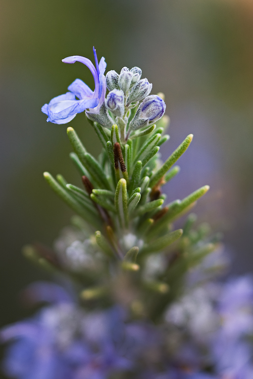
| |
I keep meaning to occasionally participate in project52. No more excuses.
This is a rosemary flower - very petit.
"Newly Crowned"
 |
|
Forum: Mini-Challenges, Games, and Photo Stories
04-14-2010, 08:12 PM
|
| |
One of my better door shots:
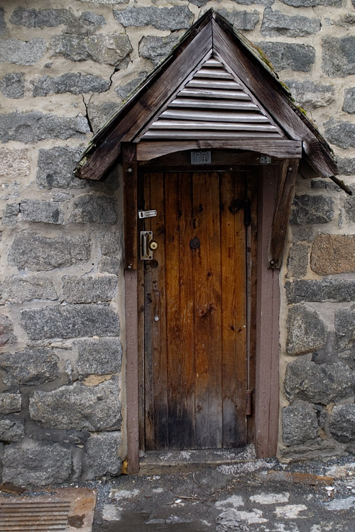
More here if you care to look
|
|
Forum: Mini-Challenges, Games, and Photo Stories
04-14-2010, 12:22 PM
|
| |
Tim (atupdate) set up an account for all of us to use hosting PP Challenge images:
Thanks again to Tim for setting up the generic Mediafire Account
Mediafire Account Log-In Name: pentaxchallenge@yahoo.com
Password: postprocessing
It has worked fine for me when I have hosted.
Oh yes... Congrats to you and Perrumo. Nice job on an image I struggled with.
|
|
Forum: Photographic Technique
04-09-2010, 03:59 PM
|
| |
I am no expert on the matter, but I tinkered with your images in Photoshop and I observed:
The Tamron image has less brightness and lower global contrast. So on it, I increased brightness (B/C adj) to match the low end of the bulk shadows distribution at 30.
Then I used the white slider in levels to match the sky brightness at ~175.
This suggests that the Tamron lens transmits less light at F4 than the Takumar and maybe has somewhat lower global contrast.
The Tamron image still appeared very inferior. So next I applied USM filter with radius 5 at 30% to approximate the local contrast of the Takumar image (as judged by my eye).
This helped the Tamron image considerably, but it still appeared significantly less "sharp". So the Takumar lens has superior local contrast.
Next I applied high pass filter at radius 1 to each image (using the above 'best so far' version of the Tamron image.) The resulting Tamron image was almost completely gray while the Takumar image had some clear, discernible detail. So the Takumar has superior resolution ("high frequency" content). [This test would be more meaningful on a TIFF file as JPG "blocks" alter the true "frequency spectrum" captured.]
In the end, I would attribute the poor showing of the Tamron in your example to a combination of significantly lower contrast and significantly less resolution. None of this is a surprise comparing a prime lens stopped down a bit to a 5x zoom at its focal length extreme and likely wide open.
The high pass test says otherwise in my opinion.
I think it is a combination of contrast & resolution. I expect the superior performance of the Takumar to hold for midtones & highlights as well, not just shadows.
Regards.
|
|
Forum: Site Suggestions and Help
04-06-2010, 03:37 PM
|
| |
Honestly the (sadly now deceased) old classic skin was much better in this regard.
For the "modern" [red] skin we currently have barely indistinguishable icons to denote thread status:

The "closed" icon is fine. The 'you have posted to this thread' icon is near worthless.
How about reverting to the 'classic' skin icons? If not:
How about solid icons for threads with new messages, just a bold outline icon otherwise?
'Popular or not' is ok, but could be improved. Light gray is hard to distinguish from light blue.
How about a big smilie for 'you have posted here'?
Or any other scheme you like. Just make it easy to tell thread status at a glance, especially 'you have posted here'.
Thanks for considering this suggestion.
|
|
Forum: Post Your Photos!
04-05-2010, 08:08 PM
|
| |
I'm no guru. But I think there is a lot right with this picture. Looking at the full size
image, I see no sign of motion blur. However, the brightest stars do seem to have a bright
purple halo around them. So go ahead and trade another second or two of shutter speed
for a step or two in aperture as WillCarney suggested.
I'm surprised you couldn't get the 18-55 kit lens to cooperate. My 'Orion Rising' shot
was 20s at 24mm f4 iso 800. Since you are successfully shooting iso 3200 here, you
should have ample room to replicate my shot, trading f-stop for iso.
As for relevant websites, I found this one inspirational if not educational.
I found the site owner congenial and helpful as well.
Have fun and good luck with your astrophotography adventure.
|
|
Forum: Mini-Challenges, Games, and Photo Stories
04-05-2010, 07:07 PM
|
| |
Flipped over many ways...
 |
|
Forum: Weekly Photo Challenges
04-01-2010, 03:39 PM
|
| |
ramseybuckeye: for some reason, the exterior shot works best for me.
tpeace: I like your abstracts
stevebrot: That has postcard potential.
daacon: Nice detail on the bird portraits.
Peter: Great shot! Your perspective choice works well.
bumbibop: nice socks your lady friend has. thanks for hosting.
Another abstract of mine from a week ago:
 |
|
Forum: Mini-Challenges, Games, and Photo Stories
04-01-2010, 03:15 PM
|
| |
Congrats, Kryosphinx.
Thx to icywarm for the commentary on all the efforts :)
|
|
Forum: Digital Processing, Software, and Printing
03-28-2010, 01:25 PM
|
| |
How about before / after pictures with comments such as 'took me 1 minute with 2 clicks"? ;)
The content aware fill "rumors" look mighty impressive. :eek:
|
|
Forum: Post Your Photos!
03-28-2010, 09:00 AM
|
| |
They are all very nice. But your teaser photo is outstanding.
|
|
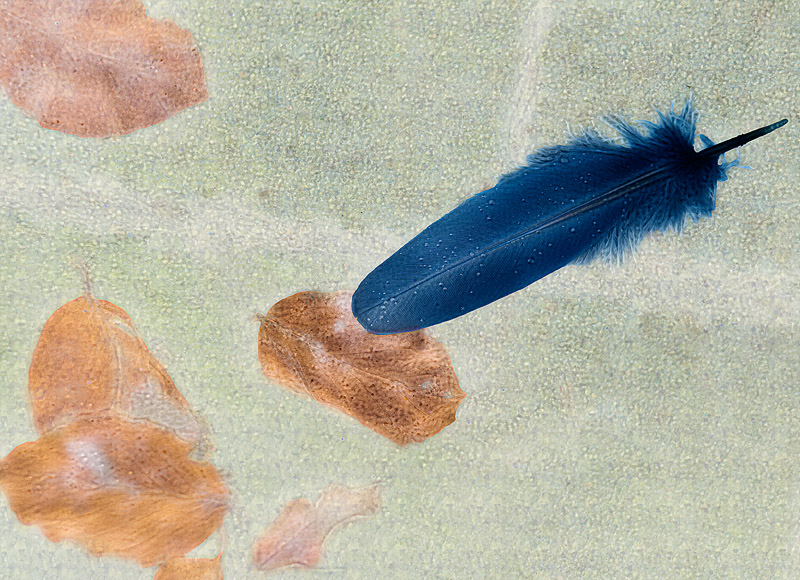
Forum: Mini-Challenges, Games, and Photo Stories
03-26-2010, 07:59 PM
|
| |
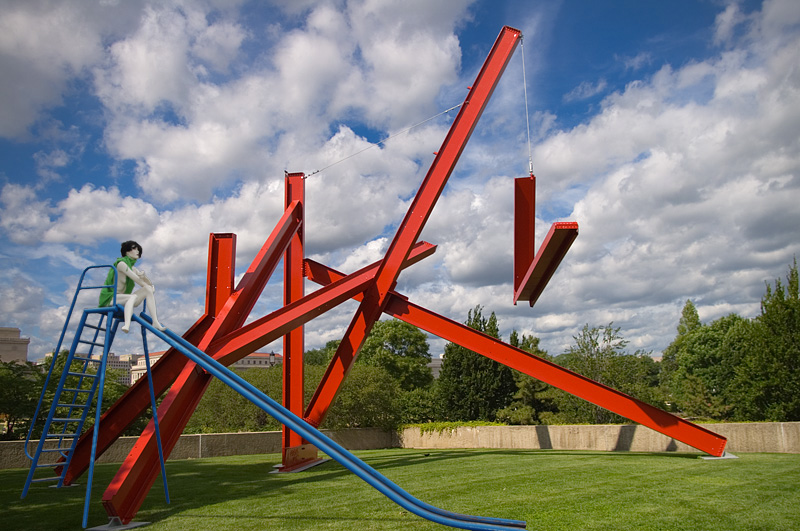
I wasn't too sure what to do with this, so I started by making a mask of the slide
and slider. Then I went looking through my archives for a new background to replace
the existing. I quickly decided it worked well with my photo of Mark di Suvero's
sculpture "Are Years What (For Marianne Moore)". [From the Hirshhorn sculpture
gardens in Washington D.C.] I liked the repetition of shapes. And the shadows
on the left worked well to mimic the flat lighting of the challenge photo.
I lightened the top part of the slide & slider with a masked Curves layer to fit in
better with the bright daylight. Then I painted in a few highlights and shadows
to complete the effort.
 |
|
Forum: Weekly Photo Challenges
03-25-2010, 03:33 PM
|
| |
Good job as host & judge, Tim. And thank you for the HM award. I may well take you up on the critique offer, too. :o
Congrats to the other HM recipients and winners.
Here I respectfully disagree. I though this composition was brilliant. I love the leading lines in the field curving at the last minute to direct the viewer's eyes to the building. Great job.
|
|
Forum: Weekly Photo Challenges
03-24-2010, 09:14 PM
|
| |
tpeace:
look like you found the silver lining to your snow clouds. #1 & #4 are super.
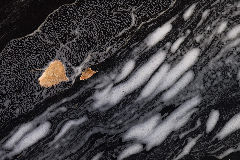
I found a few abstracts on a walk at our local park a couple days ago. Here's one of them:
 |
|
Forum: Digital Processing, Software, and Printing
03-21-2010, 01:05 PM
|
| |
A great resource to learn about retouching tools and techniques (from gentle to far-over-the-top):
RetouchPRO.com |
|
Forum: Digital Processing, Software, and Printing
03-21-2010, 01:00 PM
|
| |
My suggestion: Just drop the slide duplicator part.
I "copied" a bunch of slides for my brother a few years ago using a cheap, small 'light
table' with a cardboard cutout so light only passed through the slide. On the camera
side: *istDS + M4/100 macro lens on M (K?) bellows mounted on a tripod. I thought
the result was great, and way cheaper than buying a scanner (since I already had the
other stuff). I guess if you have thousands of slides, a scanner is the better option.
But for a few hundred, the small hassle seems well worth the $$$ saved.
I'm planning to photograph my slide collection (100's, not 1000's) once I upgrade my
camera. KX is tempting. Or maybe I'll hold on longer and see what replaces the K7
or fills the gap in between.
|
|
Forum: Post Your Photos!
03-21-2010, 11:09 AM
|
| |
I had a recent go at astro photography myself (coupled to a landscape).
I had a hint of star trials at 20s with a 24mm lens at full size. I would describe yours as
having obvious trails at full size (albeit short ones). They also wiggle. Was this taken using a tripod?
Next time, don't be afraid of high iso and shorten your exposure time. Noise is not really
a concern for pure sky shots as you have no shadows, just pitch black sky. So you can
easily control the noise as you seem to have done with the +2 exposure (also relatively harmless).
Fun stuff to play with. Keep working on it.
|
|
Forum: Weekly Photo Challenges
03-20-2010, 12:24 PM
|
| |
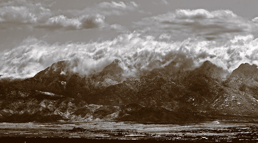
Lets start with the controversy: Technically, this is a tritone (3 inks).
But it is also sepia. (The only way to get sepia with CMYK "process" color is using MYK.)
I created this version in PS, so it actually has the "plates" for C (no ink), M,Y, and K.
And since the curves for M & Y are not quite matched, I don't think you could quite
recreate this as a true printed duo tone. Since we are dealing with RGB on the forum,
I guess it shouldn't matter in the end. (The sky has very little sepia color because I set
the M & Y ink to only print shadow tones. I think this helps make "sky" distinct from "land".)
Why sepia? I took this shot because of the roiling clouds on the mountain. It made
me think of some enormous conflict, so I titled it "sky and land at war". The original
colors are dull, the local contrasts low, and the global contrast very high. If anything,
the original colors detract from the battle that I saw. So some sort of B&W conversion
seemed appropriate. My first shot at it was a simple sepia tint which I liked well enough.
But I got some good critique suggesting it was too muddy and so still not projecting
what I wanted well enough. This is my latest attempt. It still has much room for
improvement, I'm sure.
 |
|
Forum: Post Your Photos!
03-20-2010, 10:27 AM
|
| |
Good to hear you have your camera back. I'm looking forward to many more such as these.
|
|
Forum: Digital Processing, Software, and Printing
03-17-2010, 05:51 PM
|
| |
This LL tutorial is badly broken / doesn't work as advertised.
The stated instructions result in only an extremely poor approximation of a saturation mask. That said it's still useful. (Interestingly, the resultant sat mask shown in the LL tut looks much closer to the real deal than you can get from the instructions. There's something fundamental missing from the tutorial instructions. I'm not sure what.)
Once you have the "sat" mask, use it as follows (actually explained ok in LL IMO):
Create a Hue/Sat adj layer. Fill the Hue/Sat mask with the "sat mask" content. Now select 'yellow' for colors affected and set the slider values to +5 / -25 / +15 as instructed in the article. This makes the Hue/Sat layer have more affect on more highly saturated yellows and less affect on low saturated yellows. (Remember the PS mask mantra: 'white reveals & black conceals' - and an ideal saturation will range from pure white at 100% saturated pixels to pure black for completely unsaturated pixels. The LL sat mask is still at least somewhat effective in this regard.)
If you want to learn about real saturation masking, go here:
techslop
It will likely be hard to find what you are looking for, but you will learn a TON along the way. If you insist on just the answer, look for the "Saturation in and out" tutorial (same author) on the retouchpro.com forums.
Happy PP
|
|
Forum: Mini-Challenges, Games, and Photo Stories
03-17-2010, 03:25 PM
|
| |
Congrats to the runner ups and especially to our winner, icywarm!
Thanks to ozlizard for the fun pict to play with and for the commentary.
|


