Forgot Password
Pentax Camera Forums Home
 
Log in or register to remove ads.

Showing results 1 to 8 of 8 Search: Liked Posts
Forum: Pentax News and Rumors 02-12-2012, 08:20 AM  
PentaxForums.com to Interview Pentax Japan on Feb 11 - Preliminary responses up!
Posted By Fontan
Replies: 286
Views: 59,551
From what I have read, FF really is the savior of all. It is all about DoF is what I can deduce. DoF will change everything about your photography. This is all you will ever need. Things such as IQ and artistic integrity will instantly become obsolete, much in the way VHS frmat when DVD hit the market. This is comparable to how Jesus performed miracles to those with incurable diseases like leprosy and blindness. The moment that little sensor becomes 40% or so larger, you will see that anything you shoot at turn into gold. It will effectively put an end to second and third rate photography. Photography competitions will immediately become a moot point.
Forum: Photographic Technique 06-13-2011, 11:01 PM  
The Genius of Photography
Posted By CWyatt
Replies: 4
Views: 2,660
BBC's documentary series on photography (BBC - Photography - Genius of Photography - Homepage) available on YouTube:

GeniusOfPhotography's Channel
Forum: Pentax K-r 05-30-2011, 10:37 AM  
K-r E-dial repair
Posted By Predictor
Replies: 24
Views: 30,626
There is a frequent issue with the e-dial of K-r. When it is being rotated it does not switch corresponding parameter (apperture, exposure time) at all or sometimes shifts a parameter to undesired value. This bug is caused by a lubricant inside the wheel mechanism. Silicon oil is a dielectric. It's intended to make wheel rotating smooth, but it covers contacts of sensor inside the e-dial and prevents it from normal functioning.
Is it a mistake of developers or a hackwork of taiwan assemblers I can't say. But I can tell you how to fix it.
I have attached 3 pictures showing how to disassemble the camera.
1. Remove the battery. Unscrew the screw from the bottom of the battery bay. It is not pictured because there is only one screw and it is too dark in the battery bay.
2. Unscrew all screws from the top of the body. Couple of screws are located under the built in flash.
3. Remove the top cover. Be carefull not to tear wires and flat cables connecting elements on top cover with the rest of the body. You can disconnect a flat cable from the slot at the body side to make the top cover more mobile. On the picture you can see 3 screws holding the e-dial module. Unscrew all those screws.
4. The end of a flat cable connected to the e-dial is glued to the top cover so you will have to use some force to unglue it.

5. Now you are ready to clean the e-dial sensor. Take a pure alcohol (vodka would suit too) and a clean syringe (5-10 ml). Hold the e-dial as far from the body as possible. It would be a good idea to cover the body with something water resistant. Aim a powerful jet of an alcohol under the wheel. Repeat such wash from all four sides of e-dial module.
6. Dry the e-dial module with an air flow. I used a large squirt that I use to remove dust particles from lenses.
7. Assemble everything carefully back.
Forum: Pentax K-r 04-27-2011, 11:53 PM  
Who else are waiting for a firmware update for K-r to fix the FF problem
Posted By Nobbys Nuts
Replies: 278
Views: 59,213
Haven't touched the White Balance on my KR since the day I bought it.
Have none of the problems that some keep harping on about in every thread that they can.

I must have an exceptionally good KR if everyone elses is crap.
I would love to see some more pictures from HAPPY KR owners in the photo thread I have started.
There must be more than just me.
Forum: Weekly Photo Challenges 11-23-2010, 12:57 PM  
P52-3-16 Colour: Colourful WINNERS
Posted By virgilr
Replies: 17
Views: 4,268
An outstanding collection of images based on a theme that is broad in its interpretation. As Rense rightly predicted this one would be tough to judge so I tried to focus in on the impact of all the range of colours in the images, as well as the representation of a broad range of colours (“rainbows of colours are obligatory”, said Rense!). Composition and emotional impact played a role in my judging, as well as the expression of a unique view of the subject at hand.

A few quick comments on each image, from my own, subjective option:

Ash- Colour and form, moving together in a wash of geometry, with leading lines that meet but break out of the conformity of composition. A wonderful abstract image with a juicy-fruit taste! Wonderfully done. I would have liked to have seen a bit more play of intensities and contrasts of colours of this subject with a bit of PP work, but all in all another shot to be proud of!

Bbluesman- I admire the composition and subject in your shot- however I felt that the colourful aspect of the shot was overwhelmed by the character of the subject, my eye being drawn to the face and eyes of your subject, which was marvellously captured! Perhaps an image of the subject in full costume with more colours throughout would have made the range of colour more of a contribution.

Bramela- Excellent close-up image, alive with detail, nicely composed. I felt however that the range of colours represented wasn't up to the level of those the competition demanded.

DanLoc78- How fun! These guys looked camped out waiting for their owner to come home! This image just needed something to draw me in a bit more, and the 50/50 split on the horizontal of the image was nicely balanced, but tended to overshadow the subject(s).

dunerunner- Excellent tones and range of colours I admire the strength of the composition to the right. My eye was absolutely drawn to the subject of the main leaf and I felt that the only thing lacking was a broader range of colour in the subject, although what you captured here is something that has subtle tonal ranges that are very evocative.

Iris- Wonderful gusty image! I loved the glowing light, the figures looking down from the illuminated perch. I kept looking into the image for it's details and very much enjoyed it. Only detracting factors for me where the branches to the right side of the image, and I would have preferred that the subject (pagoda) would occupy more of the frame, emphasizing the intense colours present.

Jheu02- Colorful intense image. I felt that the zoom-blur effect in all detracted from the composition- nevertheless, the image does exhibit ingenuity and strong use of colour!

Jmschrei- This image just needed a bit of refinement, finding one clear aspect of the scene before you and emphasizing it in the photo. Perhaps a tighter shot from a lower angle, with the fan billowing out the curtain?

KarenH- I really enjoyed this photo! Wonderfully composed, very colourful The only thing that I find a little distracting is your reflection in the bell, as it takes away a bit from the imaginative aspect of your image.

MikeS- Great repetition and form, and most definitely hitting the mark with the subject of the competition! Another great abstract- and to make it more of an abstract than a photo of optical media, maybe a bit more time in PP to take me someplace else? Remove the real from the shot, maybe.

Mummarazzi- The only other portrait in the competition, and wonderful rainbow colours abound! I would have loved a few other shots of this from different angles, again, to take my eye more into the colours that are surrounding the child than the child itself- I kept coming back to the expression in the mirror.

Ovim- You hit my soft spot- I have a big Maine Coon Torby just like this cat! Well composed for your concept of “dreaming in colour”, but the colour needed to be a bit more of the star than being quite so dreamy. Still, a great pet shot!

Ramseybuckeye- Another great entry in the “nature” department for this competition. I just would have liked to see a broader range of colours represented, and a bit more of a definite subject in the image. I think a crop to the left side of the image where the broadest range of colours live in the shot would have pushed this one up a notch.

Rense- Excellent composition, another wonderful abstract image. This one just falls short in the refinement of details for me- I would love to see those rays of colour coming from a pure black space (without the highlight edges of the interior circle of the CD) – so that the reflective bead is what my eye is immediately drawn to, in a pool of intense colour That being said, an arresting image brought forth again!

Spongefingers- I so admire this image for it's absolutely out-there subject matter, careful DOF to highlight the most colourful elements and composition that pulls the eye right in to this little mysterious scene. I really would have liked this shot over a more neutral background, however, to make the colours “pop” even more. One last tiny detail that would have made this shot rock even more is if the large brown shell chunk (to the right) would have been moved into the background and the large green shell (in the background to the right) been brought forward. Still, a wonderful display of colourful elements from your unique perspective!

Tamia- I so enjoyed the tableau feeling of this image, and all the elements and the subject of the photo fit the theme of the competition to a tee! This image just needs a touch of refinement- I would say removing the bin of paints would help tremendously, bringing the water jar/glass into it's place. This is a shot to be proud of, and I would love to see a bit more work on this subject, trying a few different perspectives.

Tsukiouji- Another outstanding tableau, carefully prepared and executed with lovely balance of the colourful subjects within the composition. I would have maybe liked to see a “void” space in behind the camera instead of the camera case, to bring more attention to the vibrant colours in the image. Nicely done!

VaughnA- Although not the most intensely colourful image in the competition, the use of the range of colours coupled with the composition and having the colours work in a defined role in the image works exceptionally well. The subject isn't perfect ( a battered and dried up rose), and the image provokes questions as to why the rose has been left so hastily and uncared for, as well as having great technique to draw the viewer in. So well done at many levels.

Wllm- got the Pantone swatch shot in first! This is another fantastic abstract, shot at the perfect angle, perfect DOF and the composition with it's sweeping lines so draw the eye in to a pleasing shot- and, as per the competition, a true rainbow of colours!

So, wow, this wasn't easy at all, but here are my picks for this competition:

Honourable mention (two, because they both stand strong on their merits!)
Tamia


wllm


Third place: Ash


Second place: Spongefingers


First place (and next weeks judge): VaughnA

Forum: Weekly Photo Challenges 11-15-2010, 11:55 AM  
P52-3-15 Colour: Red WINNERS!
Posted By jheu02
Replies: 33
Views: 6,487
First off, thanks everyone for participating and making my job of judging tougher than expected. Throughout the week I enjoyed looking at the entries and entering my own, only to later find out I'd be judging. So when I went back through the photos several times, I kept going back to this statement (emphasis mine):

"we want to explore what colour does in our photos..."

I also would look at the entry for what my eye was drawn to, and whether it made me think of Red and its being a necessary color, or could some other color also have replaced it. Obviously, someone could have posted a shot of a red piece of paper and I would naturally think of the color, but other photography ideas like subject, composition, focus, etc would also have to come into play. With my thought process now in your heads, here's the comments in order of posted pic and then the winners:


Rense: very good color and composition, and I like the OOF end of the stem of the subject leaf. Unfortunately, the red here, though ever present, just becomes a background...my eye keeps getting drawn back to the sweet gum (?) leaf. Bonus points for early entry. :)

bbluesman (Mark): Intriguing shot of the drum and stick. Understated red but I kept going back to this shot. My eye did keep getting drawn between the OOF red to the in-focus yellow rope though, and I feel the photo would have been equally good if the end of the stick was a different color. So, though I love the shot, overall I didn't feel the red "made" it.

Tamia: very nice composition and definitely a red subject! I liked your use of DOF and lines to draw me into the shot where I also found more red. Invites one to reach out and eat one (only to find the tart taste of a crabapple :hmm:).

wllm: Nice composition also with the leading lines of the red/while bike rack leading to (fortunately) a red bike. Don't know if you purposely placed the bike there, or it just happened to be there, but good eye for catching it. The background is a bit distracting though, and though the red contributes, for me this is a great "leading lines" type of shot.

Paleo Pete: I like your lady bug, but I would have liked to see a tighter crop, getting rid of most of the right side. The OOF bokeh on left is a good background to highlight the red bug, but I found that my eyes kept getting pulled away from our red friend by the green leaf and orangish stem.

Bramela (Bruce): I also enjoyed this photo in your SiN album. Similar thoughts as Rense's shot though. While the predominant colour is the red/fuschia scheme, it falls into the background and for me this is a great capture of the swirling details of the flower stamens (or is it the pistels...I never was good at remembering flower parts). Eyes go between these and the moth.

SpecialK (Kyle): Nice '57 Chevy, and it's red, but the background throughout the frame is distracting. The red just can't overpower it for me. I think this could be a good subject, but from much closer and at a different angle to highlight a smaller portion of the car, and deal better with the background.

jmschrei (Joe): The use of red here really does draw the eye (all Pentax biasses aside). But that's also due to wise choice of DOF and the greyscale background subjects. They're just dark enough and OOF enough to not be distracting from the primary red Pentax, and secondary red Manfrotto logo. Another case where, had Pentax chosen Yellow, this shot would work well.

Iris: Another fine subject for red. I liked your choice of DOF to really minimize the potential for distraction, AND that it's basically all darker and in the same color scheme so that the eye keeps getting drawn back to the red berries. A minor nit would be that the two OOF brownish leaves to the left of the secondary berry could be a little darker by either burning in or a mask and curves adjustment, but they're OOF enough to not distract too much.

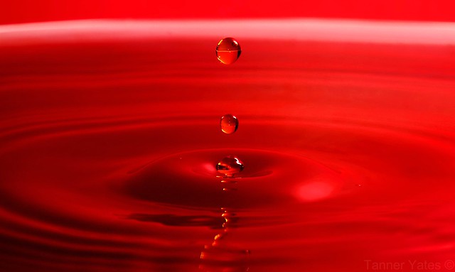
yeatzee (Tanner): Excellent job. Whether the red is from a large bowl that held the water, or simply a product of post-processing, it's very effective. Placement of the drops centered, allows an almost mirror image for the ripples. The drops are perfectly frozen in time and lighting is spot-on. Though I imagine the shot could look great in other colors, there is definitely something about the red that makes it stand out. Watch for a couple hot pixels in there.

photolady: Another SiN shot entered in P52. Depth of field and dark background remove the distractions from your subject, and the red, while present, is a definite supporting color. Overall though, I don't feel that the red here, if replaced with some other color, would be missed.

jax zee: A red rose definitely fits the color theme and the soft focus is definitely appropriate to the softness of the petals. Also, a nice control of background by limiting its physical presence and making it OOF. I can't really fault the photo for anything, but it also doesn't really speak to me either, and I don't know why, because I do like photographing flowers. Perhaps it's just a bit "too normal" of a vantage point that makes it almost seem common to me.

DanLoc78 (Dan): Had it been taken with a Pentax...:lol:. Japanese maples are a favorite red of mine. I also like the secondary red, the control of the sun flare and OOF areas. The red here definitely helps IMO since, if this had been say a silver maple with yellow leaves), they might wash out a bit more with the bright background.

virgilr: Composition! Curves! Lighting! DOF! This shot has it all. Overall great shot of an everyday item. The red definitely adds to the warmth of the shot.

casil403 (Lisa): Definite use of red here, but unfortunately, for me the shadows detract a bit. I think also the close crop, while probably needed to highlight the red, takes them out of the greater context of setting, which you described in the text about Remembrance Day. Not being there for the shot I can't say for sure if you could have managed it, but I would like to have had the red poppies in the context of tombstones/fields to tell the story w/o using words.

StevenVH: The red of the lone berry does draw attention to your subject, but the bright background and small relative size allows my attention to be drawn away again. A nice minimalist photo, but I don't think the red is a necessary element. It would have been equally good with a brown seed pod, or single yellow leaf for example.

VaughnA: Interesting story about the aloe bloom, and a nice use of red to provide the backdrop for the shot. The rec compliments the green nicely. I like the placement of the bloom with its entry lower right and sweeping up to the upper left. Again, another good minimalist photo.

mummarazzi: That is definitely a red building. Unfortunately, that's all it is. The photo doesn't really speak to me except for looking abandoned. I actually think this could work as a B/W photo though.

ovim (Oula): Who knew that a ball of red yarn could look so interesting. Great use of focal point, DOF, and neutral background. I almost wish there was an OOF cat or at least the paw in the background to finish telling the story.

ceericks (Corey): Good on ya for having your camera at the ready. A couple minutes later and the leaf could have been blown away leaving you without a shot. Nice focus and interesting bokeh in the reflection, but I have mixed thoughts about what the red really does here. Perhaps it's the blue that makes the red so-so. Go get your car painted and try again :lol:. Another good example of minimalism though.

MikeS (Mike): Traffic! Movement in the frame is evident in the 10" exposure, but I would have preferred to see it leading into the screen vs horizontally across it (leaves it a bit flat). While red is a primary color here, you've got a bit too much competition from the off-white road(?) band on the bottom third of the photo. Definitely has potential shot a little differently.

So now I have to choose...(it was easier giving comments than actually picking who would get the top spot...I was torn).

Honorable Mention: (a tie)

Tamia


Iris


3rd Place: VaughnA


2nd Place: yeatzee


1st Place (and next week's judge): virgilr
Forum: Maintenance and Repair Articles 01-24-2010, 07:52 PM  
Pentax-A 50mm f1.7 Aperture ring repair
Posted By Just1MoreDave
Replies: 77
Views: 73,361
The Pentax-A 50mm f1.7 is a very good lens except for one problem. A tiny part can break and jam the aperture ring at some place other than the A position. It often won't return to the A position, making the lens far less useful and valuable. The fix is not that hard and doesn't require special tools. It is probably better to read through this once before starting, then follow the instructions.

A clean workspace with good light is helpful. You may want a clear plastic bag to control a spring-loaded bearing. More on that later. A good quality Phillips #0 or #00 screwdriver is required to take off the mount. Tweezers, a small dab of lithium grease and a small flat-bladed screwdriver are optional.

I have heard that the mount screws have slots for a slightly different screwdriver head, but Phillips will work OK with proper technique - make sure you have good contact with the slot and apply even pressure. With the lens face-down on the work surface, remove all five screws. Grab onto the bayonet lugs and lift off the mount. You'll see this:


At this point, a lot of things are loose - the mount was holding everything together. The first thing you can do is lift off the stamped steel ring around the rear element. It links the aperture to the aperture ring. This photo will help you put it back in the right place.

Next, there's a thing on the left side of the photo marked with a green arrow. Pentax calls it the "A-M Selecting Plate", part number 38305.X50801. It has two more associated parts, a tiny spring and a metal plate. This part is critical in telling your camera you've mounted a KA lens. You can slide it out now with the tweezers, or leave it for later. The main thing is, these three parts are important for maintaining the A position functions. A closer photo:


I think it's easiest to take all these off and reinstall them in the final stages, instead of worrying about them staying in place. Here is the part, its spring and contact:


OK, now we'll talk about the second part that you don't want to lose. There's a 1.5mm ball bearing that makes the clicks between aperture settings. A spring is pushing it outward against the aperture ring, so when you remove the aperture ring, this bearing will launch into space. The bearing is just to the right of the off-white bump. In this photo, it is perched on its little spring:


If you have the lens in a plastic bag, when you slide the aperture ring off, the bearing will end up in the bag. I can usually just orient the lens so the bump is in my left palm, slide the ring off with my right, and the bearing is in my hand. This probably only works because I have spare bearings, so losing one is no big deal for me. The spring can also get lost when you're not looking at it, but it usually stays hidden in its hole. The aperture ring has the small black button in it too; keep track of that.

With the aperture ring off, you now have access to the problem. You probably see something like this:


And you have another tiny part falling out, one of those flat steel springs. Pentax put these springs on with a plastic weld, which doesn't last forever. (In their defense, they may not have expected people to be using these lenses 25 years later.) You can fix the spring in several ways. Epoxy glue is one solution. Pentax uses screws on almost all other lenses, if you have some very small screws. Screw heads or epoxy should not stick out at all, because the aperture ring has to slide by them. Here is a successful screw repair:


It's a good time to clean the aperture ring of any dirt, and remove other grit or dirt you see. One more photo to show you the little v-grooves that mark each click-stop for the aperture:


Now all you have to do is reassembly. This can be challenging because of all the tiny unsecured parts moving around. I use a small amount of lithium grease to relube the aperture ring. I also use a bit to stick the A button in place, and stick the ball bearing to its spring on the lens. I hold the lens sideways and orient the ball bearing so it's at the top and not falling off. I hold the aperture ring so the numbers are going the right way and the v-grooves are lined up with the ball bearing.

Then I slide the opposite side of the aperture ring onto the lens first. I keep sliding it on until it runs into the first (lower) flat spring, then use a small flat-blade screwdriver to tuck that flat spring under the ring. Then I slide the ring on a bit more until it's up against the bearing. I use the flat-blade screwdriver to shove the bearing down and slide the ring over it. Then the upper flat spring gets tucked under the ring and the hard part is done. You should be able to move the aperture ring and feel click-stops, and the button to select the A position should work correctly. Set the ring to the A position for the next step.

Next, reinstall the parts for the A contact. The contact plate goes in first. It has a hook that goes over the outer rim. I use a bit of grease to stick this in place too. It should be in this position, except of course your aperture ring is installed now:


Then just slide the "A-M Selecting Plate" into its slot. The stamped steel plate goes on next, flat side up. Use the first photo to install it; the tab in the aperture ring fits into the slot (red arrow). Line the mount up so the aperture lever will fit through its slot and the A contact will fit into its hole, then put that into place. Reinstall the five screws.

Check your work by mounting the lens on your DSLR. Set the aperture ring to A and see if the camera will recognize the aperture setting. Use the DOF preview to see if the lens stops down to the selected aperture, then change the aperture with the wheel and stop down again. (Exact controls to do this will vary with different camera models.) Then go use your repaired lens.
Forum: Weekly Photo Challenges 07-14-2010, 09:11 AM  
Winners: Weekly challenge #140 - No faces
Posted By woof
Replies: 10
Views: 2,494
I want to thank you ALL again for a really great turn out. I do not feel wholly competent to judge such things, and I will start by saying that the best part of this kind of thing for me is the opportunity to learn from each of you in some way. There are things that some of you have done in these photos that I would REALLY like to understand, and I will ask the winners to give a little narrative about each of their pieces... the following would be helpful to all of us I think...

Motivation for the shot
Story behind the shot if any
Special techniques used to set up the shot if any
Special techniques used in post processing if any
What you might do differently or what you learned through this shot
Anything else you'd like to impart.

I think this should be a learning opportunity for all of us, and your help and indulgence will inure to our benefit going forward.

There were too many shots here to do full justice to the all. Again, thanks for the turn out. I am going to do the Honorable Mention, Second Runner Up, First Runner Up, and Winner only. For the rest please know that I am grateful for your participation, for such a great turnout, and for a very competitive and high quality challenge!

Honorable Mention: wllm - This photo misses the challenge slightly in that it is not a person. Now we can argue this point, because it is a representation of a person [hence a representation of a representation of a person!], but technically, I said person. Still I love the photograph and wanted to promote it somewhat here.


Honorable mention: rparmar - Actually a really great photo. I have to mention it. It hits the mark perfectly. This kind of photo always leaves me a little unsatisfied in that the story is not clear to me. As an emblem of near-defeat or something similar, it works perfectly. The reason I personally find these photos difficult is that the story is not present. The final act is there and it leaves me wanting to know the story. That in itself is really an accomplishment, and I recognize it. Very nice work notwithstanding my own difficulties with this kind of photo.


Honorable mention: bbluesman - As a counterpoint to the last photo, this photo gives one perhaps a little more context within which to construct or imagine the story. Such a story might not be the real story and probably is not, but there is a lot of context. I like this very much. Here we have a very similar emblem of defeat or woe, and a lot of context, especially in these difficult times, for what might be the story. This more nearly approaches a kind of photojournalism... not that this elevates the photo particularly, but I personally am a fan of this style of photography. Good work.


Second Runner Up: ovim - This was my favorite photo for some time. You placed it early, and it haunted me a little. This is a perfect example of a photo which is more photo journalistic than anything. The anonymity here enhances the photo's impact I think. The composition is not perfect, or even very notable; however, the timing that shows the children walking away leaving the old man isolated is very powerful I think and well timed and seen.

Life rarely so ordered that you will see moments like this in a manner that is perfectly framed artistically. Yet this photo is as real as it gets, and the pathos contained in this photo is palpable. It tells a very complex story actually, and as such is really not a brief slice of time but rather a moment in a story that has a beginning, middle and ending that you might say actually spans the lifetime of the central figure. A few words about how you saw and captured this would be great. Did you take a series or was this one? Do you know any of the people in this photograph? What else can you tell us to flesh out this story?

This is very good work, congratulations for seeing and capturing this.

Suggestion: Anyone who has not read "Miss Brill" should do so.


First Runner Up: Mark Morb - I really the love high contrast and the range of light from slightly blown out to pure black. I love that the figure stands in both of these extremes. I even note that the coloring of her jacket and her hair compliment or add to the effect. There appears to be some post processing as well, perhaps some desaturation or something that I like very much as well. it has a rather monochromatic feel... but in a washed out kind of way that I like very much. Very dreamy. There is some CA in this photo that would be easy to remove I think, and for this image that is wholly warranted. Very nice image! It falls into a place that is between the other winners, and fills that spot well. I even like the title as it adds a little bit of fantasy to the story, or at least invokes the fantasies of the little girl. Well done.


Winner: captmacq - I ** love ** this photo. As someone who admires landscape very much, you absolutely NAILED the big landscape, tiny figure thing. Now there are times where a figure in a landscape can look very foreign, and there are instances where the figure is very organic to the photo. The latter is usually my preference, and this nails that as well.

I have studied Chinese art at some point in my life. During the Sung dynasty (960-1279) landscape painting reached a particular pinnacle of expression. A vast though orderly nature was conceived and institutionalized. As a part of this movement, the human figure was shown in nature, but was sharply diminished in stature and did not intrude upon the vastness of nature.

See, for example: http://upload.wikimedia.org/wikipedia/commons/7/73/Travelers_Among_Mountains_and_Streams.png This is an extreme example, but you can see the travellers if you use the zoom and zoom in to the lower right side.

I would liken captmacq's photo to this in that we have here a pleasing scene that conveys the vastness of this place, in part through the diminishing of the figure. Notwithstaning the small stature of the figure, it remains an organic and integral part of the overall scene. The simplest test of this is to imagine this scene without the figure. Nice work. You NAILED this challenge.


That's it. Please feel free to discuss these choices and/or your own choices, and again, I'd love to have a little more narrative on each of these winning photos so that perhaps we can all learn a little from these. I have already taken away a lot from them, I'd like to know more.

Thanks again to all, and congrats to the winners! And thanks again to the organizers and robjmitchell for the honor and pleasure of presiding over this.

woof!
Search took 0.00 seconds | Showing results 1 to 8 of 8

 
Forum Jump


All times are GMT -7. The time now is 02:01 PM. | See also: NikonForums.com, CanonForums.com part of our network of photo forums!
  • Red (Default)
  • Green
  • Gray
  • Dark
  • Dark Yellow
  • Dark Blue
  • Old Red
  • Old Green
  • Old Gray
  • Dial-Up Style
Hello! It's great to see you back on the forum! Have you considered joining the community?
register
Creating a FREE ACCOUNT takes under a minute, removes ads, and lets you post! [Dismiss]
Top